Showing posts with label Debt-to-GDP companion. Show all posts

Monday, October 18, 2021

"... indebtedness ... has since 1980 jumped ..."


Not every quotable line is poetic.


On 16 October I rejected Richard Vague's view that a "debt surge ... resulted in" increase in the debt-to-GDP ratio. Today I have another one -- Benjamin Friedman, from 1986:

The combined indebtedness of both government and private-sector borrowers ... has since 1980 jumped far out of proportion with nonfinancial economic activity.

Indebtedness has jumped, Friedman says. That means debt surge.[1]  Friedman is careful to point out that this increase in debt is relative to GNP.[2]  He says it in the "..." part of the quoted sentence:

[nonfinancial debt] had shown considerable stability in relation to the economy's overall growth [before 1980]

He says it again, in the same sentence, in the words you read above:

[Debt] jumped far out of proportion with nonfinancial economic activity [since 1980]

That's two cautions in one sentence.


Caution me all you want, Friedman. I still challenge you to correctly state the cause of increase in the debt relative to GDP ratio in the '80s. You make it sound like debt growth was the problem. It wasn't.

Oh, yes: debt growth most certainly *is* a problem. The problem, I'd say, even before the 1980s. But debt growth was NOT the cause of increase in debt-to-GDP, nor of debt-to-GNP, the increase that you were writing about in 1986. Debt growth was not the cause of that increase. No-sir.

I'll give you the "housing bubble" debt increase, and spot you the covid pandemic debt increase. But debt increase was not the cause of increase in the debt-to-GDP ratio in the 1980s.


Suppose we look at nonfinancial debt (TCMDODNS) and GDP (GDPA) in billions of dollars, from 1970 to 1995. This puts the increase in debt-to-GDP -- 1981 to 1986, give or take -- centered on the graph. (The debt number by default is quarterly: end-of-period. I'm using annual: end-of-period.)

Since our topic is the growth of debt and GDP, make the vertical axis a log scale. I love the way the one line parallels the other until it doesn't; and then, again, it does:

Graph #1: Two roads diverged in a yellow wood

Note the little bump at 1981 in the lower line. That's when nominal GDP started slowing in response to anti-inflation policy.

I brought the data into Excel, added exponential trend lines based on the years 1970-1981, and made the vertical axis a log scale. The trend lines straightened out nicely, and the plotted values cling to the trend lines in the 1970-1981 period. Note that GDP drops below trend immediately after 1981, while debt clings to trend until 1984:

Graph #2: I love how the exponential curves straighten out on a Log Scale graph

This graph shows that debt actually did go a little above trend -- this is not what I've been saying-- that debt did "surge" a little (if there is such a thing as a "little" surge). And I may have been a little too rigid if I said the 1981-1986 increase in the Debt-to-GDP ratio was due entirely to the decline of nominal GDP, and not at all to debt. 

However ...

NGDP reacted first to Volcker's anti-inflation policy; debt reacted only after a lag. Contrary to what I have been saying, it seems that both NGDP and debt may have been involved in increasing the debt-to-GDP ratio. I am still tempted to argue that "GDP was primary and debt was secondary". This sounds good to me; but really it would only mean that GDP reacted first and debt reacted later.


Here's another look at the Excel graph, turned to make the trend lines horizontal:

Graph #3: The Turned Graph. Some things are still easier to do on paper!

In this view it is more obvious that GDP reacted before debt. Also, the lag (before debt reacts) looks longer than I thought. But I have to say that an increase in debt doesn't strike me as a reaction to anti-inflation policy. So, okay, maybe that increase was a "surge" in debt. 

But if it's a surge, it looks like a mini-surge. A very small surge. And looking at graph #3, I think I can still say, at the very least, that the first half of the increase in the debt-to-GDP ratio was due to the slowdown of GDP, not to any "surge" in debt growth. In other words, the debt surge may have contributed to the debt-to-GDP increase, but the slowdown in NGDP growth caused that increase. (I'm still saying "debt surge" was NOT the cause of the 1981-1986 increase in the debt-to-GDP ratio.)

I notice also, after the 1981-82 drop of GDP below trend, a second drop. This second drop in GDP occurs at the same time as the mini-surge in debt. The timing and shape of the 1984-85 movement of the two lines away from trend, in opposite directions, suggests that the increase in debt growth contributed to the decrease in nominal GDP growth, and perhaps also in real GDP growth.

And, well, yeah, isn't that what the Debt-to-GDP ratio is all about.

Still, saying the increase in debt caused a decrease in GDP growth is a far cry from saying that a "surge" in debt created an increase in the debt-to-GDP ratio and that this increase stands as evidence of financialization's ultimate conquest of the nonfinancial economy. 

And miles to go before I sleep.

Saturday, October 16, 2021

A trend, not a surge

Previously:

Debt growth and NGDP growth were both on the increase. NGDP growth died out when Volcker started fiddling. Debt growth died out a few years later, perhaps because the slower-growing NGDP could no longer support the still rapidly-growing debt. But it was the fiddling -- and the decline of NGDP growth -- that caused the 1981-1986 increase in Debt-to-GDP.  There is no doubt.


This time:

I don't see a surge in the mid-1980s, nor a series of surges leading up to it. I see a trend, a trend of increasing inflation, interrupted repeatedly by recession. There was no "surge" of debt during the five years from 1982 to 1987. There was a trend of inflationary increase that goes back to the 1960s. 
It was not surging growth of debt, but rapid decline of inflation and of nominal GDP growth that caused the increase in the Debt-to-GDP ratio after 1981.

 
Look again at my "Annual Growth Rates, Debt and NGDP" graph:

Graph #1

The blue line (debt) rises far above the orange line (GDP) in three places: once, after the 1982 recession; again, after the 2001 recession; and a third time, in 2020. After 2001 we had the housing bubble. In 2020 we had the pandemic. Debt was surging both times: The rate of increase was extremely steep both times, more than in the run-up to the 1985 peak. And both times, before the surge, there was a decade or more when debt growth was unusually low. That was not the case in the years before the 1985 peak.

I have a good deal of trouble with the notion that the debt increase of the 1980s was a "surge". Here is the same graph again, with the orange line removed. Focus on the debt:

Graph #2

At the high point, 1985, debt reaches a 16.38% increase. I made the line thicker and the color brighter to emphasize the peak. 

This peak is the 1980s "debt surge" that people talk about. Richard Vague, for example, refers to

a simultaneous debt surge in both private and public debt that by 1987 had resulted in 19 percent private debt to GDP growth and 41 percent government debt to GDP growth in five years.

There was no "surge" during the five years from 1982 to 1987. After the 1982 recession, there was economic recovery -- "Morning in America" -- and there was a cyclical increase of debt, just as there was after the 1974 recession and the 1970 recession and the near-recession of 1966. To identify the biggest of the four as a "surge" is to mischaracterize the increase and understate the problem.

A surge is rapid, but brief. A trend develops gradually over an extended time period. The later stages of a trend-of-increase may be mistaken for a surge, especially if the business cycle moves from recession to recovery and expansion. That's what happened here. 

There was a trend of increase, an inflationary trend, interrupted repeatedly by recession. The recessions were created by policy in an effort to halt the trend of increasing inflation. Ironically, the recessions lead some people to ignore the inflationary trend and identify the increase as a surge.

Does it matter? Yes. If incorrect analysis of the problem leads to incorrect solutions, it matters a great deal.


The increase of debt after 1981 was a big one, certainly. But as the next graph shows, that increase came last in a series of increasingly larger steps. Notice also that the low points rise above the 5% level between 1965 and 1989:

Graph #3

Not only were the high points rising, as you would expect with a surge. But the low points were rising also. It wasn't a surge. It was a lift-off. Something caused increase not only in the 1985 debt peak, but a whole series of peaks -- and not only the peaks, but also the lows. That "something" was inflation.

Where other people might see three surges between 1970 and the late '80s, I see cyclical behavior and a trend of inflationary increase. Those three peaks do seem to be bigger than all the rest, except for the housing surge and the pandemic surge. But notice how wide these three peaks are, as compared to the surges of 2003-2004 and 2019-2020. Wide peaks take time to rise. The 1985 peak grew from a low in 1982, and it slowed near the top. Narrow peaks are fast-developing. Narrow peaks are surges.


Through the 1950s, debt growth ran lows of around 5% annual and highs between 7 and 8%. There is no particular reason to expect these early increases to be so small, except that we used little credit in those years. There is, however, a reason to expect bigger increases after the mid-60s: inflation. If higher prices are associated with a larger quantity of money, we should expect to see also a comparably larger quantity of credit being used. The graph shows that more credit was indeed being used during the great inflation.

And if inflation is driven not so much by "printing" money as by borrowing it, then in an inflationary time we might expect to see a more than comparably larger increase in credit use. I didn't do the math, but the graph probably shows this as well.

But in any case, I don't see a surge in the mid-1980s, and I don't see a series of surges leading up to it. I see a trend:

Graph #4

Call it an inflationary trend. I see a trend of increase that goes back to the mid-1960s.

I can take that trend and flatten it out. The red line minus itself gives me a red line at the zero level. The 1965-1986 blue, minus the red, moves the blue line down to fit the zero-level red:

Graph #5

I omitted the thin blue line that shows the early years and the late years. I want to add it back in now. But notice graph #3 in the 1950s: The changes in debt as a rule don't drop below the 5% level. The same again in the 1990s: not much activity below the 5% level. It's different after 2008, because times were so tough then. But as a rule, 5% is the bottom.

So I want to take graph #5 and slide the red and blue lines "up" until the low at the start of the 1970 recession just about touches the 5% level. This will bring the last low point on #5 up to the same level, and the low at 1980-81. The blue line in 1982 will drop a little below the 5% level, because the '82 recession was a tough one.

And then I'll put the thin blue line back on the graph:

Graph #6

There. We still have moderate activity in the 1950s. We still have low activity, along with two surges, in the 1990s and after. And we still have the inflationary era, but now without the inflation.

From start to finish now, we have a mostly-reliable "bottom" at the 5% level. And we have, perhaps surprisingly, a ceiling at the 10% level, broken only by the surges that came after the 1990s.

There was no debt surge in the 1980s. There was only an inflationary trend, which we "detrended" out of the data.

There was no debt surge in the 1980s.

Sunday, October 10, 2021

Definitely the fiddling

I wrote this whole thing in Excel, making notes to myself while trying to turn nonfinancial debt and nominal GDP data into a graph that shows what I know must have happened: It was the decline of NGDP growth, not the surging growth of debt, that caused the increase in the Debt-to-GDP ratio in the first half of the 1980s.

My intent is to leave no doubt.


I took annual data for TCMDODNS and GDPA from FRED and figured my own "Percent Change from Year Ago" values. I spot-checked them just now; my numbers match FRED's. (After being lost in Excel for a head-spinning 9 hours continuous, I was no longer sure.) The numbers are good, and I'm going with the original graph title "Annual Growth Rates, Debt and NGDP".

A note to myself, from the spreadsheet:

Use "percent change" values to emphasize the difference between debt and NGDP.

The "Debt-to-GDP" graph I've focused on so far this month is a ratio of totals: debt (in billions) relative to GDP (in billions). The totals are big numbers; the change from year to year is much smaller. By focusing on changes, rather than on totals, I can magnify both the yearly changes and the differences between debt and GDP. Maybe I'll be able to see things I didn't notice before.

The graph of the percent change values shows something initially interesting and then immediately obvious:

Graph #1: Percent Change Values
Graph #2: The Debt-to-GDP Ratio

Note the alignment: The peaks in debt growth on the upper graph clearly align with the rises of Debt-to-GDP on the lower graph. No wonder people say surging debt was responsible for those rises!

Graphs like those had me starting to think I had overstepped the bounds of reason with my Companion Graph of October 4. It seems the 20-year trends shown on that graph are long enough to suppress the peaks of debt growth that are plainly visible on Graph #1 above.

Graph #3: The Debt-to-GDP Companion

But I don't know if that's true. The companion graph clearly shows the sudden, sharp slowing of nominal GDP (and not of real GDP) after 1981, as the Volcker Disinflation took hold; it shows the sudden slowing of nonfinancial debt after 1986 as the Savings and Loan Crisis took hold; and it shows the slowing of both since 1990. These changes are not suppressed by the 20-year trend.

And yet my assertion that the companion graph shows no significant disturbance in the trend of debt between 1975 and 1986 seems the Achilles heel of an otherwise powerful argument:

  1. There was no change in the trend of debt that could have caused the rise in the Debt-to-GDP ratio.
  2. There was a clear shift in the nominal GDP trend that could have caused the rise in the ratio.
  3. But there was no major change in the Real GDP component of nominal GDP. 
  4. So the rise in the ratio must be due to a change in the price level component of nominal GDP.
  5. The timing of the Volcker disinflation is the smoking gun.

I have painted myself into a corner where I must either demonstrate the truth of my assertion there was no change in the trend of debt that could have caused the rise in the Debt-to-GDP ratio, or abandon my objection to the widely accepted thinking on this topic.


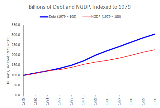
Pondering graph #1, the "percent change" values, I got thinking: Suppose we take 1979 as a starting point. The percent change in debt and NGDP were almost equal that year: 12.12% for debt, 11.73% for NGDP. So now I want to look at billions, but starting in 1979. I'll index them so they start out as if they were equal that year, and we can see the changes over the next few years.

I had the data back to 1947, and looked at all of it first:

Graph #4: Showing 1947-2020

Oh jeeze, I thought, I should have seen that coming. It looks just like what everyone says: Surging debt. Really? I couldn't see that coming?

I'm not making this shit up.

And then, because I dunno, maybe secrets are hidden: Maybe if I zoom in to the 1979 start-date I'll see what I expected to see. Hmm:

Graph 5: Showing 1979-1990

Hmm.

I went all-out this time. I made the blue line wide and the red line narrow, and used bright colors so I could see the red ON the blue, and see what the lines were doing.

I think I see a little dip in the red line, NGDP, in 1982-83.

Also maybe I see a little dip in the blue, nonfinancial debt, 1982-84. No; on second thought, no. It looks like a dip because debt was accelerating in 1984-85. That makes 1982-83 look low. It's not low.

Art, debt hasn't been low since the 1950s, what are you thinkin!


That's when I decided to look at the Debt-to-GDP ratio. But not the totals. Instead, change-in-debt to change-in-NGDP. I don't usually look at change-in relative to change-in, because it makes the graph jiggy. But I was getting desperate.

Graph #6: The Debt-to-GDP ratio using "Change-In" values

Pretty quiet during the 1960s and 70s. Then a jump in the early 1980s, same as we saw on graph #1 and #2. Then it gets quiet again, at a higher level. And then another jump, corresponding to the 2000-2009 jump on #1. And I don't know what happens there at the end.

This is like a million ways to look at graphs that support what other people say. I keep getting graphs that support existing thinking. 

I'm still looking for the other thing.


And this is where I started telling myself:

Okay. Maybe I over-stepped. Maybe 20-year growth is too long a period. Apparently it hides things that are clearly visible in year-on-year data.

But wait now. Look at my "Annual Growth Rates, Debt and NGDP" graph. Clearly, debt is on the increase since the early 1960s. Clearly NGDP is increasing, because of inflation. Clearly, the increase in NGDP  SLOWS  FIRST (like since 1978) and the increase in Debt slows LATER (like since 1986).

The "Chg Debt / Chg NGDP" graph shows sudden increase in debt growth after 1981. BUT THIS INCREASE IS RELATIVE TO NGDP GROWTH. It is not a purely objective measure. The 1978-1986 slowing of NGDP growth creates the appearance of surging debt growth. There was no surge in debt at that time.

The increase of debt after 1981 was a big one, certainly. But as the "Annual Growth Rates, Debt and NGDP" graph shows, that increase was the last of a series of progressively larger increases. The significant change, before 1986, was not the post-1981 increase in debt. The significant change was the post-1981 decrease in NGDP growth. It was this change, the change in NGDP growth, that brought the end of "stability" to the Debt-to-GDP ratio after 1981.

Now, how can I show this? Trends. Let me show the trends. This is valid. After all, the claim to which I object is the claim that financialization started suddenly in the 1980s. If I'm right, if financialization did NOT start suddenly in the 1980s, then there must have been an ongoing TREND of financialization before 1980. If there was such a trend, it must be valid to use "trend analysis" to discover it.

So I decided to go with trends, as I had on the 4th. Not 20-year trends. Just trends.

The only note I had in the spreadsheet at this point was

"Trend Analysis" on my terms (may or may not agree with the technical term).

The hobbyist has spoken.

The first trend I went with is the Hodrick Prescott, the one nobody uses any more. No problem, it makes a pretty graph:

Graph #7: Debt and NGDP, with Hodrick-Prescott Smoothies

Blue is debt, red is NGDP.

Not another word. Moving on, now the same data with linear trends, two for blue, two for red:

Graph #8: Debt and NGDP, with Linear Trends in the Crucial Period

Blue is debt, red is NGDP.

On this graph, one trend line shows the trend of increase, and the other shows the trend of decrease. Two trend lines for debt, and two for NGDP.

On the increase, the two trends are almost perfectly aligned. I made the red one dashed so you can see the blue one underneath it.

One difference: NGDP stops increase and begins decrease around 1978, just before the Volcker disinflation. Debt stops increase and begins decrease around 1985, just before the Savings and Loan Crisis. That's the whole story, right there.

Debt and NGDP both show increase since 1959 (on this graph). But NGDP breaks off and starts running downhill after 1978. (The brief 1981 peak and the brief 1984 peak and the low 1988 peak of NGDP were all influenced by the Volcker policy.) With debt, there was one more big peak after 1978, the big one that peaks in 1985. The one that throws everybody off. 

This peak is not a sudden new surge of debt. With debt you had the 1964 peak (7.18% growth) and the 1967 peak (8.0%) and the 1973 peak (10.33%) and the 1978 peak (13.63%) and the 1985 peak (16.38%) before the trend of increase broke.

Why did the increasing debt trend last longer than the increasing NGDP trend? My guess: We were coming out of three or four recessions in a row, bang-bang-bang, and we were ready for a better economy. And Ronald Reagan had the good narrative. He spoke of "Morning in America" and people were ready for that, too. We fell for it.

Or, I dunno why. But the trend of NGDP increase broke early, and the trend of Debt increase broke late, and this timing is what created the Debt-to-GDP rise of the 1980s. Despite all those other graphs.


Graph #7, with the H-P trends, shows the same thing as #8: the trend of NGDP growth died out early; the trend of debt growth lasted several years more.

So let me say this again.  Debt growth and NGDP growth were both on the increase. NGDP growth died out when Volcker started fiddling. Debt growth died out a few years later, perhaps because the slower-growing NGDP could no longer carry the load.

But it was the fiddling that caused the 1981-1986 increase in Debt-to-GDP. 

There is no doubt.

Friday, October 8, 2021

Suppose the Volcker Disinflation Started a Few Years Early

This graph shows that the "stable" years of the Debt-to-GDP ratio gave way to increase in the early 1980s because that is when the Volcker Disinflation took place:

The graph was done in Excel. Orange is the GDP Deflator. Blue is Debt-to-GDP.

The recession bars, the black GDP Deflator line, and the gray Debt-to-GDP line are an image, captured from a FRED graph and used as a background for the Plot Window in the Excel graph.

I modified the Deflator data in Excel for the years 1977-1982, replacing the inflationary peak of 1981 with a smooth transition connecting 1976 to 1983. Other than that I kept all the annual price change percentages as per the original data. But of course the price level was reduced for all years after 1976.

Real GDP values were unchanged. But because the price level is lower, nominal GDP values are lower. And because the nominal GDP values are lower, the Debt-to-GDP runs higher for all years after 1976.

Because the nominal GDP values were lower, the Debt-to-GDP runs higher for all the years after 1976.

But here's the main thing: Because the disinflation starts in 1977 rather than 1981, the increase in the Debt-to-GDP ratio also starts in 1977 rather than 1981.

The graph is living proof that in the real world, the "stable" years of the Debt-to-GDP ratio gave way to increase in the early 1980s because that is when the Volcker Disinflation took place.


Q: Why did the stability of Debt-to-GDP suddenly turn to increase in the 1980s?

A: The Volcker Disinflation.

Wednesday, October 6, 2021

Not just coincidence

Following up on my "companion graph" post of 4 October.


The blue line shows Debt-to-GDP, nonfinancial debt to gross domestic product. The red line shows inflation as measured by the GDP Deflator:

Graph #1

The black box in the middle of the graph captures the years 1981-1986. In that box in blue we see the sudden increase in debt-to-GDP. At the same time, in red, we see the Volcker disinflation, 1981-1986, within that same black box. These changes happened at the same time.

The dramatic fall of inflation created a dramatic slowing of nominal GDP growth:

Graph #2: Nominal GDP on a Log Scale, where a straight line indicates
a constant rate of growth. GDP growth (blue) falls off after 1981.

The dramatic slowing of GDP growth created a dramatic increase in the Debt-to-GDP ratio.

Monday, October 4, 2021

Debt-to-GDP and the Companion Graph


The reduction in inflation that occurred in the early 1980s, when the Federal Reserve was headed by Paul Volcker, is arguably the most widely discussed and visible macroeconomic event of the last 50 years of U.S. history.
- Goodfriend and King, 2005
But that disinflation is ignored in discussions of the Debt-to-GDP ratio.
- Arthurian


Download the PDF

The first graph here shows nonfinancial debt relative to Gross Domestic Product:

Graph #1: TCMDODNS / GDPA at FRED

Economists dwell on the remarkable stability of this ratio before 1981, and focus on the sudden sharp increase after 1981:

  • "The combined indebtedness of both government and private-sector borrowers, which earlier had shown considerable stability in relation to the economy's overall growth, and especially so since World War II, has since 1980 jumped far out of proportion with nonfinancial economic activity." (B. Friedman 1986, p.1)

  • "One clear limitation of our dataset is that it starts in 1980. It is sufficient, however, to look back at the history of the United States (for which long back data are easily available) to understand how extraordinary the developments over the last 30 years have been. As Graph 2 [here, Graph #1] shows, the US non-financial debt-to-GDP ratio was steady at around 150% [here, 140% and until the early 1980s] from the early 1950s until the mid-1980s." (Cecchetti et al 2011, p.6)

  • "When did financialization start? While there is much literature on the increasing dominance of finance in the United States after 1970, ... most analysts emphasize the neoliberal period beginning in the 1980s." (Fasianos et al 2016, p.2)

What caused the sharp increase in the Debt-to-GDP ratio in the 1980s? Financialization was not the cause. Financialization did not emerge fully formed from the void in 1981. The sudden increase in the ratio happened when Paul Volcker's anti-inflation policy started working. The next graph shows growth rates for debt and GDP, separately, using the same source data as the first graph:

Graph #2: Companion Graph Showing the FRED data TCMDODNS and GDPA

Growth is shown for moving 20-year periods. The first value of each line, plotted at 1966, indicates the rate of growth of the 1946-1966 period. The second value indicates the 1947-1967 period, etc.

GDP and nonfinancial debt run close from 1966 to 1981 -- essentially from 1946 to 1981 -- and incredibly close from 1974 to 1981. This confirms the standard evaluation of the standard Debt-to-GDP graph: stability before the 1980s.

But the lines separate after 1981, just as the Debt-to-GDP ratio rises. This is not because of any significant change in the path of debt. Graph #2 shows little change in the path of debt. Nor do the lines separate because of any significant change in the growth of Real GDP:

Graph #3: Showing FRED data TCMDODNS, GDPA, and GDPCA

The separation after 1981 can only have been due to a change in the path of the price level, as the price level is the only difference between real and nominal GDP. I am therefore forced to conclude that the sudden, sharp increase in Debt-to-GDP after 1981, visible on the first graph, was a direct consequence of the Volcker disinflation.

The price level caused debt and GDP to run together until Volcker, and then the price level caused debt and GDP to diverge.

The sudden increase in the Debt-to-GDP ratio in the 1980s was the result of anti-inflation policy. It was not the result of financialization emerging suddenly, like an evil butterfly escaping an innocuous cocoon.


The Debt-to-GDP graph shows the path of debt, but shows it relative to GDP. The companion graph shows the path of debt and the path of GDP, and shows them separately so that they may be evaluated and compared.

The essential point is that the growth of debt was rapid, persistent, and (as the vertical axis values show) accelerating without hesitation from the early days until 1986. There was no sharp change in debt growth until after the rise in Debt-to-GDP -- and the change, when it came, was decrease. The problem with debt is not the increase since 1981, but the increase since the end of the second World War.

The logic that says rapid growth of debt is okay until debt becomes a problem is the logic that creates the problem.


It was inflation that kept the ratio low. It was the Great Inflation that kept the Debt-to-GDP ratio low from the mid-60s to the Volcker disinflation. Without the Great Inflation, the ratio would have looked more like this:

Graph #4: Inflation messes with the debt-to-GDP ratio

As Investopedia says, "the beginnings of financialization in the United States can be traced as far back as the 1950s".


Data

Debt: quarterly by default, set to annual frequency and end-of-period aggregation
Domestic Nonfinancial Sectors; Debt Securities and Loans; Liability, Level (TCMDODNS)
https://fred.stlouisfed.org/series/TCMDODNS

NGDP: annual by default
Gross Domestic Product (GDPA)
https://fred.stlouisfed.org/series/GDPA

RGDP: annual by default
Real Gross Domestic Product (GDPCA)
https://fred.stlouisfed.org/series/GDPCA

Price Level: annual by default
Gross domestic product (implicit price deflator) (A191RD3A086NBEA)
https://fred.stlouisfed.org/series/A191RD3A086NBEA

Growth calculation: (At / At-20) - 1
where A is annual data from FRED, as specified.


References

Cecchetti, S., Mohanty, M. and Zampolli, F. (2011): “The real effects of debt”,  BIS Working Papers no. 352, September.
https://www.bis.org/publ/work352.pdf

Fasianos, A., Guevara, D., and Pierros, C. (2016): ‟Have We Been Here Before? Phases of Financialization within the 20th Century in the United States”, Levy Economics Institute working paper no. 869, June.
http://www.levyinstitute.org/pubs/wp_869.pdf

FRED  https://fred.stlouisfed.org/

Friedman, B. (1986): “Increasing Indebtedness and Financial Stability in the United States”,  NBER Working Papers, no 2072, November.
https://www.nber.org/system/files/working_papers/w2072/w2072.pdf

Goodfriend, M., King, R. (2005): ‟The incredible Volcker disinflation”. Journal of Monetary Economics 52 (2005) 981–1015.
https://www.bu.edu/econ/files/2011/01/GKcr2005.pdf

Investopedia (2021): ‟Financialization”.
https://www.investopedia.com/terms/f/financialization.asp

This paper online:
https://econcrit.blogspot.com/2021/10/debt-to-gdp-companion-graph.html