I wrote this whole thing in Excel, making notes to myself while trying to turn nonfinancial debt and nominal GDP data into a graph that shows what I know must have happened: It was the decline of NGDP growth, not the surging growth of debt, that caused the increase in the Debt-to-GDP ratio in the first half of the 1980s.
My intent is to leave no doubt.

I
took annual data for TCMDODNS and GDPA from FRED and figured my own
"Percent Change from Year Ago" values. I spot-checked them just now; my
numbers match FRED's. (After being lost in Excel for a head-spinning 9
hours continuous, I was no longer sure.) The numbers are good, and I'm
going with the original graph title "Annual Growth Rates, Debt and
NGDP".
A note to myself, from the spreadsheet:
Use "percent change" values to emphasize the difference between debt and NGDP.
The
"Debt-to-GDP" graph I've focused on so far this month is a ratio of
totals: debt (in billions) relative to GDP (in billions). The totals are big
numbers; the change from year to year is much smaller. By focusing on
changes, rather than on totals, I can magnify both the yearly changes and
the differences between debt and GDP. Maybe I'll be able to see things I
didn't notice before.
The graph of the percent change values shows something initially interesting and then immediately obvious:
 | |
| Graph #1: Percent Change Values Graph #2: The Debt-to-GDP Ratio |
Note the alignment: The peaks in debt growth on the upper graph clearly align with the rises of Debt-to-GDP on the lower graph. No wonder people say surging debt was responsible for those rises!
Graphs like those had me starting to think I had overstepped the bounds of reason with my Companion Graph of October 4. It seems the 20-year trends shown on that graph are long enough to suppress the peaks of debt growth that are plainly visible on Graph #1 above.
 |
| Graph #3: The Debt-to-GDP Companion |
But
I don't know if that's true. The companion graph clearly shows the
sudden, sharp slowing of nominal GDP (and not of real GDP) after 1981,
as the Volcker Disinflation took hold; it shows the sudden slowing of
nonfinancial debt after 1986 as the Savings and Loan Crisis took hold;
and it shows the slowing of both since 1990. These changes are not suppressed by the 20-year trend.
And yet my assertion that the companion graph shows no significant disturbance in the trend of debt between 1975 and 1986 seems the Achilles heel of an otherwise powerful argument:
- There was no change in the trend of debt that could have caused the rise in the Debt-to-GDP ratio.
- There was a clear shift in the nominal GDP trend that could have caused the rise in the ratio.
- But there was no major change in the Real GDP component of nominal GDP.
- So the rise in the ratio must be due to a change in the price level component of nominal GDP.
- The timing of the Volcker disinflation is the smoking gun.
I have painted myself into a corner where I must either demonstrate the truth of my assertion there was no change in the trend of debt that could have caused the rise in the Debt-to-GDP ratio, or abandon my objection to the widely accepted thinking on this topic.
Pondering
graph #1, the "percent change" values, I got thinking: Suppose we take
1979 as a starting point. The percent change in debt and NGDP were
almost equal that year: 12.12% for debt, 11.73% for NGDP. So now I want
to look at billions, but starting in 1979. I'll index them so they start
out as if they were equal that year, and we can see the changes over
the next few years.
I had the data back to 1947, and looked at all of it first:
 |
| Graph #4: Showing 1947-2020 |
Oh jeeze, I thought, I should have seen that coming. It looks just like what everyone says: Surging debt. Really? I couldn't see that coming?
I'm not making this shit up.
And then, because I dunno, maybe secrets are hidden: Maybe if I zoom in to the 1979 start-date I'll see what I expected to see. Hmm:
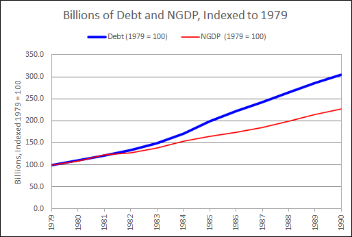 |
| Graph 5: Showing 1979-1990 |
Hmm.
I went all-out this time. I made the blue line wide and the red line narrow, and used bright colors so I could see the red ON the blue, and see what the lines were doing.
I think I see a little dip in the red line, NGDP, in 1982-83.
Also maybe I see a little dip in the blue, nonfinancial debt, 1982-84. No; on second thought, no. It looks like a dip because debt was accelerating in 1984-85. That makes 1982-83 look low. It's not low.
Art, debt hasn't been low since the 1950s, what are you thinkin!
That's
when I decided to look at the Debt-to-GDP ratio. But not the totals.
Instead, change-in-debt to change-in-NGDP. I don't usually look at
change-in relative to change-in, because it makes the graph jiggy. But I
was getting desperate.
 |
| Graph #6: The Debt-to-GDP ratio using "Change-In" values |
Pretty quiet during the 1960s and 70s. Then a jump in the early 1980s, same as we saw on graph #1 and #2. Then it gets quiet again, at a higher level. And then another jump, corresponding to the 2000-2009 jump on #1. And I don't know what happens there at the end.
This is like a million ways to look at graphs that support what other people say. I keep getting graphs that support existing thinking.
I'm still looking for the other thing.
And this is where I started telling myself:
Okay. Maybe I over-stepped. Maybe 20-year growth is too long a period. Apparently it hides things that are clearly visible in year-on-year data.
But wait now. Look at my "Annual Growth Rates, Debt and NGDP" graph. Clearly, debt is on the increase since the early 1960s. Clearly NGDP is increasing, because of inflation. Clearly, the increase in NGDP SLOWS FIRST (like since 1978) and the increase in Debt slows LATER (like since 1986).
The "Chg Debt / Chg NGDP" graph shows sudden increase in debt growth after 1981. BUT THIS INCREASE IS RELATIVE TO NGDP GROWTH. It is not a purely objective measure. The 1978-1986 slowing of NGDP growth creates the appearance of surging debt growth. There was no surge in debt at that time.
The increase of debt after 1981 was a big one, certainly. But as the "Annual Growth Rates, Debt and NGDP" graph shows, that increase was the last of a series of progressively larger increases. The significant change, before 1986, was not the post-1981 increase in debt. The significant change was the post-1981 decrease in NGDP growth. It was this change, the change in NGDP growth, that brought the end of "stability" to the Debt-to-GDP ratio after 1981.
Now, how can I show this? Trends. Let me show the trends. This is valid. After all, the claim to which I object is the claim that financialization started suddenly in the 1980s. If I'm right, if financialization did NOT start suddenly in the 1980s, then there must have been an ongoing TREND of financialization before 1980. If there was such a trend, it must be valid to use "trend analysis" to discover it.
So I decided to go with trends, as I had on the 4th. Not 20-year trends. Just trends.
The only note I had in the spreadsheet at this point was
"Trend Analysis" on my terms (may or may not agree with the technical term).
The hobbyist has spoken.
The first trend I went with is the Hodrick Prescott, the one nobody uses any more. No problem, it makes a pretty graph:
 |
| Graph #7: Debt and NGDP, with Hodrick-Prescott Smoothies |
Blue is debt, red is NGDP.
Not another word. Moving on, now the same data with linear trends, two for blue, two for red:
 |
| Graph #8: Debt and NGDP, with Linear Trends in the Crucial Period |
Blue is debt, red is NGDP.
On this graph, one trend line shows the trend of increase, and the other shows the trend of decrease. Two trend lines for debt, and two for NGDP.
On the increase, the two trends are almost perfectly aligned. I made the red one dashed so you can see the blue one underneath it.
One difference: NGDP stops increase and begins decrease around 1978, just before the Volcker disinflation. Debt stops increase and begins decrease around 1985, just before the Savings and Loan Crisis. That's the whole story, right there.
Debt and NGDP both show increase since 1959 (on this graph). But NGDP breaks off and starts running downhill after 1978. (The brief 1981 peak and the brief 1984 peak and the low 1988 peak of NGDP were all influenced by the Volcker policy.) With debt, there was one more big peak after 1978, the big one that peaks in 1985. The one that throws everybody off.
This peak is not a sudden new surge of debt. With debt you had the 1964 peak (7.18% growth) and the 1967 peak (8.0%) and the 1973 peak (10.33%) and the 1978 peak (13.63%) and the 1985 peak (16.38%) before the trend of increase broke.
Why
did the increasing debt trend last longer than the increasing NGDP
trend? My guess: We were coming out of three or four recessions in a
row, bang-bang-bang, and we were ready for a better economy. And Ronald
Reagan had the good narrative. He spoke of "Morning in America" and
people were ready for that, too. We fell for it.
Or, I dunno
why. But the trend of NGDP increase broke early, and the trend of Debt
increase broke late, and this timing is what created the Debt-to-GDP
rise of the 1980s. Despite all those other graphs.
Graph
#7, with the H-P trends, shows the same thing as #8: the trend of NGDP
growth died out early; the trend of debt growth lasted several years
more.
So let me say this again. Debt growth and NGDP growth were both on the increase. NGDP growth died out when Volcker started fiddling. Debt growth died out a few years later, perhaps because the slower-growing NGDP could no longer carry the load.
But it was the fiddling that caused the 1981-1986 increase in Debt-to-GDP.
There is no doubt.


No comments:
Post a Comment