distanced himself from Thatcher's belief that public sector borrowing should be reduced in times of recession.That's not a small thing.
Friday, November 30, 2018
Interesting note on Milton Friedman
According to William Keegan of The Guardian, Milton Friedman
Thursday, November 29, 2018
Growth and Civilization
Ref: Economics Prof Tyler Cowen says our overwhelming priorities should be maximising economic growth and making civilization more stable. Is he right? An interview with Cowen, by Robert Wiblin and Keiran Harris.
I think you have to look back in time to when the problem started, and see where it started and what happened. Then you have some clues about what the problem really is and how to solve it. The necessary first step is to understand the problem. We skipped that part. We assume that we understand the problem.
So you've got a bunch of guys who think "you can’t say much about what’s actually better". And you've got Tyler Cowen who throws out that baby with its bath water, stomps his foot on the floor, and says Yes you can! And here I am, saying stop all this nonsense, swallow your pride, and figure out what the damn problem is.
Cowen drives me to Arnold J Toynbee, who writes:
I say you have to figure out the reason things are going downhill. I say that if you're not solving the right problem, your solution won't solve the problem. And it may end up making things worse. This is the story of the last 50 years.
Toynbee continues:
Cowen says all we have to do is push our skills and our institutions back up the hill and presto our problems are solved. That's wishful thinkin.

On Getting Growth
Robert Wiblin: All right, let’s move on to the book, Stubborn Attachments... How would you summarize the key messages of this book? And how did you come to write it?I agree with Cowen that economic growth is good. But his "underlying message" makes me nervous. He seems to think that all we have to do is is sit down and be rational, and all will be well. I think the economy is a system, and our task is to understand how the system works. And I think Cowen's underlying message is an example of not doing that.
Tyler Cowen: The underlying message of the book is simply, we’re capable of making rational judgments about what is better for society. In my own discipline, economics, there’s a long-standing thread of skepticism about that. Kenneth Arrow developed an impossibility theorem. There are a lot of results that imply you can’t say much about what’s actually better.
I think you have to look back in time to when the problem started, and see where it started and what happened. Then you have some clues about what the problem really is and how to solve it. The necessary first step is to understand the problem. We skipped that part. We assume that we understand the problem.
So you've got a bunch of guys who think "you can’t say much about what’s actually better". And you've got Tyler Cowen who throws out that baby with its bath water, stomps his foot on the floor, and says Yes you can! And here I am, saying stop all this nonsense, swallow your pride, and figure out what the damn problem is.
"Exponential compounding growth"
Robert Wiblin: Let’s talk about a couple of the key ideas. One is the Crusonia plant and compounding growth. What would you talk about there in the book?A ridiculous comparison! Compounding is like apples. It's more like weeds that keep on growing and spreading and taking over your yard... and have a very low value.
Tyler Cowen: The Crusonia plant is a somewhat obscure reference. It’s taken from the works of Frank Knight, University of Chicago economist. Knight postulated there was such a thing as a Crusonia plant. It was a hypothetical. It would simply keep on growing forever, so it would be of very high value. It’s like an apple tree. Seeds fall. You get more apples. Those seeds, in turn, get you more apple trees, and so on and so on.
That’s exponential compounding growth. So if you don’t discount the future at a very high rate, if you had such a thing as a Crusonia plant, it would be very valuable.
Tyler Cowen: Then if you ask, “What, in fact, is a Crusonia plant?” It’s a modern, well-functioning economy that does generate more output every period at something like an exponential rate of growth, and it’s highly valuable. So we want to cultivate, again, economic growth.Cowen makes it sound simple: If you want good growth, you just need good institutions, which build on good ideas. Presto! No more Dark Ages.
Robert Wiblin: Why do you think the economy grows in this way where shocks or improvements seem to be permanent or at least semipermanent?
Tyler Cowen: People generate new ideas, and most new ideas don’t disappear. You can lose a new idea or have a Dark Ages. But if you have good institutions, you build upon those new ideas.
Cowen drives me to Arnold J Toynbee, who writes:
When a civilization is in decline it sometimes happens that a particular technique, that has been both feasible and profitable during the growth-stage, now begins to encounter social obstacles and to yield diminishing economic returns; if it becomes patently unremunerative it may be deliberately abandoned.When a civilization is in decline things go downhill. Cowen is saying all we have to do is push them back up the hill and all will be well.
I say you have to figure out the reason things are going downhill. I say that if you're not solving the right problem, your solution won't solve the problem. And it may end up making things worse. This is the story of the last 50 years.
Toynbee continues:
... if it becomes patently unremunerative it may be deliberately abandoned. In such a case it would obviously be a complete inversion of the true order of cause and effect to suggest that the abandonment of the technique in such circumstances was due to a technical inability to practise it and that this technical inability was a cause of the breakdown of the civilization.It is not that a loss of skills (or institutions) leads to abandonment of technology (or ethics and morals) and causes the decline of civilization. Rather the opposite: the decline of civilization is part of a business cycle that can endure for millennia; during the decline, some technologies (ethics, morals) become unprofitable and are therefore abandoned; the loss of skills (and institutions) follows.
Cowen says all we have to do is push our skills and our institutions back up the hill and presto our problems are solved. That's wishful thinkin.

Wednesday, November 28, 2018
There's a lower bound on interest rates, but not on "dumbing it down"
Noah Smith, Why a Great U.S. Economy Doesn’t Feel So Great, at Bloomberg:
So "the gritty details of things that are thought to affect productivity", that's micro. Macro, meanwhile, is short-term mismatches and temporary phenomena.
Keynes rolls in the grave.
Me, I'm frozen in disbelief.
Various subfields of economics deal with the gritty details of things that are thought to affect productivity — taxes, public goods, economic development, education, health, research and development, financial markets, etc. Increasingly, these fields — which comprise a majority of what economists study — are grouped together under the name of microeconomics.
In the short term, economists believe, the business cycle can cause fluctuations around the long-term trend. When a financial crisis, tight monetary policy or some other shock causes aggregate demand for goods and services to fall, businesses stop investing and lay off workers. The ensuing recession causes a mismatch — offices and factories sit empty, while workers who could fill those offices and factories stay at home playing video games. The downturn doesn’t last forever, but in the most severe situations it can persist for as long as a decade. The branch of economics which deals with this sort of temporary phenomenon is called macroeconomics.
So "the gritty details of things that are thought to affect productivity", that's micro. Macro, meanwhile, is short-term mismatches and temporary phenomena.
Keynes rolls in the grave.
Me, I'm frozen in disbelief.
Tuesday, November 27, 2018
A fault line in the banana
FRED Blog asks: Are we moving toward a cashless economy? They ask an interesting question. And they answer it, it seems to me, with a rather definite "No".
However, their conclusion is "the question remains open."
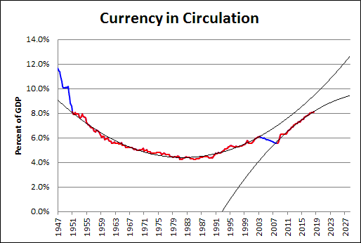
I'm confused by their post, so I'll leave it alone. But the graph they show is for currency in circulation. I've got monetarist blood, so I looked at it. Then I looked at currency in circulation relative to GDP, because, you know, context.
It's a banana, currency relative to GDP, low in the middle and high on the ends. The graph reminds me of a Scott Sumner post from two or three years back. Sumner said Currency-to-GDP is the inverse of velocity. He said interest rates move with velocity. And yeah, I'm leaving that alone too.
Here is the banana:
I'm lookin at currency in circulation relative to GDP, and I see something no one else seems to notice. Or maybe it's that no one else thinks it is worth bothering with. But it sure looks important to me: Between the years 2000 and 2010, there is an interruption in the banana.
I brought the data into Excel and put a trend line on it. Two trend lines, actually: second order polynomials, both of them.
The blue line shows currency in circulation relative to GDP, just like on the first graph. The red is identical, and hides most of the blue. But there are two red segments here, each indicating the data used to generate one of the trend lines.
The long red (1951Q1-2003Q2) creates the basic banana shape that is so obvious on the graph. Then, after the interruption (2003Q2-2008Q2), the banana-path resumes, as shown by the short red (2008Q2-2018Q3).
But there is a problem with this simplification. Short red is low: lower than the trend of the long red banana. It also appears that short red is curving the wrong way; but I will say no to this, because short red is going the right way to become a flatline. I like flatline ratios: they suggest the approach of economic stability. Just one problem, then: Short red is low.
One could argue that the short red, running low, is a cause or a consequence, or both, of the economic sluggishness of the past decade. I would make that argument: Slow economic growth and slow growth of the quantity of money go hand in hand. Definitely.

Here is a detail of the "fault line" in the banana:
The fault line is blue. Notice that it starts in 2003 and ends in 2008. This fault line is not the result of the Global Financial Crisis or the Great Recession. The fault line came before those events and, if anything, was the cause of them.
However, their conclusion is "the question remains open."
I'm confused by their post, so I'll leave it alone. But the graph they show is for currency in circulation. I've got monetarist blood, so I looked at it. Then I looked at currency in circulation relative to GDP, because, you know, context.
It's a banana, currency relative to GDP, low in the middle and high on the ends. The graph reminds me of a Scott Sumner post from two or three years back. Sumner said Currency-to-GDP is the inverse of velocity. He said interest rates move with velocity. And yeah, I'm leaving that alone too.
Here is the banana:
 |
| Graph #1: Currency in Circulation relative to GDP |
I'm lookin at currency in circulation relative to GDP, and I see something no one else seems to notice. Or maybe it's that no one else thinks it is worth bothering with. But it sure looks important to me: Between the years 2000 and 2010, there is an interruption in the banana.
I brought the data into Excel and put a trend line on it. Two trend lines, actually: second order polynomials, both of them.
 |
| Graph #2 |
The blue line shows currency in circulation relative to GDP, just like on the first graph. The red is identical, and hides most of the blue. But there are two red segments here, each indicating the data used to generate one of the trend lines.
The long red (1951Q1-2003Q2) creates the basic banana shape that is so obvious on the graph. Then, after the interruption (2003Q2-2008Q2), the banana-path resumes, as shown by the short red (2008Q2-2018Q3).
But there is a problem with this simplification. Short red is low: lower than the trend of the long red banana. It also appears that short red is curving the wrong way; but I will say no to this, because short red is going the right way to become a flatline. I like flatline ratios: they suggest the approach of economic stability. Just one problem, then: Short red is low.
One could argue that the short red, running low, is a cause or a consequence, or both, of the economic sluggishness of the past decade. I would make that argument: Slow economic growth and slow growth of the quantity of money go hand in hand. Definitely.
Here is a detail of the "fault line" in the banana:
 |
| Graph #3: Currency Trends Detail |
Sunday, November 25, 2018
"2 years of 10% and 0% growth is not the same as 2 years of 5% growth."
In comments here the other day, Jim said:
So I opened up Excel and typed 5% Every Year. And then I typed 10%, 0%, 10%, ...
And I looked at what I had, and those were the two conditions Jim specified: one of constant and one of alternating growth. I thought about it. And then I added another one: Random growth one year, and then enough growth the next year to bring the two-year total to 10%. (The third year again random, and the next bringing the two-year total to 10%; etc.)
I generated numbers enough to fill the cells below the three labels, but not more than I could see on the screen. But this seemed unsatisfactory because it only amounted to about 30 years of growth. I should figure more than 30 years, I thought. So I added some more, and the screen scrolled, and when I got 40 years of growth I figured that was plenty.
(These decisions I make, based on impressions and impulses and a desire to keep most of my data visible on the screen... is this how science is done?)
I was going to number the first row of data "Year 0". My starting point. That way the second row, the first year of growth, would get a "1" in the Year column. But then, no. Because I knew I'd be looking at exponential trend line equations to see the growth rates for my different columns of data. And exponential trend lines want my "Year" numbers to start with 1. Not zero.
So I made my first year Year 1 even though it's just a starting point and not a measure of change. That made the first change appear in Year 2. And that made the 40th change appear in Year 41. I hate this one-year discrepancy, because if I don't explain it it looks like a mistake. And if I do explain it, it looks like I'm making excuses. But it's just the way Excel works. Either that, or Excel and I have a serious misunderstanding.
Here is the graph I came up with:
I put trend lines and trend line equations on the graph, then hid the trend lines because I just need the equations. The trend line equations on the graph are color-coded to match the lines and the legend. Blue shows 5% growth every year. The trend line equation shows a 4.88% growth rate; this differs from 5% because of compounding, I suppose. Nothing is easy.
Red shows alternating growth: 10% one year, 0% the next, and repeating. This gives an average growth rate of 5% but of course the red line is not a smooth curve. It is up-and-down, up-and-down, like a saw-tooth. The trend line equation shows an exponential growth rate of 4.77%.
That's close to 4.88%, I told myself.
Green uses a random number between 0 and 10 as the growth rate for one year, and then 10 minus that growth rate as the rate for the next year. Then for the following year a new random number; and for the year after that, again the difference from 10. This gives a series of two-year averages each equal to 5%; the trend line equation shows 4.88%, just the same as the blue line.
Now I'm going to ignore the green and concentrate on the red.
The red exponential rate is a little low. And at the right side of the graph, you can see that my red line ends at a low point of the sawtooth. I thought these two lows might be related. So I added one more year to the graph, to make that red line end at a high point of the sawtooth. You can see the red line scoot up at the end:
However, there is no change in the 4.77% exponential trend rate. I should have known.
Looking at that red line now, it appears that for the first half of the graph, the high points of the sawtooth are noticeably above the blue line. But in the latter half, the lows of the sawtooth being below the blue is what stands out. This seems to be telling me that the red line is not growing as fast as the blue line.
4.77% versus 4.88% growth: I should have known.
Okay. So I figured, let's look at the difference between red and blue. The one minus the other. Get rid of the exponential upward sweep, and consider the red line relative to the blue.
Also, the difference between green and blue.
Okay: The red line is definitely not keeping up with the blue.
The green line is easily explained with one word: "random". But the red one, the red one is interesting. At the start, red is almost entirely above the zero line: Red is greater than blue. By the end, red is almost entirely below the zero line: Red is less than blue.
If the graph kept going for another 40 years, I expect we'd see the red continue downward.
Notice also that the zigs and zags of the red grow longer as we go from left to right. The difference between red and blue is getting bigger. But don't forget, the red and blue on Graph 1 and 2 also get bigger as we go from left to right. So the question now is: Is the difference increasing faster than the blue line, or slower, or is it keeping pace? And that's our next graph:
Now the red zigs and zags are all of equal length, or nearly equal anyway. So I want to say the red difference is keeping pace with blue. And yet, for the years shown, the red difference starts out on average at around 2% of the value of blue on the high side; and 35 or 40 years later we find it on average again around 2% the value of blue, but on the low side.
I have no doubt that if we continued the graph out for another 40 years or so we would see the red zig-zag continue on its downward path. Actually, what's happening here reminds me of Bruce Boghosian's The Growth of Oligarchy in a Yard-Sale Model of Asset Exchange (PDF, 15 pages). See The Mathematics of Inequality at TuftsNow:
In Fair coin, foul outcome I looked at some Excel graphs of the process Boghosian describes. My last graph there shows the same zig-zag pattern of decline that turned up in Graph #4 above. And I figured out how the process works:
I had in mind to say this of the red pattern on Graph #4: Jim is right. Two years of 10% and 0% growth is not the same as two years of 5% growth. And, all else equal, it looks like low volatility of economic growth will over the long term produce greater growth than high volatility. However, the economy never grows in a persistent alternating pattern like the "10%, 0%, 10%..." example. Not over the long term.
And I was going to say: "So Jim is right, but the effect on the economy must be of little consequence." I was going to say that, but now, no. And now also I must omit the "However, the economy never grows in a persistent alternating pattern" and the rest of that paragraph.
Beyond that, I have to think about this some more.
Its not very meaningful to average percentages. 2 years of 10% and 0% growth is not the same as 2 years of 5% growth.Jim said pretty much the same thing a few years back. I can't find that older remark, but it definitely got stuck between my ears. Since it came up again now, I thought this time I'd actually take a look at some numbers. Because without looking at the numbers I can't make progress, and it'll be a loose end in my head forever.
So I opened up Excel and typed 5% Every Year. And then I typed 10%, 0%, 10%, ...
And I looked at what I had, and those were the two conditions Jim specified: one of constant and one of alternating growth. I thought about it. And then I added another one: Random growth one year, and then enough growth the next year to bring the two-year total to 10%. (The third year again random, and the next bringing the two-year total to 10%; etc.)
I generated numbers enough to fill the cells below the three labels, but not more than I could see on the screen. But this seemed unsatisfactory because it only amounted to about 30 years of growth. I should figure more than 30 years, I thought. So I added some more, and the screen scrolled, and when I got 40 years of growth I figured that was plenty.
(These decisions I make, based on impressions and impulses and a desire to keep most of my data visible on the screen... is this how science is done?)
I was going to number the first row of data "Year 0". My starting point. That way the second row, the first year of growth, would get a "1" in the Year column. But then, no. Because I knew I'd be looking at exponential trend line equations to see the growth rates for my different columns of data. And exponential trend lines want my "Year" numbers to start with 1. Not zero.
So I made my first year Year 1 even though it's just a starting point and not a measure of change. That made the first change appear in Year 2. And that made the 40th change appear in Year 41. I hate this one-year discrepancy, because if I don't explain it it looks like a mistake. And if I do explain it, it looks like I'm making excuses. But it's just the way Excel works. Either that, or Excel and I have a serious misunderstanding.
Here is the graph I came up with:
 |
| Graph #1: A Comparison of Constant and Averaged Growth Rates |
Red shows alternating growth: 10% one year, 0% the next, and repeating. This gives an average growth rate of 5% but of course the red line is not a smooth curve. It is up-and-down, up-and-down, like a saw-tooth. The trend line equation shows an exponential growth rate of 4.77%.
That's close to 4.88%, I told myself.
Green uses a random number between 0 and 10 as the growth rate for one year, and then 10 minus that growth rate as the rate for the next year. Then for the following year a new random number; and for the year after that, again the difference from 10. This gives a series of two-year averages each equal to 5%; the trend line equation shows 4.88%, just the same as the blue line.
Now I'm going to ignore the green and concentrate on the red.
The red exponential rate is a little low. And at the right side of the graph, you can see that my red line ends at a low point of the sawtooth. I thought these two lows might be related. So I added one more year to the graph, to make that red line end at a high point of the sawtooth. You can see the red line scoot up at the end:
 |
| Graph #2: Like Graph #1 but with One Additional Year |
Looking at that red line now, it appears that for the first half of the graph, the high points of the sawtooth are noticeably above the blue line. But in the latter half, the lows of the sawtooth being below the blue is what stands out. This seems to be telling me that the red line is not growing as fast as the blue line.
4.77% versus 4.88% growth: I should have known.
Okay. So I figured, let's look at the difference between red and blue. The one minus the other. Get rid of the exponential upward sweep, and consider the red line relative to the blue.
Also, the difference between green and blue.
 |
| Graph #3: Differences from the Constant Rate of the Blue Line |
The green line is easily explained with one word: "random". But the red one, the red one is interesting. At the start, red is almost entirely above the zero line: Red is greater than blue. By the end, red is almost entirely below the zero line: Red is less than blue.
If the graph kept going for another 40 years, I expect we'd see the red continue downward.
Notice also that the zigs and zags of the red grow longer as we go from left to right. The difference between red and blue is getting bigger. But don't forget, the red and blue on Graph 1 and 2 also get bigger as we go from left to right. So the question now is: Is the difference increasing faster than the blue line, or slower, or is it keeping pace? And that's our next graph:
 |
| Graph #4: Differences as a Percent of the Blue Line |
I have no doubt that if we continued the graph out for another 40 years or so we would see the red zig-zag continue on its downward path. Actually, what's happening here reminds me of Bruce Boghosian's The Growth of Oligarchy in a Yard-Sale Model of Asset Exchange (PDF, 15 pages). See The Mathematics of Inequality at TuftsNow:
This is essentially a coin toss, and you might think that in the end both sides would end up with the same amount of wealth. But it turns out those who have more keep getting more.Yeah, I thought "both sides would end up with the same amount of wealth". Or in this case, with the same amount of growth. Now I'm seeing this is not the case.
In Fair coin, foul outcome I looked at some Excel graphs of the process Boghosian describes. My last graph there shows the same zig-zag pattern of decline that turned up in Graph #4 above. And I figured out how the process works:
Consider a two-transaction sequence. On average in a two-transaction sequence, because the coin is fair, the rich guy and the poor guy should each win one of the wealth transfers. There are two ways this can happen:
1. The rich guy wins the first transfer, and the poor guy wins the second. Or
2. The poor guy wins the first transfer, and the rich guy wins the second.
If the rich guy wins first, the first transfer reduces the poor guy's wealth. So the second wealth transfer is smaller. The poor guy loses the larger transfer and wins the smaller one. Therefore, his wealth is reduced.
If the poor guy wins first, the first wealth transfer increases the poor guy's wealth. So the second wealth transfer is larger than the first. The poor guy loses this larger transfer. Therefore, his wealth is reduced.
Either way, the poor guy loses.
I had in mind to say this of the red pattern on Graph #4: Jim is right. Two years of 10% and 0% growth is not the same as two years of 5% growth. And, all else equal, it looks like low volatility of economic growth will over the long term produce greater growth than high volatility. However, the economy never grows in a persistent alternating pattern like the "10%, 0%, 10%..." example. Not over the long term.
And I was going to say: "So Jim is right, but the effect on the economy must be of little consequence." I was going to say that, but now, no. And now also I must omit the "However, the economy never grows in a persistent alternating pattern" and the rest of that paragraph.
Beyond that, I have to think about this some more.
Friday, November 16, 2018
The story is satisfying, but the argument is not
I remember now. I was fascinated by Jacob Assa's "Final GDP" story once before, back in March of this year. Then I started looking into the numbers and was disappointed. I began by showing one of Assa's graphs:
Assa offers the gap between employment and output as evidence that Real GDP overstates output by figuring finance as productive activity.
The graph shows Real GDP and employment running together until the early 1980s, when GDP accelerates and employment starts falling behind. Fascinated, I went to FRED to see if I could duplicate the graph using GDPC1 and PAYEMS.
Yes, I could duplicate the graph. Using data since 1977, indexed to 1977, the lines on my graph followed a pattern similar to Assa's. I even got similar index values for 2011 where his graph ends: 260 for GDP (versus Assa's 250) and about 160 for employment (versus 150).
Of course, when I created my duplicate graph at FRED, it didn't start with 1977. It showed all the data, as FRED does by default, going back to the late 1940s for Real GDP, and even earlier for employment. And when I looked at all the data, I didn't see GDP and employment "running together until the early 1980s". I saw them running together only for about ten years, beginning in the early 1970s.
This graph shows GDP rising more rapidly than employment in recent decades, when the difference can be attributed to what Assa calls "the financialization of GDP". But it also shows GDP rising more rapidly than employment from the late 1940s to the early 1970s, when it should not. And there is a decade, beginning in the 1970s, where GDP and employment run together, when they should not:
I felt deceived.
In a comment on mine of last March, Jerry reminded me that
Evaluating my graph showing all the data, Jerry added
So I looked at the growth rates. Here's what I got:
At FRED they still haven't fixed the major glitch that incorrectly saves your graph settings when you click the Page short URL option. That's okay: I was ready for em this time. I got a screen grab of the graph settings, just in case.
That's about as far as I got, back in March, with my disappointment in Jacob Assa's argument. This time I want to stay on the case a little longer.
I downloaded the growth-rate-difference data to Excel and recreated the graph there. Looking at it, it seemed to me that the spikey data ended (and the "great moderation" began) with the data point at Q2 1984. So I figured two averages: one ending and another one starting at that date. This way I could compare the average performance of the period when the data seems to show the increasing financialization of GDP, to the period when it doesn't.
The average per-quarter growth rate difference for Q4 1947 thru Q2 1984 is 0.37551 percent. The average per-quarter value for Q2 1984 thru Q3 2018 is 0.32239 percent. The difference of the averages is 0.05311 percent. Multiply by 4 to approximate annual growth rates, and I get 0.2%. (To five decimal places, 0.21245%). The difference is about one-fifth of one percent less in the late period.
The difference is less, in the late period. What does that mean? It means employment growth and RGDP growth are more similar in the late period than in the early period. It means I'm not finding the financialization of GDP that explains things for Jacob Assa. I'm not finding it.
I guess I could have done it differently. I could have looked at the original source data (my graph #2 above), picked data points for the time that the two data sets are running together, and excluded that period from my calculation. Compare the before to the after, in other words, leaving out the middle.
Looking at a close-up detail of Graph #2, I picked "arbitrary" but "best guess" start- and end-points for "two data sets running together":
Now we can compare three periods for the Growth Rate Difference: 1947Q2-1976Q1, 1976Q1-1982Q1, and 1982Q1-2018Q3.
Again, this is based on quarterly data. Multiply the numbers above the columns by 4 to approximate annual growth rates. (It's not accurate, but it is close.) Rounded values: I get percentage point differences of 1.650 for the early period, 0.234 for the middle period, and 1.375 for the late period. Approximately one and two thirds, a quarter, and one and one third respectively.
The late period shows GDP, on average, growing about one and one third percentage points faster than employment. This is the period for which Jacob Assa shows his Figure 2 (my Graph #1 in this post) and says:
"... a wedge between output (as measured by GDP and employment trends), ..." But I can only make sense of it as
"... a wedge between output (as measured by GDP) and employment trends, ..." Not to make a big deal of misplaced punctuation, but I want to admit that I changed Assa's sentence, in case his original is correct and I have mis-grasped his meaning.
The late period on my graph is the period during which "the imputation of productive output for the FIRE sector" has driven a wedge between output and employment, according to Assa. The early and middle periods, I therefore presume, do not show the influence of the imputation of productive output for the FIRE sector.
What Assa's claims mean, as I read it, is that the difference between RGDP growth and employment growth should get bigger as time goes by. The difference in recent years should be bigger than the difference in more remote years. And the difference in the middle period should be larger than in the early years, but less than in the late years. These expectations arising from Assa's argument are not fulfilled. I find this most disappointing, as I really do like Assa's story.
 |
| Graph #1: Jacob Assa's Figure 2, US GDP (constant prices) and total employment, 1977=100 |
The graph shows Real GDP and employment running together until the early 1980s, when GDP accelerates and employment starts falling behind. Fascinated, I went to FRED to see if I could duplicate the graph using GDPC1 and PAYEMS.
Yes, I could duplicate the graph. Using data since 1977, indexed to 1977, the lines on my graph followed a pattern similar to Assa's. I even got similar index values for 2011 where his graph ends: 260 for GDP (versus Assa's 250) and about 160 for employment (versus 150).
Of course, when I created my duplicate graph at FRED, it didn't start with 1977. It showed all the data, as FRED does by default, going back to the late 1940s for Real GDP, and even earlier for employment. And when I looked at all the data, I didn't see GDP and employment "running together until the early 1980s". I saw them running together only for about ten years, beginning in the early 1970s.
 |
| Graph #2: Real GDP (blue) and Total Employment (red) |
"Under SNA 1953 the financial sector would have thus shown a negative £6.1 billion value added. “Adopting SNA 1968 had, in effect, made UK finance productive” (Christophers 130, emphasis in original)."Real GDP and employment do not run together in the early years, though it seems to me that by Assa's argument they should. And then they do run together for a decade mid-graph, after 1968, when by Assa's argument they should not. Assa's graph does not show the early years' mismatch, a mismatch that does not support the "financialization of GDP" argument. And then the graph shows about half of the "running together" decade in the middle, enough that we may imagine GDP and employment were running together from the start, as his argument implies. Thus, what remains is a graph which appears to support Assa's argument.
I felt deceived.
In a comment on mine of last March, Jerry reminded me that
it makes sense that RGDP should go up faster than the size of the workforce, even if there is no funny business involved with how finance is tracked -- from technology.Good point, but I still felt that Assa's argument was not really supported by the data. The only other option I can see is that I'm misinterpreting the argument. Maybe a year from now I'll read his stuff again...
Evaluating my graph showing all the data, Jerry added
Exponential graphs are hard to look at on a linear scale like this -- the right side always looks bigger than the left side, even if it's not really.Jerry thought it might be better to compare the growth rates of real GDP and employment. He presented a graph and said
It does look by eyeball there like there is a pre/post 1980 change. The blue is always above the red from 1980 to 2008.Yeah. But I think the change that strikes Jerry's eyeball there is called "the Great Moderation".
So I looked at the growth rates. Here's what I got:
 |
| Graph #3: The difference between the RGDP Growth Rate and the Employment Growth Rate |
That's about as far as I got, back in March, with my disappointment in Jacob Assa's argument. This time I want to stay on the case a little longer.
I downloaded the growth-rate-difference data to Excel and recreated the graph there. Looking at it, it seemed to me that the spikey data ended (and the "great moderation" began) with the data point at Q2 1984. So I figured two averages: one ending and another one starting at that date. This way I could compare the average performance of the period when the data seems to show the increasing financialization of GDP, to the period when it doesn't.
 |
| Graph #4: Same as #3, with Averages before and after Q2 1984 You can click the graph to see it bigger. |
The difference is less, in the late period. What does that mean? It means employment growth and RGDP growth are more similar in the late period than in the early period. It means I'm not finding the financialization of GDP that explains things for Jacob Assa. I'm not finding it.
I guess I could have done it differently. I could have looked at the original source data (my graph #2 above), picked data points for the time that the two data sets are running together, and excluded that period from my calculation. Compare the before to the after, in other words, leaving out the middle.
Looking at a close-up detail of Graph #2, I picked "arbitrary" but "best guess" start- and end-points for "two data sets running together":
 |
| Graph #5: Selecting (by eye) the Start and End Dates for the "running together" period. The dots indicate Q1 1976 and Q1 1982. (The lines are indexed to 1977.) |
 |
| Graph #6: Average Difference, RGDP Growth less Employment Growth, by Period |
The late period shows GDP, on average, growing about one and one third percentage points faster than employment. This is the period for which Jacob Assa shows his Figure 2 (my Graph #1 in this post) and says:
Recent research has suggested that the imputation of productive output for the FIRE sector in the national accounts has distorted GDP ... [It] drives a wedge between output (as measured by GDP) and employment trends, as visible in the phenomenon of ‘jobless growth’ observed after the three most recent recessions in the US (see figure 2).I have moved one closing parenthesis mark from this excerpt. The original reads
The late period on my graph is the period during which "the imputation of productive output for the FIRE sector" has driven a wedge between output and employment, according to Assa. The early and middle periods, I therefore presume, do not show the influence of the imputation of productive output for the FIRE sector.
What Assa's claims mean, as I read it, is that the difference between RGDP growth and employment growth should get bigger as time goes by. The difference in recent years should be bigger than the difference in more remote years. And the difference in the middle period should be larger than in the early years, but less than in the late years. These expectations arising from Assa's argument are not fulfilled. I find this most disappointing, as I really do like Assa's story.
Wednesday, November 14, 2018
Jacob Assa, 2017
At IDEAS:
Jacob Assa, 2017. "Leveraged Growth: Endogenous Money and Speculative Credit in a Stock-flow Consistent Measure of Output," Working Papers 1727, New School for Social Research, Department of Economics.
Abstract:
Jacob Assa, 2017. "Leveraged Growth: Endogenous Money and Speculative Credit in a Stock-flow Consistent Measure of Output," Working Papers 1727, New School for Social Research, Department of Economics.
Abstract:
Modern Monetary Theory (MMT) as well as Stock-Flow Consistent (SFC) modelling have both had significant implications for economic theory in recent years. Neither, however, had any meaningful impact on the key measurement of output, Gross Domestic Product (GDP). While balance sheets have been nominally included in national accounting systems since 1968, main aggregates such as GDP are still blind to the creation and flow of credit (and hence debt). The financial sector is only presented in GDP as a provider of services, not as a producer of credit and thus money. Following Schumpeter's (and Bezemer's) functional differentiation of credit, this paper separates finance into two parts - credit to the productive sectors and credit for speculation (i.e. for purchasing financial assets and real-estate). The former grows at the same rate as GDP, while the latter grows faster, increasing aggregate leverage. A systemic leverage index is then constructed from flow-of-funds data for the US (1960-2015), and used to render real GDP stock-flow consistent. Debt-adjusted GDP is theoretically and methodologically more consistent than GDP, and also correlates better with aggregate employment. The paper concludes by discussing the implications of debt-adjusted output for the trend and volatility of growth, as well as some thoughts on the gap between measurement and theory in economics.
Tuesday, November 13, 2018
Jacob Assa, 2016
At IDEAS:
Jacob Assa, 2016. "The Financialization of GDP and its Implications for Macroeconomic Debates," Working Papers 1610, New School for Social Research, Department of Economics.
Abstract:
Jacob Assa, 2016. "The Financialization of GDP and its Implications for Macroeconomic Debates," Working Papers 1610, New School for Social Research, Department of Economics.
Abstract:
The large and growing literature on financialization has focused on identifying the expansion of the financial sector into various realms of economies and societies, as well as analysing its effects on economic growth, employment, inequality and democracy, among other variables. Most works in this literature, however, still use standard indicators such as Gross Domestic Product (GDP) for empirically defining and examining the scope of financialization or the extent of its impacts. This paper builds on recent research focusing on the financialization of GDP itself. While the original measure in the 1930s and 1940s was designed to capture the production of measurable output, subsequent updates to the national accounting framework shifted the production boundary (which determines what gets counted in GDP) to cover more services, including those for which there is no direct measure of output. In particular, the ‘value-added’ of financial services is imputed based on banks’ revenues and costs, and the inclusion of such income in GDP has caused a deterioration in its correlation with measures of employment and median income, as well as in its performance as a leading indicator. Using new data and treating financial revenues as a cost to the overall economy, a new measure – Final GDP – performs better than GDP on all three fronts. It also sheds light on several unresolved empirical debates in macroeconomics. First, the phenomenon of the Great Moderation of fluctuations in output appears to be a statistical artefact, as the inclusion of finance in GDP smooths over volatility as well as trends of secular stagnation. Second, the spurious breakdown of Okun’s Law also turns out to be a figment of the data, since GDP by construction has been diverging from employment and aggregate demand. Jobless growth recoveries thus turn out to be merely periods of stagnation when employment growth is naturally subdued. Finally, using in-sample forecasting, FGDP outperforms GDP as a leading indicator, foretelling the Great Recession earlier and more clearly than the standard measure. The paper concludes by assessing some broader implications of the finalization of GDP for economics and politics.
Monday, November 12, 2018
Jacob Assa, 2015
At IDEAS:
Jacob Assa, 2015. "Financial Output as Economic Input: Resolving the Inconsistent Treatment of Financial Services in the National Accounts," Working Papers 1501, New School for Social Research, Department of Economics.
Abstract:
Jacob Assa, 2015. "Financial Output as Economic Input: Resolving the Inconsistent Treatment of Financial Services in the National Accounts," Working Papers 1501, New School for Social Research, Department of Economics.
Abstract:
This paper investigates the inconsistent treatment of financial services in the national accounts. While net interest income from financial intermediation is netted out as input to other industries and thus does not affect the overall level and trend of Gross Domestic Product (GDP), fee-based net income from financial services is included as value-added, inflating GDP by the same amount. A new measure of economic activity which resolves this inconsistency is introduced, treating all financial income as a cost or intermediate input to the rest of the economy. The resulting aggregate tracks employment and median income far more closely than GDP.
Sunday, November 11, 2018
"The history of national accounting closely tracks the rise of the nation-state" -- Jacob Assa
At ideas.repec.org, Gross Domestic Power: Geopolitical Economy and the History of National Accounts by Jacob Assa. From the Abstract:
Received histories present national accounts as universal, purely economic measures based mostly on theoretical foundations. This paper argues that this is an anachronistic approach to the long and uneven development of these estimates and builds on geopolitical economy to examine national income estimates as quantifications of state power. First, it reveals national income accounts to be historically and geographically contingent rather than universal, suggesting contestation instead of any hegemony or dominance of one central ideology. Second, the economic power and motivations of nation-states, rather than economic theory, are at the core of the design of national income estimates, which are used to promote states’ position in international competition as well as advocate for particular national economic policies. The history of national accounting closely tracks the rise of the nation-state, the unique phase of British hegemony, the two World Wars, the east-west competition of the Cold War, and the north-south competition of the recent two decades. To this day, revisions to national accounting systems reflect the shifting balance of power and incessant international competition.
Saturday, November 10, 2018
Put out the FIRE (in GDP)! -- Jacob Assa
Recommended reading: Put out the FIRE (in GDP)! by Jacob Assa.
An excerpt:
An excerpt:
By 2009 — even after the onset of the financial crisis — FIRE accounted for over a third of all economic activity included in U.S. GDP. Recent years have witnessed a growing divergence between the economic picture painted by GDP on the one hand, and one suggested by employment figures or standard of living measures such as median income, on the other.
The last three recessions in the U.S., for example, have been followed by “jobless recoveries”: GDP rose while unemployment rates remained high and job-creation stagnated, as shown in Figure 1:
...
Figure 1. Indices of GDP and Employment for the United States, 1987-2011 (1987=100)
© Jacob Assa
Does the inclusion of all FIRE revenues in GDP explain these divergences?
...
Unlike other sectors that produce goods and services, FIRE mostly creates and trades financial assets. In other words, FIRE creates and trades exchange value (money and credit) rather than producing use-value (a good or a service that can be consumed directly). In short, including FIRE in GDP provides an erroneous picture of the amount of goods and services that our economy creates.
Recognizing the error of including all FIRE revenue in GDP calculations also helps to explain why GDP growth in recent years has not translated into job growth...

Friday, November 9, 2018
I disagree with James Hamilton
James Hamilton: Strong GDP growth, weak fundamentals, 26 October 2018
Good graphs. Interesting post. Every time Hamilton says something, he shows it on a graph. I like that approach to econ. Hamilton says recent RGDP growth is better than "the 3.1% average for the U.S. economy over the last 70 years, and is well above the 2.2% average rate since the recovery from the Great Recession began".
He says his Recession Indicator Index is "among the lowest levels we ever see", and our economy "remains clearly in the expansion phase".
And he ruminates on the "fundamentals". Government spending pushed growth up more than half a percentage point, he says. But exports are down. Housing construction is down. And "nonresidential fixed investment was also weak."
Okay, I have a question about government spending. If we go back to Keynes, as I understand it he said to get out of the Depression you need a lot of government spending; and then as the economy comes back to normal growth, you can safely cut back on the government spending. Okay: high government spending makes for growth, and low government spending makes for recession. But if you don't go from high to low, if you go from high to the middle ground, you're not undermining growth. You're just sort of transferring the engine of growth back to the private sector. Maybe I have it all wrong?
I don't think so. I think I've just described the whole idea behind "stimulus": you get the economy going, and then you get out of the way.
I can see GDP growth being above the long-term average because of the high level of government spending. But look at the numbers with me. The economy grew at a 3.5% rate; government spending "contributed 0.6 percentage points" to this. So if we subtract government's part, the economy grew at a 2.9% rate. Below three percent. Not worth writing home about.
But we just went from high to low. We should have gone from high to normal. What's normal government growth, maybe half of that 0.6 number? Add 0.2 to the 2.9% rate and we're at 3.1% -- the long-term RGDP growth rate, exactly. If we add 0.3 instead, we're above the long-term average.
So I'm not sure Jim Hamilton's qualms are well founded. I can see being hesitant, but I can't see being worried.
Hamilton's conclusion:
Final sales? If we discourage wage hikes as a way to fight inflation, then we can only boost final sales by increasing borrowing and debt. And nobody wants that. So nobody should be surprised if final sales are weak.
Let's set final sales aside, and consider the "weak investment spending":
The red wiggly shows residential fixed investment relative to GDP. It peaked in 2005 -- giving us two years early warning of what was to come -- and has been running low ever since. Weak investment spending? Yes. The economy may have recovered, but things are not back to normal.
Residential investment has seldom been lower. Still, it is not much lower now than it was in the mid-1990s, 1994-98. And those years were good.
The blue wiggly shows nonresidential fixed investment relative to GDP. Nonresidential investment has seldom been higher. Weak investment spending? Nay.
The dashed lines show the most recent values, Q3 2018.
Wiggly blue is Private Nonresidential Fixed Investment (PNFI); Wiggly red is Private Residential Fixed Investment (PRFI); both of them shown as percent of Gross Domestic Product (GDP). I created a "Page short URL" link to the graph at FRED, as usual, but it is garbage, thanks to the recent update of their FRED Graph system.
It's not surprising that residential investment is weak in the wake of a housing crisis. But it's a misreading of the data, I think, to say that nonresidential fixed investment is low.
One more thing. After Hamilton says investment is weak, and before his concluding paragraph, he writes:
Okay, but look at inventory relative to GDP:
Except in the aftermath of the Great Recession, inventories have never been lower. Hamilton says they went up. I say, so what?
Creating inventory puts people to work, right? It increases income, right? Maybe in the next accounting period the stats will show people spending that income. Creating inventory can boost the economy just like government stimulus spending. Maybe it will. Maybe it is.
Or maybe Hamilton is right to worry, and two consecutive quarters of above-average growth is all we can expect.
Hang in there. We'll find out soon enough.
Good graphs. Interesting post. Every time Hamilton says something, he shows it on a graph. I like that approach to econ. Hamilton says recent RGDP growth is better than "the 3.1% average for the U.S. economy over the last 70 years, and is well above the 2.2% average rate since the recovery from the Great Recession began".
He says his Recession Indicator Index is "among the lowest levels we ever see", and our economy "remains clearly in the expansion phase".
And he ruminates on the "fundamentals". Government spending pushed growth up more than half a percentage point, he says. But exports are down. Housing construction is down. And "nonresidential fixed investment was also weak."
Okay, I have a question about government spending. If we go back to Keynes, as I understand it he said to get out of the Depression you need a lot of government spending; and then as the economy comes back to normal growth, you can safely cut back on the government spending. Okay: high government spending makes for growth, and low government spending makes for recession. But if you don't go from high to low, if you go from high to the middle ground, you're not undermining growth. You're just sort of transferring the engine of growth back to the private sector. Maybe I have it all wrong?
I don't think so. I think I've just described the whole idea behind "stimulus": you get the economy going, and then you get out of the way.
I can see GDP growth being above the long-term average because of the high level of government spending. But look at the numbers with me. The economy grew at a 3.5% rate; government spending "contributed 0.6 percentage points" to this. So if we subtract government's part, the economy grew at a 2.9% rate. Below three percent. Not worth writing home about.
But we just went from high to low. We should have gone from high to normal. What's normal government growth, maybe half of that 0.6 number? Add 0.2 to the 2.9% rate and we're at 3.1% -- the long-term RGDP growth rate, exactly. If we add 0.3 instead, we're above the long-term average.
So I'm not sure Jim Hamilton's qualms are well founded. I can see being hesitant, but I can't see being worried.
Hamilton's conclusion:
I conclude that the fiscal stimulus continues to help give us a favorable headline number. But I am concerned about weak investment spending and final sales.
Final sales? If we discourage wage hikes as a way to fight inflation, then we can only boost final sales by increasing borrowing and debt. And nobody wants that. So nobody should be surprised if final sales are weak.
Let's set final sales aside, and consider the "weak investment spending":
 |
| Residential (red) and Nonresidential (blue) Fixed Investment as Percent of GDP |
Residential investment has seldom been lower. Still, it is not much lower now than it was in the mid-1990s, 1994-98. And those years were good.
The blue wiggly shows nonresidential fixed investment relative to GDP. Nonresidential investment has seldom been higher. Weak investment spending? Nay.
The dashed lines show the most recent values, Q3 2018.
Wiggly blue is Private Nonresidential Fixed Investment (PNFI); Wiggly red is Private Residential Fixed Investment (PRFI); both of them shown as percent of Gross Domestic Product (GDP). I created a "Page short URL" link to the graph at FRED, as usual, but it is garbage, thanks to the recent update of their FRED Graph system.
It's not surprising that residential investment is weak in the wake of a housing crisis. But it's a misreading of the data, I think, to say that nonresidential fixed investment is low.
One more thing. After Hamilton says investment is weak, and before his concluding paragraph, he writes:
Most of the growth came from inventory build-up. GDP measures what is produced. If goods are produced but not purchased, inventories accumulate, so GDP can look strong even though spending is weak. Subtracting off inventories, real final sales were only up at a 1.4% annual rate in the third quarter."Most of the growth came from inventory build-up."
Okay, but look at inventory relative to GDP:
 |
| Total Business Inventories as a Percent of GDP |
Creating inventory puts people to work, right? It increases income, right? Maybe in the next accounting period the stats will show people spending that income. Creating inventory can boost the economy just like government stimulus spending. Maybe it will. Maybe it is.
Or maybe Hamilton is right to worry, and two consecutive quarters of above-average growth is all we can expect.
Hang in there. We'll find out soon enough.
Sunday, November 4, 2018
West of FantAsia
I don't know who these people are, but I don't much like em.
They're telling me that we don't need nations, we need superstates. They're saying that people who still think in terms of nations are bad people, and people who think in terms of Europe as superstate are okay.
For most of the people who accept that view, it is a fantasy. We have no actual experience with superstates. On the other hand, the only thing that's obvious is that when you have a near-superstate, like the USA or the EU, it only wants to get bigger.
That's what NAFTA was, a move in the direction of greater integration and consolidation of nations. And that's what the European Coal and Steel Community was for Europe in 1951, and the European Economic Community in 1957, the Common Market. And the 1973 enlargement, and the 1986 enlargement, and the European Union in 1993, and the subsequent enlargements of that union.
For that matter, that's what the World Trade Organization is, a move in the direction of greater integration and consolidation of nations.
Oh, it all starts out innocently enough, sold to people as a way to improve economic conditions. But to really accomplish what they promise would take more than hand-holding and economic fantasy.
 |
| The European Community Organizing Network (ECON) no link on purpose |
"The rise of xenophopic and nationalist forces in all parts of Europe, and the erosion -- or collapse -- of the traditional political consensus, present difficult terrain for all of us involved in building civil society on the continent."
They're telling me that we don't need nations, we need superstates. They're saying that people who still think in terms of nations are bad people, and people who think in terms of Europe as superstate are okay.
For most of the people who accept that view, it is a fantasy. We have no actual experience with superstates. On the other hand, the only thing that's obvious is that when you have a near-superstate, like the USA or the EU, it only wants to get bigger.
That's what NAFTA was, a move in the direction of greater integration and consolidation of nations. And that's what the European Coal and Steel Community was for Europe in 1951, and the European Economic Community in 1957, the Common Market. And the 1973 enlargement, and the 1986 enlargement, and the European Union in 1993, and the subsequent enlargements of that union.
For that matter, that's what the World Trade Organization is, a move in the direction of greater integration and consolidation of nations.
Oh, it all starts out innocently enough, sold to people as a way to improve economic conditions. But to really accomplish what they promise would take more than hand-holding and economic fantasy.
Subscribe to:
Posts (Atom)
-
I've been hearing the phrase "late capitalism" for so long that I'm forced to conclude that the very concept of late cap...
-
 Went to Harbor Freight the other day. When I left, there was so much traffic I had to fight my way out of the parking lot -- at one p.m. on ...
 -
As I write this it is mid-October in an even-numbered year. Elections are weeks away. Yesterday, I saw Republican candidates heavily adver...
-
It is surely true that the price level cannot rise without a corresponding increase in the quantity of money or velocity or use of credit. ...
-
 I'm not a fan of "diagrams" in economics, but sometimes... This is a screen capture of slide 36 from a SlideShare presentatio...