Thursday, May 30, 2019

The very definition of excessive finance

"Financial Sectors" as a percent of "All Sectors" (Debt Securities and Loans; Liability, Level) Logged Values:

Graph #1

I added trend lines by eye, in Excel. As I am not an economist it is perfectly okay to do that.

Were I to put dates on it, 'twould be as follows:
  • Trend 1:  Q4 1951 - Q4 1974
  • Trend 2:  Q4 1976 - Q4 2002
  • Trend 3:  Q4 2002 - Q2 2009
  • Trend 4:  Q2 2011 - Q4 2018
Q4 2018 is end-of-data.

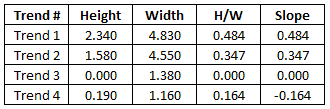
Using Excel's "Size and Position" option to examine the trend lines -- as I said: I'm not an economist, so it's okay -- turns up the following:


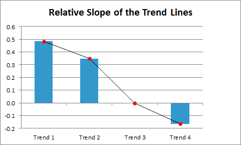
The graph of those slope values shows downward progress:

Graph #2
but that was obvious from the start. Looking at the numbers, though, I can say that the Trend 2 growth rate is only about 72% of the Trend 1 growth rate. And it's all downhill from there. (I didn't check this but I'm pretty sure I'd get the same 72% number if I looked at the values in a more respectable manner.)

So what can we conclude from this? I'm thinkin: Excessive finance doesn't just drag down the economy. It even drags down finance.

There's a lesson in that, I think.

Tuesday, May 28, 2019

Financial Business Interest Received: Corporate and Non-Corporate

This is a stacked graph. The corporate number is shown in red; the non-corporate number (blue) adds a little on top of that. For example in the last year shown (2017) the corporate number is a little under 1,600 billion; the total (corporate plus noncorporate financial business interest received) is a little over 1,600 billion:

Graph #1
Just to get an idea of relative size.

Here's another look: Corporate as a Percent of Total (corporate + non-corporate):

Graph #2
Now that's interesting. The corporate share hung in there at 99% of the total from 1946 to 1994, then dropped rapidly to 91% of the total. What's really odd is that since the Great Recession the drop has stopped and the corporate share is now hanging in there at 91%.

I have no idea what caused the drop or the stop -- I'd guess tax law changes but I have no idea really -- but that's definitely an interesting graph.

Sunday, May 26, 2019

Bears repeating

I'm tedious-ing  my way through the 65 comments on Scott Sumner's 2012 post "Debt surges don’t cause recessions". Here's a good one.

Ryan quoted Sumner:
“Forget about debt and focus on NGDP. It’s NGDP instability that creates problems, not debt surges.”
and remarked:
This is the closest I have ever seen of an economist saying “It’s not the fall that kills you, it’s the sudden stop at the end.”
I laughed my ass off and visited Ryan's Stationary Waves blog. The blog is still active, seven years later. (At this writing, the most recent post is only two days old.) Not all econ, but some interesting stuff.

Sumnr responded to Ryan:
Rayn, I think you misread me. I am saying it’s the fall (in NGDP) that kills you. When you have a debt bubble but no fall in NGDP, you don’t get hurt. Or maybe I misread your comment . . .

Ryan responded in turn:
Prof. Sumner,

It’s like this: If rising debt causes a decrease in NGDP, then rising debt kills you. If NGDP falls for some other reason, then it is that other reason that kills you.
YES! Ryan continues:
Changes in outstanding debt may cause a change in NGDP. Changes in employment may cause a change in NGDP. Changes in the money supply may cause a change in NGDP.

But in all cases, a change in NGDP is the result of some other factor. NGDP does not simply rise and fall in a vacuum, for no discernable reason.
Yeah, I say the same: GDP is a result (of all the things we do to boost GDP). GDP is the consequence of other things. Ryan finishes his thought:
So basically, what I am suggesting is that when you invite us not to “reason from” anything other than NGDP, you are correctly pointing out that it is the sudden stop at the end (NGDP) that kills us. On the other hand, you are moving us away from any analysis of why on Earth we might be plummeting toward the ground. It’s like trying to prevent suicides by analysing splatter marks on the sidewalk.
It's an evaluation of Sumner's thinking that definitely bears repeating.

Sumner replied:
Ryan, You said;

“But in all cases, a change in NGDP is the result of some other factor. NGDP does not simply rise and fall in a vacuum, for no discernable reason.”

The Fed determines NGDP.
Wow.

A comment by Vivian Darkbloom, not in the Ryan/SSumner thread but entirely relevant:
I sometimes think that you have so much invested in [NGDP targeting] (which by your own admission does not constitute *all* of macro) that you reject out of hand any other explanation for economic phenomena.

Friday, May 24, 2019

Palladino on corporate financialization

At the Roosevelt Institute: Corporate Financialization Hurts Jobs and Wages by Lenore Palladino. In the first paragraph Palladino sets the context of the argument. In the second, she defines corporate financialization: "the shift within public companies from making money off of selling goods and services to making a higher proportion of their profits off of financial activity..."

Exactly. Back in the 1990s, I remember being surprised to read that
Since 1990, Ford has made more money from financial services, principally automobile loans to consumers and dealers, than from car- and truck-making operations.

And less surprised, but still shocked to read that
Ford Motor Company has earned more as a banker than as a car builder in five of the last six years.

"[T]he ratio of financial profits out of overall corporate profits has increased dramatically in the last few decades," Palladino says, "and corporations have spent trillions purchasing back their own stock simply to increase their share price since such maneuvers became legal in 1982."


Palladino:
Though the literature is still nascent, several scholars have examined the direct negative impact of corporate financialization on income inequality. One study found that financialization, net of other factors, could account for more than half of the decline in labor’s share of income in the non-financial sector of the economy
Income is generated more within the financial sector these days, and less within the non-financial sector. And, Palladino says, this "financialization of America’s public corporations has contributed just as much to economic inequality as more commonly-cited factors."

As Adam Smith said: The cost of finance, if not paid out of profit, must come out of wages.

Wednesday, May 22, 2019

Compatible concepts

I came upon an old (2010) article by L. Randall Wray: Here's What Prophetic Economist Hyman Minsky Would Say About Today's Crisis, at Business Insider.

It's a good one. Some real zingers, like
Even if the early postwar "Keynesian" economics had little to do with J.M. Keynes at least it had some connection to the world in which we actually live.
The article also contains this observation:
According to Minsky, the economy emerged from WWII with a very robust financial system—hardly any private debt (it had been wiped out in the Great Depression) and lots of safe and liquid federal government debt...
Yeah, exactly. It reminded me of one of the major themes of my econ blogging. What follows is mine of 22 March 2016.


Scattered Thoughts on the Private-to-Public (P2P) Debt Ratio

If I take TCMDO debt -- All Sectors; Debt Securities and Loans; Liability, Level -- and subtract out the Federal portion of that debt, I'm left with something I call the Non-Federal debt. If I take the non-Federal debt and look at it relative to the Federal, I get the red line in this graph:

Graph #1: The Private-to-Public Debt Ratio (red) and the Growth Rate of RGDP (blue)
The red is the same data I looked at twice recently -- but only the FRED part this time, so it starts after World War Two instead of during World War One. Sigh... Also, the data frequency is semiannual instead of quarterly because -- spoiler alert -- I'm going to show a scatterplot, and it turns out that "Quarterly, End of Period" is not the same as "Quarterly". Sigh...

The blue line is inflation-adjusted GDP, the so-called "real" GDP. Percent change from year ago. Semiannual. And (in case you missed it) blue.

The scatterplot caught my eye:

Graph #2: The Scatterplot Version of the Previous Graph with
the Debt Ratio on the X-Axis and the RGDP Growth Rate on the Y-Axis
What caught my eye is this: On the left, the dots fit themselves pretty well to an up-and-down pattern. On the right, the dots fit themselves mostly to a left-and-right pattern. And in the middle, there's just a jumble of dots.

That jumble is mostly between 3¼ and 5¼ on the X-Axis. But if you look, most of the activity of the red line on Graph #1 is between 3.25 and 5.25 on the vertical axis:

Graph #3: Showing the "Activity Zone" of the Red Line
In other words, there is a big cluster of dots there on the one graph because that's mostly where the red line is, on the other.

For the record, the activity zone is too high. If the red line ran mostly below the 3.25 level instead of mostly above it, our economy would be in a lot better shape. But that's neither here nor there, I guess...

You can see that the red line is mostly between the two dotted red lines (in other words, between 3.25 and 5.25 on the X-Axis of Graph #2). Below the lower dotted line are the dots that fit themselves to an up-and-down pattern on the left on Graph #2. Above the upper dotted line are the dots that fit themselves to the mostly left-and-right pattern on the right on that graph.

I want to take Graph #2, the scatterplot, and separate the dots into those three regions: left, right, and middle. Then I want to look at the dots in those three regions and look at the Y-Axis values, the RGDP Growth Rate values. I want to get the average of the RGDP Growth Rates for each of those three regions. It looks to me like the left will show a high average rate of growth, the right will show a low average rate, and the middle will show in the middle. But we don't have to guess.

//

Out with the dogs, I was thinking about the scatterplot dot behavior. On the left, when the P2P debt ratio is low, we see RGDP growth following the expected, business-cycle-like behavior: up and down, up and down, up and down, and so forth. On the right, where the P2P ratio is high, we see RGDP growth behaving unexpectedly. And large changes in the debt ratio have relatively little effect on RGDP growth. Moreover, the highs and the lows of RGDP growth are lower on the right (when P2P is high) than on the left (when P2P is low).

I'm thinking these differing behaviors of RGDP growth may show up in the Phillips curve. When P2P is low, the curve behaves as Bill Phillips described. When P2P is high, it does not. Hey -- it's just a thought. I can't prove it yet. I haven't even looked into it yet. I'm just sayin, there is more to this P2P story than anyone realizes.

//

I downloaded the data from the scatterplot graph and eliminated rows before the second half of 1951, where some values were missing. I ended up with data from 1951 H2 ("H" for half, as opposed to "Q" for quarter; that's FRED notation) to 2015 H1. I got 128 rows of data.

Of the 128 items, 30 show P2P ratios less than 3.25. These have an average growth rate of 4.06 percent.

Of the 128 items, 19 show P2P ratios above 5.25. These have an average growth rate of 2.01 percent.

The balance, the 79 items with a P2P from 3.25 to 5.25 (inclusive) have an average growth rate of 3.05 percent.

So yes, as we might have expected, a low private-to-public debt ratio is associated with a high rate of RGDP growth. And a high P2P debt ratio is associated with a low rate of RGDP growth.

What else is new.

Friday, May 17, 2019

Capitalism and irony

Private debt has long been a problem. The textbook I used when I took Econ 101 (McConnell Economics, 1975) says
Although the size and growth of public debt are looked upon with awe and alarm, private debt has grown much faster. Private and public debt were of about equal size in 1947. But private debt has grown much faster and is now over three times as large -- about $1,350 billion, compared with $470 billion -- as the public debt.
And that's from the 1975 edition. McConnell adds:
If you insist upon worrying about debt, you will do well to concern yourself with private rather than public indebtedness.


In the January/February 1993 issue of the Federal Reserve Bank of St. Louis Review, Keith M. Carlson's article on debt, the opening sentence:
Early last year, a survey of the 50 Blue Chip forecasters indicated that the most important factor influencing the outlook for near-term economic growth in the United States was the debt burden carried by governments, households and businesses.
Okay, maybe not only private debt. But not only public debt, either. And Carlson's article is from the early 1990s.


During and immediately after the Global Financial Crisis and Great Recession, concern about private debt was sprouting like green shoots:
  • "The global economy cannot return to health until households have worked off at least part of their excess debt. So far they have made little progress." -- The Secret Economist, 8 May 2009
  • "Thirty years of surging growth in private sector leverage, in the balance sheets of the financial sector and in notional profitability of the financial sector in the US and other high-income countries has ended in calamity." -- Martin Wolf, 23 December 2009
  • "My operating assumption is that the main current problem with the US economy is Too Much Debt in the private sector, and that all will not be well until both the household and financial sectors have deleveraged back down at least to something like the levels of the 1990s (at a rough guess). On the pace so far, it appears likely that that will take at least a decade." -- Stuart Staniford, 3 July 2010
  • "I think it’s fair to say that a majority of economists believe that excessive private debt played a key role in getting us into this economic mess, and is playing a key role in preventing us from getting out." -- Paul Krugman, 25 September 2010


As recently as 2016, Richard Vague was saying
"Both private debt and government debt matter, and both will be discussed here, but of these two, it is private debt that has the larger and more direct impact on economic outcomes... When too high, private debt becomes a drag on economic growth."
But at long last, it seems capitalism has found a solution to the problem of private debt. At BNY Mellon for example we read that
The post-crisis era has seen private debt become an established asset class in its own right, matching the needs of yield-seeking institutional investors and companies looking for capital to grow.
"Private debt" is no longer a problem. They redefined it. Think I'm kidding? See for yourself:


So it goes.

Thursday, May 16, 2019

Debt overload by design

From the February 1992 testimony of Alan Greenspan to Congress:
To support these favorable outcomes for economic activity and inflation, the Committee reaffirmed the ranges for M2, M3, and debt that it had selected on a tentative basis last July--that is, 2-1/2 to 6-1/2 percent for M2, 1 to 5 percent for M3, and 4-1/2 to 8-1/2 percent for debt, measured on a fourth-quarter-to-fourth-quarter basis. These are the same as the ranges used for 1991.
Suppose they hit dead-center in the middle of each target range. Then M2 money would have grown 4.5%, M3 would have grown 3%, and debt would have grown 6.5%.

Debt grows faster than money by design. And, apparently, this has been the design since 1970 or before.

So if the question is "Why do we have all this debt?" the answer is "Policy".