 |
| Graph #1 |
I added trend lines by eye, in Excel. As I am not an economist it is perfectly okay to do that.
Were I to put dates on it, 'twould be as follows:
- Trend 1: Q4 1951 - Q4 1974
- Trend 2: Q4 1976 - Q4 2002
- Trend 3: Q4 2002 - Q2 2009
- Trend 4: Q2 2011 - Q4 2018
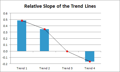
Using Excel's "Size and Position" option to examine the trend lines -- as I said: I'm not an economist, so it's okay -- turns up the following:
The graph of those slope values shows downward progress:
 |
| Graph #2 |
So what can we conclude from this? I'm thinkin: Excessive finance doesn't just drag down the economy. It even drags down finance.
There's a lesson in that, I think.


1 comment:
Also I would suggest (i.e., insist) that finance became by definition "excessive" as of Q4 1974 or (probably) before.
If we wanted to put limits on the size of finance or the degree of inequality, for example, we'd want to return to values that existed in 1974 or before.
Before: Because by 1974 it was already too late.
Post a Comment