However, their conclusion is "the question remains open."
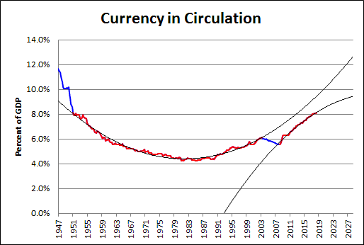
I'm confused by their post, so I'll leave it alone. But the graph they show is for currency in circulation. I've got monetarist blood, so I looked at it. Then I looked at currency in circulation relative to GDP, because, you know, context.
It's a banana, currency relative to GDP, low in the middle and high on the ends. The graph reminds me of a Scott Sumner post from two or three years back. Sumner said Currency-to-GDP is the inverse of velocity. He said interest rates move with velocity. And yeah, I'm leaving that alone too.
Here is the banana:
 |
| Graph #1: Currency in Circulation relative to GDP |
I'm lookin at currency in circulation relative to GDP, and I see something no one else seems to notice. Or maybe it's that no one else thinks it is worth bothering with. But it sure looks important to me: Between the years 2000 and 2010, there is an interruption in the banana.
I brought the data into Excel and put a trend line on it. Two trend lines, actually: second order polynomials, both of them.
 |
| Graph #2 |
The blue line shows currency in circulation relative to GDP, just like on the first graph. The red is identical, and hides most of the blue. But there are two red segments here, each indicating the data used to generate one of the trend lines.
The long red (1951Q1-2003Q2) creates the basic banana shape that is so obvious on the graph. Then, after the interruption (2003Q2-2008Q2), the banana-path resumes, as shown by the short red (2008Q2-2018Q3).
But there is a problem with this simplification. Short red is low: lower than the trend of the long red banana. It also appears that short red is curving the wrong way; but I will say no to this, because short red is going the right way to become a flatline. I like flatline ratios: they suggest the approach of economic stability. Just one problem, then: Short red is low.
One could argue that the short red, running low, is a cause or a consequence, or both, of the economic sluggishness of the past decade. I would make that argument: Slow economic growth and slow growth of the quantity of money go hand in hand. Definitely.

Here is a detail of the "fault line" in the banana:
 |
| Graph #3: Currency Trends Detail |


3 comments:
Come to think of it, it makes sense that "Currency-to-GDP is the inverse of velocity". To my way of thinking you can increase velocity by spending your money faster. But you can't spend it faster than you receive it unless you use credit. So using credit is a way to increase velocity.
And then if we say that currency is not credit and all other kinds of money are credit, well then the spending of something other than currency on GDP makes the GDP-to-currency ratio increase and presto, higher velocity.
Myself, I prefer to think of M1 rather than just currency as the monetary floor from which velocity is figured. But that's a minor detail.
From the post: "Sumner said ... interest rates move with velocity."
Yeah, okay. Greater velocity, in my view, means more use of credit per dollar of narrow money, say, currency. More "stretching" of narrow dollars. More credit in use. Greater demand for money as a medium of exchange (not for "holding"). An increase in demand relative to supply should push the price up, and a decrease should push the price down. Therefore, velocity and interest rates would move together.
Remind me to look into this.
PS: So I'm saying that borrowing affects velocity, which affects interest rates.
Exactly the opposite, Sumner's post title is "Yes, interest rates really do impact the demand for money"
He has interest rates as cause; I have interest rates as effect.
Probably both things are true.
Post a Comment