Thursday, November 30, 2023

Balance of Trade

Three graphs today.

Balance of trade seems a simple concept. If we buy more than we sell in international markets, we have a trade deficit. If we sell more than we buy we have a surplus. But maybe I have that all wrong, because I can never find useful graphs on the balance of trade. I'm going with what I found yesterday.

I found these three one after the other, just as I am showing them here. First, for the years 1866 to 1969, the excess of total exports over general imports during that century:

Graph #1

Here, the US shows a surplus of exports over imports. I see the growth of trade, as tiny jiggies get bigger in the 1870s and bigger yet in the 1890s. There is a significant increase during World War One, then a return to trend growth in the 1920s. The Depression and Smoot-Hawley stand out as a low spot in the 1930s. Then there is a massive increase during the Second World War. After that war, the massiveness continues (in hundreds of millions of dollars), with perhaps a hint of decline making an appearance during the 1960s.

The second graph shows total trade of goods for the United States, for 1960 to 2013. This dataset was "discontinued" in 2013:

Graph #2

This second graph appears to start out near zero, like the first one. Not so. Hovering the mouse over the graph at FRED shows the trade surplus in the early years runs in the neighborhood of a billion or two -- until 1967:

  • 1967 Q1: 1.024 billion
  • 1967 Q2: 1.380 billion
  • 1967 Q3: 0.774 billion
  • 1967 Q4: 0.622 billion
  • 1968 Q1: 0.256 billion

And it is all downhill from there -- with jiggies, of course (1968 Q2 = 0.442 billion; 1968 Q3 = negative 0.161 billion, a deficit). Unfortunately, this shift from surplus to deficit occurred only a few years before 1971, when Nixon "closed the gold window". People today all too often say that closing the gold window caused our trade deficits. No. The "gold window" thing was a canary in the coal mine. It was a warning of trouble to come.


The third graph shows the trade balance for goods and services, from 1992 to the latest data (September 2023):

Graph #3

This graph also appears to start near zero, but the first value shown is a two billion dollar trade deficit.


The data on the first graph is mostly above zero; on the second graph, mostly below; on the third graph, everything is below zero. So it goes.

The vertical scale of the first graph shows millions of dollars; the other two show billions. But the steps in vertical scale #2 are 40-billion-dollar steps; in #3 they are half as big. So I guess it's not time to "discontinue" the Graph #3 dataset. Not yet.

Friday, November 24, 2023

Household Debt since 1980

If we take Household Debt Service Payments as a Percent of Disposable Personal Income, multiply by Disposable Personal Income, and divide by 100 we get Household Debt Service Payments in billions.

By the way, I'm working in annual data, here. Default units, unless noted. And billions, unless noted.

If we take Household Debt Service Payments (in billions) and subtract Monetary interest paid: Households, we get Principle Repaid on Household Debt.

If we take Principle Repaid on Household Debt, divide by Households and Nonprofit Organizations; Debt Securities and Loans; Liability, Level, multiply by 100, and ignore Nonprofit Organizations, we get Principle Repaid on Household Debt as a Percent of Household Debt Outstanding.

Make that

divide by (Households and Nonprofit Organizations; Debt Securities and Loans; Liability, Level (in billions) less Households and Nonprofit Organizations; Debt Securities and Loans; Liability, Level (in "Change, Billions"), multiply by 100, and ignore Nonprofit Organizations

By this adjustment the calculation shows the interest paid each year as a percent of the outstanding debt at the start of the year for household debt.

That leaves us (as of 2021-22) with principle repaid on household debt around 6% of household debt outstanding. That's near the high end of the range of values since 1980.

The average for the 1980-2022 period is 5.123%, say five percent. Principle repayment on average runs about 5% of outstanding household debt.

For comparison, monetary interest paid on household debt works out to 7.71% for the 1980-2022 period. It reached a bottom in 2021 at 4.40%, and rose in 2022 to 4.49%

For the last couple of years, with principle repayment around 6% of outstanding debt and interest cost near 4.5%, the debt service total is running about 10.5% of debt owed.

This graph shows household debt service as a percent of DPI (blue) and as a percent of household debt outstanding at the start of each year.

Tuesday, November 21, 2023

FYI: Population

FYI: Writing about this stuff helps me remember it -- and helps me find it again later, when I can't remember!

 
They have their reasons, no doubt, but economists use a couple different measures of population.

At FRED, this Real gross domestic product per capita page links to Table 7.1, which identifies FRED series B230RC0Q173SBEA as the relevant population measure for the per capita calculation. FRED calls that measure "Population". But when I search FRED for population, I get 107,803 results. So I call it "B23". I checked the arithmetic. Yes, that's the right population data for per capita GDP.

So we know the population measure for per capita output. But economists use a different population measure to figure labor force size. When they figure the Labor Force Participation Rate, they divide the Civilian Labor Force Level by a measure called Population Level. I checked the arithmetic here, too. The numbers work out.

So using two different measures of population is standard practice. The "B23" measure, FRED's "Population", is now approaching 340 million people. I did a quick check; these three other population measures offer numbers in the same neighborhood as the B23, but vary in details like data frequency and the start- and end-dates of the data:

FRED's "Population Level" dataset is approaching 270 million people, far short of 340 million. According to ALFRED, until 2019 this Population Level dataset was called the "Civilian Noninstitutional Population". And according to FRED's notes on the series,

Civilian noninstitutional population is defined as persons 16 years of age and older residing in the 50 states and the District of Columbia, who are not inmates of institutions (e.g., penal and mental facilities, homes for the aged), and who are not on active duty in the Armed Forces.

The "Population Level" dataset leaves out a lot of people that the "B23" dataset includes.


By the way: To figure the unemployment rate, they count up the number of people unemployed, and divide this by a third population measure: the Civilian Labor Force Level. I think of that measure as a subset of the population, and it is. But it is also a useful measure of population. This measure is presently approaching a count of 170 million -- half the level of the B23 series, at 340.

Again, I checked the arithmetic.


This I find interesting: Economists talk about the Labor Force Participation Rate quite often. The participation rate is the number of people who have a job or want one, as a percent of the "Population Level", the small population measure, people who could have a job or want one.

The story is that the participation rate increased all through the 1960s and '70s and '80s because of the baby boom after World War Two, and because of the increasing entry of women into the workforce.

That story continues: The participation rate continued to increase in the 1990s, but more slowly. Then after 2000, the participation rate started to come down: People who started working in the 1960s were starting to retire in the 2000s. Then, after the financial disruption of 2008, participation started coming down even faster. This graph shows that history:

Graph #1: The Labor Force Participation Rate

Graph #1 is based on population after excluding people under 16, and people who are not US residents, and people who are inmates of institutions, and people on active duty in the armed forces. If instead we use a more inclusive measure of population, the graph will look different. For the next graph I use the bigger measure, my B23, the one FRED calls "Population". Now the "participation rate" looks like this:

Graph #2: The Keep-This-In-Mind Participation Rate

By this measure, the participation rate is well below 40% in 1962. It rises rapidly from the early 1960s to 1990, just as the official measure does. But that's it. It reaches 50% and stays there. It doesn't fall after 2000, as the official measure does.

The Graph #2 picture of the participation rate looks like it has reached an upper limit, a ceiling of some kind. Oh, yes, it came down two percentage points after the financial disruption of 2008. But it leveled off in 2014 and started rising the following year. By the end of 2019 it was almost back to 50%. And yes, with covid in 2020 the participation rate came down a couple points once again. But after the Covid Shutdown Recession, the rate went up again, and rapidly this time. By the third quarter of 2023 it had reached 49.96%. It will almost certainly be back to 50% by the time the end-of-year data is in.

Is there an upper limit to labor force participation? If we get a couple of years without a pandemic and without a financial crisis, this non-standard measure of the participation rate might go above 50% and keep on going up. Or maybe it will sit at the 50% level until the economy improves or, god help us, until it gets worse again. If we can go two years without some kind of global emergency, we will see if the participation rate can go over 50%. 

Here's a thought: Maybe the Labor Force Participation Rate increases as the economy goes bad, because more people have more need for money at such times. If that is true, then both graphs above would indicate that the economy was going bad from the 1960s to 1990. I dunno if that's true -- and the two graphs disagree after 1990, so maybe not -- but going bad since the 1960s is a bedrock principle of my thoughts on our long-term economic decline.


PS: I'm not saying there is anything wrong with the official measure of the labor force participation rate. I just wanted to see how it would look if we used a measure of population that matches how I think of the US population: all of us.

Thursday, November 16, 2023

Still saying the same (after almost 14 years)

I re-post below mine of 20 February 2010, from my old blog, revised only slightly.

I should say that when I use the word "credit" you should understand me to mean "borrowed money". I use the word "credit" to distinguish borrowed money from earned money, because borrowed money comes with debt and the cost of interest. Earned money does not.


We use credit for money

I say debt is caused not by excessive spending, but by the use of credit. You think that's just silly. You think excessive spending causes the use of credit.

I agree: That can happen sometimes.

You: It happens all the time. It is why the federal debt is so big.

(I do not point out that if the Prodigal Son wastes his whole inheritance but not a penny more, he has spent excessively without using credit. Nor do I point out that the non-federal debt is bigger than the federal.)

Me: No. Excessive spending is just one cause of credit-use. There are other causes.

You: That cannot be. Excessive spending -- spending in excess of income -- always results in the use of credit. There is no other cause.

(I do not point out that if one saves 75% of one's income, and spends a frugal 30% of income by borrowing 5%, this also results in the use of credit.)

Me: Okay. But what you are telling me is: IF A > B THEN (B-A) < 0. That is a mathematical definition, and it is certainly true. But it is not a cause. The mathematical definition is true always -- even when we do not have a deficit. Why do we have deficits?

You: Well, the reason is corruption... the special interests... greed... liberal thinking... forgetting conservative principles. The reason is whatever causes spending to be more than government brings in.

Me: Oh, you are right about that: The reason is whatever causes spending to be more than government brings in. Yes, indeed. It may be that spending is excessive. Or it may be that spending is not excessive but is "greater than B" for other reasons. We will never solve these budget imbalances until we discover the real cause of excessive credit use, and fix that specific problem.

And what is the real cause of excessive credit use? The cause is economic policy:

  •  It is policy to minimize spending-money in the economy (to fight inflation).

  •  It is policy to encourage spending (to promote economic growth).

  •  It is policy to encourage the use of credit (as a source of spendable funds).

  •  It is policy to encourage accumulation of debt (by unintended consequence).


Why do we have all this debt? Because we use all that credit. It's policy.

Monday, November 13, 2023

Oatmilk Tea

Edit 17 Nov 2023 (Renamed); old name: "Not Economics".  

No econ today -- but what would we talk about anyway? Government shutdown, again?


When I was 15 or so, some 60 years back, I spent the summer on my uncle's farm. He had a horse -- Sally, her name was. He had a wooden bin in the barn where he kept oats for the horse. First time I had to feed Sally I lifted the lid of the bin and -- WOW! It smelled so good!

So that was my first impression of oats. It's still with me today.


I was a coffee drinker my whole life, until recently coffee started messing up my stomach. Looked for an alternative but kept going back to coffee because nothing else tasted right. But finally, my stomach made me quit.

Went with tea for a while, switching, peppermint tea and green tea and Celestial Seasonings Cinnamon Apple Spice and back. Eventually I stopped longing for the taste of coffee, and settled on green tea. It felt like I was home again then, for a while. But I must have been making it too strong, and my stomach started acting up again. So I stopped cold turkey.

I wanted to drink milk. But milk is cold, and I don't especially like the taste. And then we got oat milk. Planet Oat Oatmilk, the "extra creamy original". This stuff tastes good. I never thought I would say such a thing. Before long I was making oatmilk tea, hot water with a little oatmilk. So now I think about Sally and Uncle Cecil and his oats bin almost every day. And my stomach, so far, is okay.

Time for another cup.

Sunday, November 12, 2023

Intrinsic value


"But what was always true in the past, and will remain so in the future, is that the output of a free market economy and the notion of wealth creation will reflect the value preferences of people. Indeed, the very concept of wealth has no meaning other than as a reflection of human value preferences. There is no intrinsic value in wheat, a machine, or a software program. It is only as these products satisfy human needs currently, or are perceived to be able do so in the future, that they are valued."


Again, Greenspan says:

"There is no intrinsic value in wheat, a machine, or a software program. It is only as these products satisfy human needs ... that they are valued."


Wheat, machinery, software, gold, and irredeemable paper money. No intrinsic value. Value is in the eye of the beholder.

Saturday, November 11, 2023

Federal spending that counts in GDP

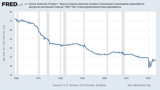
Federal spending that counts in GDP, as a percent of Total federal spending:

Graph #1: Federal Spending that Counts in GDP, as a Percent of Total Federal Spending

70% in 1960, 26% now. Check my work. First time I looked at this.


Table 1.1.10 shows "Percentage Shares of Gross Domestic Product".

Thursday, November 9, 2023

Shares in cost since 1987

Labor's share:

At FRED: https://fred.stlouisfed.org/series/MPU4910141

Capital's share:

At FRED: https://fred.stlouisfed.org/series/MPU4910131

"Share in cost" is at least approximately equal to Share of income:

At FRED: https://fred.stlouisfed.org/graph/?g=1b9SO

Tuesday, November 7, 2023

A difference often overlooked


"It is useful to distinguish between supply and demand causes of rising inflation, because supply-driven (or cost-push) inflation is associated with a decline in output, while demand-driven (or demand-pull) inflation is associated with a rise in output."
from "Inflation in the U.S. Economy: Causes and Policy Options", Congressional Research Service

Wikipedia: "The Congressional Research Service (CRS) is a public policy research institute of the United States Congress. Operating within the Library of Congress, it works primarily and directly for members of Congress and their committees and staff on a confidential, nonpartisan basis. CRS is sometimes known as Congress' think tank due to its broad mandate of providing research and analysis on all matters relevant to national policymaking."


See also:
"The most important difference between cost-push and demand-pull inflation"

Monday, November 6, 2023

The wages of finance

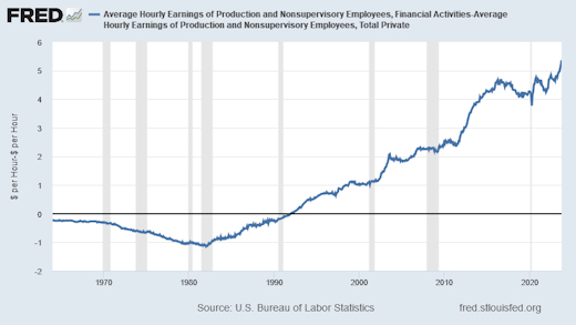
Average Hourly Earnings of Production and Nonsupervisory Employees,
Financial Activities versus the whole Private Sector

The Difference in Average Hourly Earnings:

Graph #1: Difference between average wages in finance and the private sector overall
at the grunt level

I subtracted the "Total Private" average wage from the "Financial Activities" average wage to see the difference. The Financial Activities wage was less than the Total Private wage until 1992. Since 1992, the Financial Activities wage has been the bigger number.

In the 1960s the average hourly wage in finance was 25 to 30 cents less than the private sector average.

In 1979, finance was a dollar less.

In January 1982, finance was $1.15 less. That was the low point for finance.

In December 1991, the financial wage was two cents less than the overall average.

In February 1992 the financial wage was two cents more than the private sector number.

In July 1998 finance was a dollar more than the private sector average.

In August 2003 finance was $2.08 more.

In May 2012, $3.01 more.

In May 2014, $4.06 more.

And in August 2023, the average grunt-level financial wage was $5.07 more than the average for all the grunts in the private sector.


But if you ask me, none of these numbers matter. What matters is the unrelenting uptrend visible in every aspect of finance.

Sunday, November 5, 2023

Three from Paul Samuelson

"... there is only one valid reality in a given economic situation, however hard it may be to recognize and isolate it. There is not one theory of economics for Republicans and one for Democrats, not one for workers and one for employers." 


"Individual virtues can be restored to being social virtues, provided we are able to restore a healthy environment of adequate aggregate demand for the product of business."


"... the political health of a democracy is tied up in a crucial way with the successful maintenance of stable high employment and living opportunities." 


From Chapter 1 of Samuelson's Economics, fourth edition (1958).

Saturday, November 4, 2023

Thursday, November 2, 2023

This morning the Democrats have lost the November 2024 election

The news this morning tells of big-city mayors getting together to beg the federal government for money, because of costs related to the immigrants bussed out of Texas.

Government spending is NOT the cause of our continuing economic troubles, but PEOPLE THINK IT IS THE CAUSE OF THOSE TROUBLES. And the Democrats' questionable immigration policies now come down to a matter of government spending.

The only thing the Republicans need to say now is "I told you so" and the 2024 presidential election is theirs.