Saturday, October 30, 2021

"Fed's inflation measure holds at record annual pace for fourth straight month"

A record annual pace? Maybe I'm missing something here, but inflation now is nowhere close to the double-digit inflation of the 1970s.


I'm not finding a date for the article, but in the HTML it says

<meta data-n-head="ssr" data-hid="dc.date" name="dc.date" content="2021-10-29">

so 29 October, the same day I'm making these notes. Okay, yeah, and the "Updated" field on the FRED Graph page says "7:43 AM CDT" -- the same day, or  else there would be a date there. 

Just checking.


The article's opening statement:

The core personal consumption expenditures index, the Federal Reserve’s preferred inflation measure, continued to climb at the fastest annual pace on record in September.

The fastest annual pace on record? I don't think so.

Looking for info on "the Federal Reserve’s preferred inflation measure", I come across this item from Fox Business dated August 27, 2021; presumably the July 2021 inflation:


Inflation "soars by most in 30 years". That I can believe. I already looked at this graph, showing "Percent Change from Year Ago" inflation:

Graph #1 (Click the graph to see it bigger)

At the extreme right of the graph, inflation shoots up to 3.6 percent. Then if you look 30 years earlier, around 1990 (near the middle of the graph), there's a label pointing to March 1991 when inflation was 3.65 percent. Inflation now is the highest since then, but not a record.

I still don't know what they're talking about when they say inflation is presently at "a record annual pace". What record? If you look back a little farther in time on the graph you can see inflation peaking in 1975 and again in 1981, both near 10% annual. Looks to me like the January 1975 inflation rate is the record.


I don't find anything telling me which one of FRED's 816,000 datasets is "the Federal Reserve’s preferred inflation measure". I'm on my own here. The Fox Business article mentions the "core personal consumption expenditures index". (That's the PCE index, not the CPI.)

They also say "Core PCE ... excludes food and energy prices". (I think "core" is a keyword the Fed uses to mean "excludes food and energy prices".)

I looked up core pce at FRED and went with the first one they turned up: Personal Consumption Expenditures Excluding Food and Energy (Chain-Type Price Index). The numbers are right. On graph #2, in the upper-left of the graph area an information box shows 3.5% inflation for May and 3.6% for June, July, August, and September.

Graph #2 (click to enlarge)

The dots are months. The rightmost dot is September. Fox Business gives the same numbers FRED gives, 3.6% for the last four months:

Core PCE, which excludes food and energy prices, last month rose 3.6% year over year, according to the Bureau of Economic Analysis. Core prices have accelerated by that amount for four straight months.

They omit May. But the other numbers match. We're looking at the same graph Fox Biz is looking at.

They make the inflation sound pretty nasty, don't they? "Core prices have accelerated by that amount for four straight months." The Sunday morning talk shows that I mentioned on the 20th, in Inflation show-and-tell, also made the inflation sound pretty nasty.

I'm not too concerned about the inflation we've been getting. I'm more concerned about the inflation the media may be creating out of ignorance. The inflation numbers we're looking at measure "percent change from year ago". Inflation didn't go up 3.6% between August and September. It went up 3.6% between September of 2020 and September of 2021. Inflation's not as bad as they make it sound.

This next graph shows both the from-year-ago change and the from-last-month change:

Graph #3 (click to enlarge)

The red line shows percent change from one month ago; the blue line shows percent change from 12 months ago. So you would expect the blue line to be higher, and sure enough it is.

It's hard to see without making the graph bigger, but the big increase in the blue line runs from the low in February 2021, to the high in April. After that it runs almost flat, with the 3.5% in May and then June thru September at 3.6%.

You can see a similar increase in the red change-from-one-month-ago line: There's a low in February 2021 and a high in April. After April, the month-to-month numbers actually go down. Since May, the price increases have been getting smaller. That's why I say I'm not too concerned about the inflation we've been getting.

As I said before, if you get one month of high inflation, that high number stays in the "percent change from year ago" calculation for a whole year. It makes inflation look persistent when it is not. That's why it's important to look at the red line, the month-to-month numbers.

Graph #4 (click to enlarge)

The red line on Graph #3 is shown in blue on #4. The from-year-ago graph is gone.

Graph #4 shows a lot more months than #3. Don't let that confuse you. What I want you to see is the low of April 2020 and the high of April 2021.

When they figured from-year-ago inflation for March 2021, the low of April 2020 was still in the calculation. But when they figured the from-year-ago for April 2021, the old data (April 2020) came out of the calculation. It was replaced by the monthly high of April 2021. 

Replacing the low monthly number with a high one -- burning the candle at both ends, so to speak -- made the from-year-ago inflation increase look unusually big and threatening. That's why on Graph #3 the March-to-April 2021 increase is disproportionately bigger in the blue line than in the red. That's why the gap between red and blue opens up so much with the April number.

The April 2021 increase was big, but not as big as the from-year-ago number makes it seem. It seems big because the unusual low came out of the calculation. This kind of figuring is the reason Graph #3 shows the blue line stubbornly high, even though the red line is already back down in the normal range of inflation. And this kind of figuring will happen again next month and the month after.

About halfway between April 2020 and April 2021 on Graph #4, the blue line shows two months in a row at the zero level. No inflation. Those two months are October and November of 2020. The October 2021 from-year-ago inflation will have this month of no inflation dropping out of the calculation. Any inflation will be high by comparison, making the from-year-ago number look big.

And then a month later, the zero inflation of November 2020 will come out of the November 2021 report. This mathematical chicanery will again make the from-year-ago inflation number seem worrisome.

There'll be inflation, but it won't be as bad as the news will make it sound. To get a feel for what's happening with prices, pay a lot of attention to the month-to-month numbers, and not so much to the from-year-ago numbers.


One more graph to look at: index values. The index values are like the price level, as opposed to the "change-in" numbers we've been looking at.

On Graph #5 the line goes up just as prices go up.

Graph #5 (click to enlarge)

The flatter the line, the less the rise of prices. The steeper the line, the more the rise of prices.

On this graph we can see prices going up more quickly after February 2021 than before. And after May 2021 we can see the line flattening and a slowing of inflation. That's what you need to know. You can see it here, and you can see it in the red line on Graph #3.

Friday, October 29, 2021

"Taxes must be levied" to pay interest on the federal debt

Krugman, "Nobody Understands Debt" (1 Jan 2012):

Now, the fact that federal debt isn’t at all like a mortgage on America’s future doesn’t mean that the debt is harmless. Taxes must be levied to pay the interest ...


Peterson, "What is the Primary Deficit?" (18 Feb 2021):

To evaluate the government’s fiscal situation, analysts typically reference the total deficit — the gap between total federal spending and revenues. However, another measurement — the primary deficit — focuses on the difference between government revenues and spending, excluding interest payments...

Even without accounting for interest payments, federal spending has frequently outpaced revenues — causing the government to run primary deficits. Over the past 50 years, annual federal revenues have equaled or exceeded non-interest expenditures only 13 times.

"Taxes must be levied," Krugman says, "to pay the interest".

Based on Peterson's information, three-quarters of the time the federal budget is in deficit even before they get to paying the interest on the debt. You could turn that fact around and say that three quarters of the time, they just the borrow money to pay interest on the debt. Three quarters of the time, taxpayers don't foot the bill.

The statement "Taxes must be levied to pay the interest" is true only 25% of the time, or 26% if you're fussy. It's a weak argument, a bullshit argument, to say taxes  must be levied to pay interest on the federal debt. I wouldn't make such an argument.


For the record, this is the first time I ever found something from Peter G Peterson the least bit useful.

Wednesday, October 27, 2021

How economists think of debt

Benjamin Friedman, "Debt and Economic Activity in the United States", 1981. Yeah, I haven't yet set this 20-page paper aside.

Footnote 3:

The debt ratio peak during 1918-78 occurred in 1933, the trough year of the depression.

So how come, in 1981, we could look at debt as far back as 1918 but now, today, at FRED, data on US debt goes back only to the latter 1940s?

Why? Because data is available, but definitions have changed and the old-definition numbers don't match the new-definition numbers. That's the story, anyway.

Really? I'd rather see a graph that goes back to 1918 and needs two lines to show the debt, two lines that run close but don't match, rather than a graph with only one line where debt only goes back to 1946. FRED is justifiably proud of the 816,000 US and international time series they offer. But can't they add one series for older debt? What, is 816,001 an unlucky number?


"In addition," Friedman adds in the footnote -- and here is where we discover how an economist sees debt:

much of the household and business debt nominally outstanding during the depression was of questionable value.

The debt was "of questionable value".

Assets have value. Friedman sees debt as an asset: a source of income to the lender. Economists don't think of debt as a cost. This is the reason "nobody saw it coming" -- it being the financial crisis of 2008.

The debt was of questionable "value" because it had become unpayable. The moment it becomes unpayable is the moment the crisis arises. But no one sees a problem until they're not receiving the payments, because no one is looking at debt as a liability. This is willful blindness. 

Oh, they'll say over and over again that one person's liability is another person's asset, and that it all nets out to zero and debt is not a problem. But as long as the asset earnings arrive on schedule, no one stops to consider the liability side. And even when they do stop, as in 2007-08 when earnings became worrisome, it was not the liabilities that got attention, but the "toxic assets".

If they were considering debt as a cost, they could have seen the problem developing since the 1960s, just as Minsky did.

Monday, October 25, 2021

Supply-side economics

When no one is a consumer, everyone is a producer and no one buys anything except in the expectation of selling it for a profit.

This is supply-side economics, and it operates on the same principle as the chain letter: "The 'chain' is an exponentially growing pyramid (a tree graph) that cannot be sustained indefinitely."

Friday, October 22, 2021

Inflation: FRED Graph / Excel Graph Overlay

The Excel plot, using fake data at a constant inflation rate, matches surprisingly well the FRED data series CPILFESL:

My fake data  for the monthly inflation (thick blue line) was a constant 0.165% per month rate of inflation; this number gives a "percent change from year ago" of 2%. I went for 2% because that number was the Fed's inflation target.

Interruptions to the constant 0.165% rate occur ONLY at the low during the recession and at the high that occurred a year later. This data gives the thick blue line, the percent change from the month before. That same data also generates a price index series, which I used to figure the percent change from year ago inflation.

It amazes me that so little is needed to essentially duplicate the US inflation history of the past couple years: two interruptions to the target rate, and the "from year ago" calculation. Nothing else.


Month 7 is January 2019
Month 51 is September 2022

The red and blue lines with dots are from the FRED graph
The recession bar (Feb 2020 to Apr 2020) is from the FRED graph

The thick orange and blue lines were generated by Excel for a constant monthly inflation rate interrupted only at months 21-23 and 34-36 where the FRED data values were used.

The plot window from the FRED graph was used as a background image for the Excel plot window.


This post is third in a series on inflation.

Thursday, October 21, 2021

INFLATION FOLLOW-UP

Usually I let my writing sit a day before I post it, so I have time to check it over, and to allow time for OH NO, THAT'S TOTALLY WRONG to pop into my head -- some little thing that I forgot, maybe, that makes all the difference

Didn't do that with yesterday's "Inflation show-and-tell" because I was so happy with it.

But when I went to bed I couldn't sleep. I was going over the numbers in my head and nothing was working out as I described it in the post. After a while I got up and took the post off-line so I could sleep.

Reading the thing over this morning I come to this:

And now that inflation has gone high, I think we can expect it to stay high for about a year, even if price increases drop back to what they were in 2020. Why? Because as one new monthly low is added in to the change-from-year-ago, the oldest monthly low drops out of the calculation. Once a monthly value comes into the calculation, it stays in the calculation for a year.

I don't like saying stuff like that without checking it. Things that are obvious in the daytime keep me awake at night. "Obvious" sometimes goes down with the sun.

So I looked over yesterday's graphs and decided to make a new graph showing just one inflation dataset instead of two, and to show "monthly" and "from year ago" on one graph instead of two. So I tossed aside the inflation measure I usually use, the "All Items" measure, shown in red on yesterday's graphs.

That leaves me with the one I don't prefer, the "All Items Less Food and Energy" measure. If that keeps me awake tonight, maybe I'll write about it tomorrow.


Graph #1: Monthly (red) and From Year Ago (blue) Inflation Rates

The red runs low because it shows the change in prices from a month ago. The blue runs higher because it shows the change in prices from a year ago.

After January 2021, the blue line goes up a lot while the red goes up much less. Doesn't that bother you just a little? Bothers me.

The red line peaks in April at about 1%. That would be 12% for the year, or more. That's unacceptable. But one month before that peak, the number was in the normal range, or close to it. And for six or seven months before that, the numbers were low; before that, only one high one; and before that a month of low inflation and three months below zero -- three months of falling prices. This takes us back to March 2020. Almost all the numbers were low, and the one high (July 2020) was more or less counterbalanced by the low of April 2020.

So how did blue inflation skyrocket in April 2021? Yes, May and June also show high inflation rates. But May and June didn't happen yet when they figured the April numbers.


I want to see how the changes are related: how a change in the monthly number influences the course of the "from year ago" inflation rate. To make it easier to see the effects of a change, I made some dummy data that always has the same monthly inflation rate.

It turns out that a unchanging inflation rate of 0.165% per month results in 2% annual inflation. I went with that because the 2% annual rate was the "target" rate for a long time. Still is, maybe.

The colors don't match the FRED graph, but here's the graph of unchanging inflation:

Graph #2: Dummy Data showing a Constant Monthly Inflation Rate

The numbers across the bottom represent months. The monthly inflation numbers are shown in blue, and the from-year-ago numbers in Excel's Uninspiring Orange. The orange line starts late because I waited until there was 12 months of blue data. 13 months actually, so the first month can be replaced by the 13th month. January-to-January, or whatever. After that late start, orange runs at 2% annual.

Now let me modify the dummy data. After month 20, I will replace three numbers with the three below-zero values from graph #1: March, April and May 2020. The covid recession appears as a vertical bar on that graph; for reference, the recession started on February 1 and ended on April 1.

The modified Excel graph, with the blue line showing the three-month low:

Graph #3: Constant Inflation except for the  Low of March-April-May 2020

According to the FRED data, the three low values are -0.021, -0.369, and -0.075. Add the three together, you get -0.465. That's a decline of less than half a percentage point. But the orange line shows a full percentage point decline. How did that happen?

I dunno. But that's a question for another time. The question that must be answered now is this: What's going on with the graph? Why does the blue line return immediately to the 0.165 level while the orange line runs low for so long? And then why does the orange line come back up when it does?

Just like the red line on graph #1, the blue on #3 has just three points below zero. I even used the same numbers. And after those three points, the blue goes back to the constant 0.165% monthly inflation rate. So that's the blue line.

The orange line measures a 12-month change. After the 3 low values visible on the blue line have come into the orange calculation, the other 9 values in that calculation can only be some of the 0.165 numbers that are everywhere else on the blue line. As the months go by, the low values gradually move from "newly entered" to "ready come out of the 12 values". Then, over the next three months, those lows come out of the calculation, and the line works its way back up to the 2.0% level.

But if, by some chance, something pushes the monthly inflation number up just as the three monthly lows are coming out of the from-year-ago inflation number, that number will not just go back to normal. It will go high, as the low number comes out and the high number goes in at the same time. 

In the real world, and on graph #1, the unusual low of April 2020 was coming out of the from-year-ago calculation just as the unusual high of April 2021 was being counted in. If the timing was different, we might not have had a high from-year-ago number for April 2021. But the timing wasn't different.

Again in May, the low of 2020 came out of the from-year-ago inflation just as the high of May 2021 was being counted in. As a result, we got two fluke months in a row where from-year-ago inflation (blue on graph #1) shot up a lot, while the monthly numbers (red) did not increase enough to explain the large increase in the from-year-ago number.

This explanation doesn't work so well for June because the 2020 number wasn't so low. Maybe people saw the high inflation of April and May and decided to get on the bandwagon and raise their prices. Dunno.


Now I'm adding the highs from graph #1 to the Excel graph: April, May and June of 2021:

Graph #4: Constant Inflation except for the 2020 Low and the 2021 High

I cut a few years off the start of the graph and added a few at the end to make room for the return to normal a year after the 2021 high.

Month 34 on this graph is April 2021, the first of three highs. That puts us, in October, at month 40. So we're only about half done with this high level of "from year ago" inflation. Of course it depends on how reality turns out. But if you go by graph #1, we are already three months past the monthly (red) highs, and well into the Lets Make Things Look Bad For No Reason stage.

We'll see how it goes. 


Oh by the way: Yesterday's post is online again, unchanged. Maybe I'll sleep better tonight.

Wednesday, October 20, 2021

Inflation show-and-tell

The 17 October 2021 "Meet the Press" transcript:
https://www.nbcnews.com/meet-the-press/news/meet-press-october-17-2021-n1281714

Use the graphs to find the stuff I talk about in the post. It'll be worth your time.


Some months back, when inflation came into the news again, I read an article by J.W. Mason, Mike Konczal and Lauren Melodia. The article pointed out that inflation figures are very often reported as "percent change from year ago" values. The article said that a year ago prices were down because of the pandemic and our response -- shutting down the economy.

As I recall, the article seemed to suggest that some higher price increases should be expected, to offset the lower price increases we saw a year ago. Sort of a balancing-out effect.

I didn't understand that at the time. But I didn't forget it. And I didn't reject it outright; and I do love to give examples of not jumping to conclusions on economic issues. And, yes, my mind does tend to wander.

But the other thing, the inflation is reported as percent change from year ago thing, that is a very important observation. Here, in red and blue, are two measures of the consumer price index. The dots are monthly. Each dot represents the change in the rate of inflation from a year before. There is a lot of overlap. Adjacent dots count a lot of the same inflation.

Graph #1: Two Measures CPI Inflation, showing Percent Change From Year Ago

I'm gonna say the last five dots of each line show inflation running high; and before that, the last one (blue) or two (red) show it rising. Before that, the dots show inflation "normal" or "low".

Notice that both the red and blue lines run low for about a year: from Spring of 2020 to Spring of 2021. And now that inflation has gone high, as Konczal et al said, we can expect it to stay high for about a year, even if price increases drop back to what they were in 2020. Why? Because as one new monthly low is added in to the change-from-year-ago, the oldest monthly low drops out of the calculation. Once a monthly value comes into the calculation, it stays in the calculation for a year. So inflation as shown here (percent change from year ago) can change little -- just as we now see little change since June 2021.

That big increase of March-April-May 2021? I'll get to that.

In the Spring of 2022, those rising numbers will start to drop out of the calculation: first March 2021, then April, and so forth; and at that point we may start to see a decline in the "from year ago" rate.

Now, I'm talking monthly numbers while we look at a "from year ago" graph. So let me show you the graph of monthlies. Same FRED data sets. But the vertical axis label is different. And the numbers are different:

Graph #2: Same Two Inflation Datasets, this time showing Percent Change from Previous Month

Note first of all that the Y-Axis values are much smaller on graph #2. On graph #1, normal inflation (see 2019) was around 2%, and the high numbers were around 4 or 5%. On #2, normal inflation is around 0.2%, and the high numbers around 0.8%.

If you take a year of normal months at 0.2% inflation, and figure each month as 0.2% on top of what came before, you get inflation a little over 2% for the year all told. So the numbers seem roughly right. (There is surely more error in my eyeball estimates than in the FRED data.)

Next, look at the sharp drop in the monthly numbers during the brief recession of early 2020. February marks the start of that recession and April marks the end. By June the number has bounced back up to "high normal" (similar to March and April 2019). And after that, the monthlies fall back to their normal range and stay there from August 2020 to February 2021.

During those same months, the first graph shows inflation running not normal, but low. Why? Because on the first graph, the low of March 2020 is included in the "from year ago" number until March of 2021. The low of April 2020 is in the "from year ago" number until April 2021. And the low of May 2020 is in the commonly reported number until May 2021.


Beginning in March of 2021, the three lowest numbers on graph #2 started dropping out of the graph #1 calculation. Beginning in April, the three highest numbers on graph #2 started being figured in. The result, visible on graph #1, was a big increase after March 2021. This is exactly the effect described by Konczal, Mason, and Melodia. The "percent change from year ago" measure of inflation was pushed unusually high because three unusually low numbers became more than a year old.

I'm not trying to make excuses. No inflation is good inflation. But figuring "from year ago" inflation is a good technique when you have inflation for several years running, as we had in the 1970s. Figuring inflation "from year ago" is not a good technique when you have big changes for short periods of time, as we had with the very brief covid recession and since that time.

The inflation we actually got in April, May, and June of 2021 had nothing to do with the inflation of a year earlier. The "from year ago" inflation reported for those months of 2021 was an artificially high number, because the numbers dropping out of the calculation were so extremely low.

[And since July, the "from year ago" inflation -- the commonly reported inflation -- has been running high because there were high numbers in April, May and June. That's the problem, the John Podhoretz problem. Read on.]

Now, if you got what I said so far, I can get to the point.


On Sunday, 17 October, on Meet the Press, Chuck Todd said

A post-Covid supply chain back-up has spread across the globe, causing cargo ship traffic jams, slowing delivery of goods and yes, driving up costs. In fact, those higher costs have helped feed a rise in prices all over the map, leading to the sharpest rise in inflation in 13 years.

He didn't say which measure of inflation, but they're all in the same neighborhood.

By the way, that "supply chain" story is some good bullshit, isn't it? 

During the show, John Podhoretz said:

I'd just say speaking of the economy though, this is all happening at a time of rising and apparently non-transitory inflation.

"Non-transitory" inflation. How the hell does he know that? Look at the second graph. Two months after June 2021, inflation was back in its normal range. That was August. September was normal or just on the high side of normal. With a little luck, this inflation scare could all be over by next month. "Non-transitory," he says.

Again, Podhoretz:

And we could be looking at inflation continuing to go up ...

People are in a mindless panic over what is, so far, mostly normal or near-normal inflation.

Or maybe they're not "in" a panic. Maybe they're trying to create a panic. 

Or maybe they just never thought about "from year ago" inflation versus the actual monthly numbers. Maybe they never considered whether the method that is very useful in a time of long-term inflation may be very flawed in a time of uncomfortably large, but surprisingly brief, upward and downward changes in the rate of inflation.

The worst thing would be for media people, reporting their concern as though it were news, to create among consumers a self-fulfilling concern that drives the rate of inflation higher and makes high inflation more long-lasting.

Tuesday, October 19, 2021

Two roads diverged, and diverged, and diverge again

An expanded version of yesterday's first graph:


Graph #1: Slide the ScrollBar Right to See More, or just Click the Graph

You may be more familiar with the data in this form:

Graph #2: The Debt-to-GDP Ratio

Monday, October 18, 2021

"... indebtedness ... has since 1980 jumped ..."


Not every quotable line is poetic.


On 16 October I rejected Richard Vague's view that a "debt surge ... resulted in" increase in the debt-to-GDP ratio. Today I have another one -- Benjamin Friedman, from 1986:

The combined indebtedness of both government and private-sector borrowers ... has since 1980 jumped far out of proportion with nonfinancial economic activity.

Indebtedness has jumped, Friedman says. That means debt surge.[1]  Friedman is careful to point out that this increase in debt is relative to GNP.[2]  He says it in the "..." part of the quoted sentence:

[nonfinancial debt] had shown considerable stability in relation to the economy's overall growth [before 1980]

He says it again, in the same sentence, in the words you read above:

[Debt] jumped far out of proportion with nonfinancial economic activity [since 1980]

That's two cautions in one sentence.


Caution me all you want, Friedman. I still challenge you to correctly state the cause of increase in the debt relative to GDP ratio in the '80s. You make it sound like debt growth was the problem. It wasn't.

Oh, yes: debt growth most certainly *is* a problem. The problem, I'd say, even before the 1980s. But debt growth was NOT the cause of increase in debt-to-GDP, nor of debt-to-GNP, the increase that you were writing about in 1986. Debt growth was not the cause of that increase. No-sir.

I'll give you the "housing bubble" debt increase, and spot you the covid pandemic debt increase. But debt increase was not the cause of increase in the debt-to-GDP ratio in the 1980s.


Suppose we look at nonfinancial debt (TCMDODNS) and GDP (GDPA) in billions of dollars, from 1970 to 1995. This puts the increase in debt-to-GDP -- 1981 to 1986, give or take -- centered on the graph. (The debt number by default is quarterly: end-of-period. I'm using annual: end-of-period.)

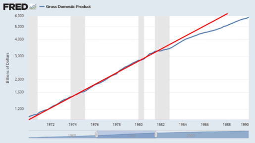
Since our topic is the growth of debt and GDP, make the vertical axis a log scale. I love the way the one line parallels the other until it doesn't; and then, again, it does:

Graph #1: Two roads diverged in a yellow wood

Note the little bump at 1981 in the lower line. That's when nominal GDP started slowing in response to anti-inflation policy.

I brought the data into Excel, added exponential trend lines based on the years 1970-1981, and made the vertical axis a log scale. The trend lines straightened out nicely, and the plotted values cling to the trend lines in the 1970-1981 period. Note that GDP drops below trend immediately after 1981, while debt clings to trend until 1984:

Graph #2: I love how the exponential curves straighten out on a Log Scale graph

This graph shows that debt actually did go a little above trend -- this is not what I've been saying-- that debt did "surge" a little (if there is such a thing as a "little" surge). And I may have been a little too rigid if I said the 1981-1986 increase in the Debt-to-GDP ratio was due entirely to the decline of nominal GDP, and not at all to debt. 

However ...

NGDP reacted first to Volcker's anti-inflation policy; debt reacted only after a lag. Contrary to what I have been saying, it seems that both NGDP and debt may have been involved in increasing the debt-to-GDP ratio. I am still tempted to argue that "GDP was primary and debt was secondary". This sounds good to me; but really it would only mean that GDP reacted first and debt reacted later.


Here's another look at the Excel graph, turned to make the trend lines horizontal:

Graph #3: The Turned Graph. Some things are still easier to do on paper!

In this view it is more obvious that GDP reacted before debt. Also, the lag (before debt reacts) looks longer than I thought. But I have to say that an increase in debt doesn't strike me as a reaction to anti-inflation policy. So, okay, maybe that increase was a "surge" in debt. 

But if it's a surge, it looks like a mini-surge. A very small surge. And looking at graph #3, I think I can still say, at the very least, that the first half of the increase in the debt-to-GDP ratio was due to the slowdown of GDP, not to any "surge" in debt growth. In other words, the debt surge may have contributed to the debt-to-GDP increase, but the slowdown in NGDP growth caused that increase. (I'm still saying "debt surge" was NOT the cause of the 1981-1986 increase in the debt-to-GDP ratio.)

I notice also, after the 1981-82 drop of GDP below trend, a second drop. This second drop in GDP occurs at the same time as the mini-surge in debt. The timing and shape of the 1984-85 movement of the two lines away from trend, in opposite directions, suggests that the increase in debt growth contributed to the decrease in nominal GDP growth, and perhaps also in real GDP growth.

And, well, yeah, isn't that what the Debt-to-GDP ratio is all about.

Still, saying the increase in debt caused a decrease in GDP growth is a far cry from saying that a "surge" in debt created an increase in the debt-to-GDP ratio and that this increase stands as evidence of financialization's ultimate conquest of the nonfinancial economy. 

And miles to go before I sleep.

Saturday, October 16, 2021

A trend, not a surge

Previously:

Debt growth and NGDP growth were both on the increase. NGDP growth died out when Volcker started fiddling. Debt growth died out a few years later, perhaps because the slower-growing NGDP could no longer support the still rapidly-growing debt. But it was the fiddling -- and the decline of NGDP growth -- that caused the 1981-1986 increase in Debt-to-GDP.  There is no doubt.


This time:

I don't see a surge in the mid-1980s, nor a series of surges leading up to it. I see a trend, a trend of increasing inflation, interrupted repeatedly by recession. There was no "surge" of debt during the five years from 1982 to 1987. There was a trend of inflationary increase that goes back to the 1960s. 
It was not surging growth of debt, but rapid decline of inflation and of nominal GDP growth that caused the increase in the Debt-to-GDP ratio after 1981.

 
Look again at my "Annual Growth Rates, Debt and NGDP" graph:

Graph #1

The blue line (debt) rises far above the orange line (GDP) in three places: once, after the 1982 recession; again, after the 2001 recession; and a third time, in 2020. After 2001 we had the housing bubble. In 2020 we had the pandemic. Debt was surging both times: The rate of increase was extremely steep both times, more than in the run-up to the 1985 peak. And both times, before the surge, there was a decade or more when debt growth was unusually low. That was not the case in the years before the 1985 peak.

I have a good deal of trouble with the notion that the debt increase of the 1980s was a "surge". Here is the same graph again, with the orange line removed. Focus on the debt:

Graph #2

At the high point, 1985, debt reaches a 16.38% increase. I made the line thicker and the color brighter to emphasize the peak. 

This peak is the 1980s "debt surge" that people talk about. Richard Vague, for example, refers to

a simultaneous debt surge in both private and public debt that by 1987 had resulted in 19 percent private debt to GDP growth and 41 percent government debt to GDP growth in five years.

There was no "surge" during the five years from 1982 to 1987. After the 1982 recession, there was economic recovery -- "Morning in America" -- and there was a cyclical increase of debt, just as there was after the 1974 recession and the 1970 recession and the near-recession of 1966. To identify the biggest of the four as a "surge" is to mischaracterize the increase and understate the problem.

A surge is rapid, but brief. A trend develops gradually over an extended time period. The later stages of a trend-of-increase may be mistaken for a surge, especially if the business cycle moves from recession to recovery and expansion. That's what happened here. 

There was a trend of increase, an inflationary trend, interrupted repeatedly by recession. The recessions were created by policy in an effort to halt the trend of increasing inflation. Ironically, the recessions lead some people to ignore the inflationary trend and identify the increase as a surge.

Does it matter? Yes. If incorrect analysis of the problem leads to incorrect solutions, it matters a great deal.


The increase of debt after 1981 was a big one, certainly. But as the next graph shows, that increase came last in a series of increasingly larger steps. Notice also that the low points rise above the 5% level between 1965 and 1989:

Graph #3

Not only were the high points rising, as you would expect with a surge. But the low points were rising also. It wasn't a surge. It was a lift-off. Something caused increase not only in the 1985 debt peak, but a whole series of peaks -- and not only the peaks, but also the lows. That "something" was inflation.

Where other people might see three surges between 1970 and the late '80s, I see cyclical behavior and a trend of inflationary increase. Those three peaks do seem to be bigger than all the rest, except for the housing surge and the pandemic surge. But notice how wide these three peaks are, as compared to the surges of 2003-2004 and 2019-2020. Wide peaks take time to rise. The 1985 peak grew from a low in 1982, and it slowed near the top. Narrow peaks are fast-developing. Narrow peaks are surges.


Through the 1950s, debt growth ran lows of around 5% annual and highs between 7 and 8%. There is no particular reason to expect these early increases to be so small, except that we used little credit in those years. There is, however, a reason to expect bigger increases after the mid-60s: inflation. If higher prices are associated with a larger quantity of money, we should expect to see also a comparably larger quantity of credit being used. The graph shows that more credit was indeed being used during the great inflation.

And if inflation is driven not so much by "printing" money as by borrowing it, then in an inflationary time we might expect to see a more than comparably larger increase in credit use. I didn't do the math, but the graph probably shows this as well.

But in any case, I don't see a surge in the mid-1980s, and I don't see a series of surges leading up to it. I see a trend:

Graph #4

Call it an inflationary trend. I see a trend of increase that goes back to the mid-1960s.

I can take that trend and flatten it out. The red line minus itself gives me a red line at the zero level. The 1965-1986 blue, minus the red, moves the blue line down to fit the zero-level red:

Graph #5

I omitted the thin blue line that shows the early years and the late years. I want to add it back in now. But notice graph #3 in the 1950s: The changes in debt as a rule don't drop below the 5% level. The same again in the 1990s: not much activity below the 5% level. It's different after 2008, because times were so tough then. But as a rule, 5% is the bottom.

So I want to take graph #5 and slide the red and blue lines "up" until the low at the start of the 1970 recession just about touches the 5% level. This will bring the last low point on #5 up to the same level, and the low at 1980-81. The blue line in 1982 will drop a little below the 5% level, because the '82 recession was a tough one.

And then I'll put the thin blue line back on the graph:

Graph #6

There. We still have moderate activity in the 1950s. We still have low activity, along with two surges, in the 1990s and after. And we still have the inflationary era, but now without the inflation.

From start to finish now, we have a mostly-reliable "bottom" at the 5% level. And we have, perhaps surprisingly, a ceiling at the 10% level, broken only by the surges that came after the 1990s.

There was no debt surge in the 1980s. There was only an inflationary trend, which we "detrended" out of the data.

There was no debt surge in the 1980s.

Wednesday, October 13, 2021

Going for the win

I've been looking into Debt-to-GDP a lot lately, so I've seen a lot of debt data -- including recent debt data. I don't focus on recent data, because in my view the recent situation is the result of bad policy that's been in place  since the 1980s  since the 1960s or before.

I'm not focused on the results. I'm focused on the policies that led to those results. Just sayin. And I'm not the guy who points the finger at Federal debt. But looking at all those debt graphs lately, I was surprised to find myself surprised more than once by the size of Biden budget items.

My wife watches the Sunday morning news/talk shows (This Week & Meet the Press) and on those shows lately the consensus seems to be that Biden is promoting a "progessive" agenda; I take that to mean spending a lot, or trying to spend a lot.

There are people who love that agenda and people who hate it. Myself, I'm just tired of it. It seems to be an agenda designed -- on purpose, far as I can see -- to make sure absolutely nothing gets done in Congress. It seems more like Mitch McConnell's plan than Joe Biden's. But according to the Sunday morning jabberwocks, this is the Biden plan.


Off the top of my head: For as long as I've been studying the economy, there have always been two reliable recurring issues: the debt ceiling, and the minimum wage. Both have the same problem: After a few years, the changes you made a few years ago are no longer good enough. After a few years, you need a new, higher minimum wage or a new, higher debt ceiling, or both. This is like economics for children. You're not making any progress. It's a joke to call such policies "progressive".

In the General Theory, Keynes made a most interesting point: The accepted theory of his time no longer explained the economy's behavior. In his view, what was needed was not a new gimmick, not a new narrative to retell the same old story, and not a new pointless progressive policy. What was needed was a thunderingly new theory to explain the behavior of the economy.

We're in a similar situation today. There are plenty of people who have a damn good idea what that new theory has to be. There are, however, disagreements on details; so we should hope, and pray if you pray, and in any case work toward agreement where there is now disagreement. And we have to hope that this new vision comes together and "gels" before it's too late.

I used to think we had plenty of time, you know, before it was too late. I don't think that anymore. Not since January 6th. Those people are more dedicated that you are, you progressive cunt, to setting the economy right. Only trouble is, their plan won't work either.

Those people, they all think what you thought I was gonna say -- that the Federal debt is the problem. Eh, they've moved beyond that now. Now they say the Federal government is the problem. But they're not thinkin clear.

I'm too old now to deal with insurrection, or revolution, or whatever you want to call it. But you know, no matter what you call it, and no matter how it turns out, when it's over and we try to get back to a normal life, we're gonna have the same problem. We're gonna have to deal with the economy and we're gonna have to make it work and it's gonna have to work for us. All of us.

No, that doesn't mean we have to maintain and enhance the great disparities of wealth and income that have developed over the last 40-odd years, no. But I am sure that there are people who think they are worth more per hour than I'm worth, and I have neither the energy nor the desire to argue the point.


If the problem, at root, is the economy, then maybe we should just admit that the economy is the problem. Then we could focus on the problem. And that is somewhere in the neighborhood of what we need to do, to actually solve the problem.


These assholes on Sunday morning TV... what they always say is "How are we gonna resolve our differences?"

Well, what we need to do is the thing that they never do on TV: We need to think of the problem as an economic problem, the way we used to think of it. And we should admit that the things we've been doing since the time of Reagan have not helped to solve the problem -- and that a lot of those things have changed our world, but *not* for the better. And then we can start re-thinking things.

Because yeah, nobody has a solution that works: nobody whose solution has been tried; they all have failed. 

So what we have to do is choose to decide that we don't really know what the solution is, and that we have to stop, sit down, and think things through from the beginning. And postpone reaching any conclusion, until we are forced to reach it.

Sunday, October 10, 2021

Definitely the fiddling

I wrote this whole thing in Excel, making notes to myself while trying to turn nonfinancial debt and nominal GDP data into a graph that shows what I know must have happened: It was the decline of NGDP growth, not the surging growth of debt, that caused the increase in the Debt-to-GDP ratio in the first half of the 1980s.

My intent is to leave no doubt.


I took annual data for TCMDODNS and GDPA from FRED and figured my own "Percent Change from Year Ago" values. I spot-checked them just now; my numbers match FRED's. (After being lost in Excel for a head-spinning 9 hours continuous, I was no longer sure.) The numbers are good, and I'm going with the original graph title "Annual Growth Rates, Debt and NGDP".

A note to myself, from the spreadsheet:

Use "percent change" values to emphasize the difference between debt and NGDP.

The "Debt-to-GDP" graph I've focused on so far this month is a ratio of totals: debt (in billions) relative to GDP (in billions). The totals are big numbers; the change from year to year is much smaller. By focusing on changes, rather than on totals, I can magnify both the yearly changes and the differences between debt and GDP. Maybe I'll be able to see things I didn't notice before.

The graph of the percent change values shows something initially interesting and then immediately obvious:

Graph #1: Percent Change Values
Graph #2: The Debt-to-GDP Ratio

Note the alignment: The peaks in debt growth on the upper graph clearly align with the rises of Debt-to-GDP on the lower graph. No wonder people say surging debt was responsible for those rises!

Graphs like those had me starting to think I had overstepped the bounds of reason with my Companion Graph of October 4. It seems the 20-year trends shown on that graph are long enough to suppress the peaks of debt growth that are plainly visible on Graph #1 above.

Graph #3: The Debt-to-GDP Companion

But I don't know if that's true. The companion graph clearly shows the sudden, sharp slowing of nominal GDP (and not of real GDP) after 1981, as the Volcker Disinflation took hold; it shows the sudden slowing of nonfinancial debt after 1986 as the Savings and Loan Crisis took hold; and it shows the slowing of both since 1990. These changes are not suppressed by the 20-year trend.

And yet my assertion that the companion graph shows no significant disturbance in the trend of debt between 1975 and 1986 seems the Achilles heel of an otherwise powerful argument:

  1. There was no change in the trend of debt that could have caused the rise in the Debt-to-GDP ratio.
  2. There was a clear shift in the nominal GDP trend that could have caused the rise in the ratio.
  3. But there was no major change in the Real GDP component of nominal GDP. 
  4. So the rise in the ratio must be due to a change in the price level component of nominal GDP.
  5. The timing of the Volcker disinflation is the smoking gun.

I have painted myself into a corner where I must either demonstrate the truth of my assertion there was no change in the trend of debt that could have caused the rise in the Debt-to-GDP ratio, or abandon my objection to the widely accepted thinking on this topic.


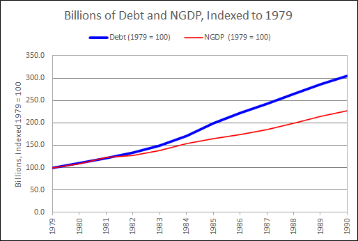
Pondering graph #1, the "percent change" values, I got thinking: Suppose we take 1979 as a starting point. The percent change in debt and NGDP were almost equal that year: 12.12% for debt, 11.73% for NGDP. So now I want to look at billions, but starting in 1979. I'll index them so they start out as if they were equal that year, and we can see the changes over the next few years.

I had the data back to 1947, and looked at all of it first:

Graph #4: Showing 1947-2020

Oh jeeze, I thought, I should have seen that coming. It looks just like what everyone says: Surging debt. Really? I couldn't see that coming?

I'm not making this shit up.

And then, because I dunno, maybe secrets are hidden: Maybe if I zoom in to the 1979 start-date I'll see what I expected to see. Hmm:

Graph 5: Showing 1979-1990

Hmm.

I went all-out this time. I made the blue line wide and the red line narrow, and used bright colors so I could see the red ON the blue, and see what the lines were doing.

I think I see a little dip in the red line, NGDP, in 1982-83.

Also maybe I see a little dip in the blue, nonfinancial debt, 1982-84. No; on second thought, no. It looks like a dip because debt was accelerating in 1984-85. That makes 1982-83 look low. It's not low.

Art, debt hasn't been low since the 1950s, what are you thinkin!


That's when I decided to look at the Debt-to-GDP ratio. But not the totals. Instead, change-in-debt to change-in-NGDP. I don't usually look at change-in relative to change-in, because it makes the graph jiggy. But I was getting desperate.

Graph #6: The Debt-to-GDP ratio using "Change-In" values

Pretty quiet during the 1960s and 70s. Then a jump in the early 1980s, same as we saw on graph #1 and #2. Then it gets quiet again, at a higher level. And then another jump, corresponding to the 2000-2009 jump on #1. And I don't know what happens there at the end.

This is like a million ways to look at graphs that support what other people say. I keep getting graphs that support existing thinking. 

I'm still looking for the other thing.


And this is where I started telling myself:

Okay. Maybe I over-stepped. Maybe 20-year growth is too long a period. Apparently it hides things that are clearly visible in year-on-year data.

But wait now. Look at my "Annual Growth Rates, Debt and NGDP" graph. Clearly, debt is on the increase since the early 1960s. Clearly NGDP is increasing, because of inflation. Clearly, the increase in NGDP  SLOWS  FIRST (like since 1978) and the increase in Debt slows LATER (like since 1986).

The "Chg Debt / Chg NGDP" graph shows sudden increase in debt growth after 1981. BUT THIS INCREASE IS RELATIVE TO NGDP GROWTH. It is not a purely objective measure. The 1978-1986 slowing of NGDP growth creates the appearance of surging debt growth. There was no surge in debt at that time.

The increase of debt after 1981 was a big one, certainly. But as the "Annual Growth Rates, Debt and NGDP" graph shows, that increase was the last of a series of progressively larger increases. The significant change, before 1986, was not the post-1981 increase in debt. The significant change was the post-1981 decrease in NGDP growth. It was this change, the change in NGDP growth, that brought the end of "stability" to the Debt-to-GDP ratio after 1981.

Now, how can I show this? Trends. Let me show the trends. This is valid. After all, the claim to which I object is the claim that financialization started suddenly in the 1980s. If I'm right, if financialization did NOT start suddenly in the 1980s, then there must have been an ongoing TREND of financialization before 1980. If there was such a trend, it must be valid to use "trend analysis" to discover it.

So I decided to go with trends, as I had on the 4th. Not 20-year trends. Just trends.

The only note I had in the spreadsheet at this point was

"Trend Analysis" on my terms (may or may not agree with the technical term).

The hobbyist has spoken.

The first trend I went with is the Hodrick Prescott, the one nobody uses any more. No problem, it makes a pretty graph:

Graph #7: Debt and NGDP, with Hodrick-Prescott Smoothies

Blue is debt, red is NGDP.

Not another word. Moving on, now the same data with linear trends, two for blue, two for red:

Graph #8: Debt and NGDP, with Linear Trends in the Crucial Period

Blue is debt, red is NGDP.

On this graph, one trend line shows the trend of increase, and the other shows the trend of decrease. Two trend lines for debt, and two for NGDP.

On the increase, the two trends are almost perfectly aligned. I made the red one dashed so you can see the blue one underneath it.

One difference: NGDP stops increase and begins decrease around 1978, just before the Volcker disinflation. Debt stops increase and begins decrease around 1985, just before the Savings and Loan Crisis. That's the whole story, right there.

Debt and NGDP both show increase since 1959 (on this graph). But NGDP breaks off and starts running downhill after 1978. (The brief 1981 peak and the brief 1984 peak and the low 1988 peak of NGDP were all influenced by the Volcker policy.) With debt, there was one more big peak after 1978, the big one that peaks in 1985. The one that throws everybody off. 

This peak is not a sudden new surge of debt. With debt you had the 1964 peak (7.18% growth) and the 1967 peak (8.0%) and the 1973 peak (10.33%) and the 1978 peak (13.63%) and the 1985 peak (16.38%) before the trend of increase broke.

Why did the increasing debt trend last longer than the increasing NGDP trend? My guess: We were coming out of three or four recessions in a row, bang-bang-bang, and we were ready for a better economy. And Ronald Reagan had the good narrative. He spoke of "Morning in America" and people were ready for that, too. We fell for it.

Or, I dunno why. But the trend of NGDP increase broke early, and the trend of Debt increase broke late, and this timing is what created the Debt-to-GDP rise of the 1980s. Despite all those other graphs.


Graph #7, with the H-P trends, shows the same thing as #8: the trend of NGDP growth died out early; the trend of debt growth lasted several years more.

So let me say this again.  Debt growth and NGDP growth were both on the increase. NGDP growth died out when Volcker started fiddling. Debt growth died out a few years later, perhaps because the slower-growing NGDP could no longer carry the load.

But it was the fiddling that caused the 1981-1986 increase in Debt-to-GDP. 

There is no doubt.

Friday, October 8, 2021

Suppose the Volcker Disinflation Started a Few Years Early

This graph shows that the "stable" years of the Debt-to-GDP ratio gave way to increase in the early 1980s because that is when the Volcker Disinflation took place:

The graph was done in Excel. Orange is the GDP Deflator. Blue is Debt-to-GDP.

The recession bars, the black GDP Deflator line, and the gray Debt-to-GDP line are an image, captured from a FRED graph and used as a background for the Plot Window in the Excel graph.

I modified the Deflator data in Excel for the years 1977-1982, replacing the inflationary peak of 1981 with a smooth transition connecting 1976 to 1983. Other than that I kept all the annual price change percentages as per the original data. But of course the price level was reduced for all years after 1976.

Real GDP values were unchanged. But because the price level is lower, nominal GDP values are lower. And because the nominal GDP values are lower, the Debt-to-GDP runs higher for all years after 1976.

Because the nominal GDP values were lower, the Debt-to-GDP runs higher for all the years after 1976.

But here's the main thing: Because the disinflation starts in 1977 rather than 1981, the increase in the Debt-to-GDP ratio also starts in 1977 rather than 1981.

The graph is living proof that in the real world, the "stable" years of the Debt-to-GDP ratio gave way to increase in the early 1980s because that is when the Volcker Disinflation took place.


Q: Why did the stability of Debt-to-GDP suddenly turn to increase in the 1980s?

A: The Volcker Disinflation.

Wednesday, October 6, 2021

Not just coincidence

Following up on my "companion graph" post of 4 October.


The blue line shows Debt-to-GDP, nonfinancial debt to gross domestic product. The red line shows inflation as measured by the GDP Deflator:

Graph #1

The black box in the middle of the graph captures the years 1981-1986. In that box in blue we see the sudden increase in debt-to-GDP. At the same time, in red, we see the Volcker disinflation, 1981-1986, within that same black box. These changes happened at the same time.

The dramatic fall of inflation created a dramatic slowing of nominal GDP growth:

Graph #2: Nominal GDP on a Log Scale, where a straight line indicates
a constant rate of growth. GDP growth (blue) falls off after 1981.

The dramatic slowing of GDP growth created a dramatic increase in the Debt-to-GDP ratio.

Monday, October 4, 2021

Debt-to-GDP and the Companion Graph


The reduction in inflation that occurred in the early 1980s, when the Federal Reserve was headed by Paul Volcker, is arguably the most widely discussed and visible macroeconomic event of the last 50 years of U.S. history.
- Goodfriend and King, 2005
But that disinflation is ignored in discussions of the Debt-to-GDP ratio.
- Arthurian


Download the PDF

The first graph here shows nonfinancial debt relative to Gross Domestic Product:

Graph #1: TCMDODNS / GDPA at FRED

Economists dwell on the remarkable stability of this ratio before 1981, and focus on the sudden sharp increase after 1981:

  • "The combined indebtedness of both government and private-sector borrowers, which earlier had shown considerable stability in relation to the economy's overall growth, and especially so since World War II, has since 1980 jumped far out of proportion with nonfinancial economic activity." (B. Friedman 1986, p.1)

  • "One clear limitation of our dataset is that it starts in 1980. It is sufficient, however, to look back at the history of the United States (for which long back data are easily available) to understand how extraordinary the developments over the last 30 years have been. As Graph 2 [here, Graph #1] shows, the US non-financial debt-to-GDP ratio was steady at around 150% [here, 140% and until the early 1980s] from the early 1950s until the mid-1980s." (Cecchetti et al 2011, p.6)

  • "When did financialization start? While there is much literature on the increasing dominance of finance in the United States after 1970, ... most analysts emphasize the neoliberal period beginning in the 1980s." (Fasianos et al 2016, p.2)

What caused the sharp increase in the Debt-to-GDP ratio in the 1980s? Financialization was not the cause. Financialization did not emerge fully formed from the void in 1981. The sudden increase in the ratio happened when Paul Volcker's anti-inflation policy started working. The next graph shows growth rates for debt and GDP, separately, using the same source data as the first graph:

Graph #2: Companion Graph Showing the FRED data TCMDODNS and GDPA

Growth is shown for moving 20-year periods. The first value of each line, plotted at 1966, indicates the rate of growth of the 1946-1966 period. The second value indicates the 1947-1967 period, etc.

GDP and nonfinancial debt run close from 1966 to 1981 -- essentially from 1946 to 1981 -- and incredibly close from 1974 to 1981. This confirms the standard evaluation of the standard Debt-to-GDP graph: stability before the 1980s.

But the lines separate after 1981, just as the Debt-to-GDP ratio rises. This is not because of any significant change in the path of debt. Graph #2 shows little change in the path of debt. Nor do the lines separate because of any significant change in the growth of Real GDP:

Graph #3: Showing FRED data TCMDODNS, GDPA, and GDPCA

The separation after 1981 can only have been due to a change in the path of the price level, as the price level is the only difference between real and nominal GDP. I am therefore forced to conclude that the sudden, sharp increase in Debt-to-GDP after 1981, visible on the first graph, was a direct consequence of the Volcker disinflation.

The price level caused debt and GDP to run together until Volcker, and then the price level caused debt and GDP to diverge.

The sudden increase in the Debt-to-GDP ratio in the 1980s was the result of anti-inflation policy. It was not the result of financialization emerging suddenly, like an evil butterfly escaping an innocuous cocoon.


The Debt-to-GDP graph shows the path of debt, but shows it relative to GDP. The companion graph shows the path of debt and the path of GDP, and shows them separately so that they may be evaluated and compared.

The essential point is that the growth of debt was rapid, persistent, and (as the vertical axis values show) accelerating without hesitation from the early days until 1986. There was no sharp change in debt growth until after the rise in Debt-to-GDP -- and the change, when it came, was decrease. The problem with debt is not the increase since 1981, but the increase since the end of the second World War.

The logic that says rapid growth of debt is okay until debt becomes a problem is the logic that creates the problem.


It was inflation that kept the ratio low. It was the Great Inflation that kept the Debt-to-GDP ratio low from the mid-60s to the Volcker disinflation. Without the Great Inflation, the ratio would have looked more like this:

Graph #4: Inflation messes with the debt-to-GDP ratio

As Investopedia says, "the beginnings of financialization in the United States can be traced as far back as the 1950s".


Data

Debt: quarterly by default, set to annual frequency and end-of-period aggregation
Domestic Nonfinancial Sectors; Debt Securities and Loans; Liability, Level (TCMDODNS)
https://fred.stlouisfed.org/series/TCMDODNS

NGDP: annual by default
Gross Domestic Product (GDPA)
https://fred.stlouisfed.org/series/GDPA

RGDP: annual by default
Real Gross Domestic Product (GDPCA)
https://fred.stlouisfed.org/series/GDPCA

Price Level: annual by default
Gross domestic product (implicit price deflator) (A191RD3A086NBEA)
https://fred.stlouisfed.org/series/A191RD3A086NBEA

Growth calculation: (At / At-20) - 1
where A is annual data from FRED, as specified.


References

Cecchetti, S., Mohanty, M. and Zampolli, F. (2011): “The real effects of debt”,  BIS Working Papers no. 352, September.
https://www.bis.org/publ/work352.pdf

Fasianos, A., Guevara, D., and Pierros, C. (2016): ‟Have We Been Here Before? Phases of Financialization within the 20th Century in the United States”, Levy Economics Institute working paper no. 869, June.
http://www.levyinstitute.org/pubs/wp_869.pdf

FRED  https://fred.stlouisfed.org/

Friedman, B. (1986): “Increasing Indebtedness and Financial Stability in the United States”,  NBER Working Papers, no 2072, November.
https://www.nber.org/system/files/working_papers/w2072/w2072.pdf

Goodfriend, M., King, R. (2005): ‟The incredible Volcker disinflation”. Journal of Monetary Economics 52 (2005) 981–1015.
https://www.bu.edu/econ/files/2011/01/GKcr2005.pdf

Investopedia (2021): ‟Financialization”.
https://www.investopedia.com/terms/f/financialization.asp

This paper online:
https://econcrit.blogspot.com/2021/10/debt-to-gdp-companion-graph.html