 |
| Graph #1 |
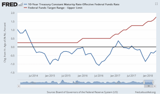
Over the course of 2015 the blue line moved toward zero. By December it was almost zero, meaning there had been almost no change from a year earlier. At that moment the Fed raised the target a quarter point and held it there for a year.
For six months after the Fed raised the target, the spread narrowed. By July 2016 it was one percentage point smaller than a year earlier. Then (with no additional change by the Fed) the trend turned upward. By the end of 2016, again, there was no change from a year earlier.
In other words, the first quarter-point increase by the Fed, the increase of December 2015, affected the spread for about six months. After that, the prior trend (narrowing less and less) resumed. And in the first two months of 2017 the spread actually started to widen.
As happened a year earlier, the Fed saw it coming. They raised the target once again at the end of 2016 and twice more in the first half of 2017. Despite all these increases, the spread held steady till October 2017, showing little or no change from a year earlier. Then, perhaps anticipating another increase by the Fed, the spread fell in November and again in December when the anticipated increase came to pass.
Those several increases together did hasten the narrowing of the spread. But the low point of the blue line this time was not as low as the two prior lows you see on the graph. And the third low occurred in the same month as the Fed's December 2017 target increase. By January, one month after the target hike, the trend was upward again, in the direction of a bigger spread.
The most recent increase in the target, in March 2018, probably slowed the move toward widening. But the move toward widening continues. And that's where we are as of the April data.

In summary:
- ONE target increase (Dec 2015) caused six months of increased narrowing. Then,
- THREE increases (Dec 2016-Jun 2017) stopped the widening of the spread but caused little narrowing. ANTICIPATION of the Dec 2017 increase did increase the narrowing; but despite
- TWO increases (Dec 2017, Mar 2018) the narrowing grows less, and the widening appears more ready to resume.

Does this analysis stand up? I think so. Here's a graph of the yield spread plain and simple. No "change from year ago" view to complicate things, this time. The blue line is the spread. The red bumps indicate the Fed bumping up the Federal Funds target.
 |
| Graph #2 |
The analysis stands up.
The December 2015 target change was a 0.25% increase that led to a 1% decrease in the spread, a decrease four times as big as the increase.
The target change that began in December 2016 was a 0.75% increase that caused a 1% decrease in the spread. This time, the spread changed only a little more than the target.
And the December 2017 target change was a 0.25% increase, despite which the yield spread continued to rise. There was no decrease in the spread.
The longer the Fed has continued this policy of increase, the more the economy has adjusted to the idea that interest rates are finally getting back to normal.

This seems like an appropriate time to remember that we still have many policies which encourage credit use, and no policy that encourages repayment of debt. A tax rate designed to vary with the taxpayer's debt-to-income ratio could encourage repayment of debt without being punitive. Such a policy could reduce the growth (and eventually even the level) of accumulated debt, bringing relief to debtors while encouraging economic growth and vigor.
The best time to implement such a plan would be in the very early stages of what will eventually be a long, strong boom. Now, for example. Right now.


1 comment:
James Hamilton, 1 July 2018, looking at "the spread between the yield on a 10-year U.S. Treasury security and a 3-month Treasury bill":
"The spread has declined significantly since the end of the Great Recession, and now is down to 95 basis points. That’s below the historical average around 150 bp, but not that much below. In about a third of the months since 1953, the spread has been that low or lower."
Post a Comment