Wednesday, August 22, 2018

The Nominal-to-Real calculation

Start with GDP:

Graph #1 (Click the Graph or the Caption for a Better View)
The black line shows GDP, sometimes called Nominal GDP or NGDP. The fat blue line, well hidden by the red, shows inflation-adjusted GDP (Real GDP or RGDP). And the red shows the result of the standard calculation that converts NGDP to RGDP.

The calculation, given in the upper border of the graph, is GDP divided by the price index and multiplied by 100.

When they figure the price index, they could take care of the 100 as the last step. Then, when we convert nominal to real, we would only have to divide by the price index. But they don't take care of it for us, so we have to remember to do it ourselves.

And if your memory is not so good, like mine? Don't worry; the graph will remind you. Instead of ending near 18000, the red line will end near 180, with the whole line shrunk down to match. 180 is not as far above zero as where our black GDP line starts. So it will be obvious when you see it, that you forgot to multiply. And you curse your memory again, and fix your calculation again, and you're good.

//

Now the mind-blower: Let's pretend we're looking at debt, not GDP.

It's just numbers to work with. I need numbers to work with. And it is representative: Typically, when people convert nominal debt to real debt, they use the same calculation, the standard calculation that is used to convert nominal GDP to Real GDP. Plus, that's the calculation I want to look at today, the nominal-to-real conversion.

So the black line is debt. The fat blue line is Real Debt, or so people say. And the red line shows the calculation. The same calculation that is used to convert GDP to Real GDP.

According to me, as a way to convert nominal to real, that calculation is perfectly good when used to convert GDP, but completely unacceptable when used to convert debt.

Maybe that blows your mind even more. Maybe it should.

//

One difference between debt and GDP is that when we figure GDP we start again at zero every year. GDP is never a total for more than one year. Debt is not like that. Debt is always a total for more than one year. When we figure debt, we take the end-of-year balance and use it as the start-of-year balance for the next year. And by "we" I don't mean me; I mean the experts who work up the numbers.

Debt is reported every year, just like GDP. But the number is a multi-year accumulation. One year's debt includes the borrowing of many years, and reflects the prices of many years.

GDP is never a total for more than one year. Debt is always a  total for more than one year. This difference is the reason the standard calculation works for GDP but does not work for debt. Why? Because the price index gives the price level for one year at a time. There is no price index for the many years of borrowing that are accumulated in one year's debt.

There is no price index that measures the price level for a multi-year accumulation of debt. So the standard nominal-to-real calculation gives the wrong answer when you use it to figure real debt.

To convert nominal debt to real, a different calculation is needed. One like this.

In Round Numbers

In an inflationary economy, which ours has been, the dollar loses value over time. A dollar a year ago was worth more than a dollar today. A dollar five years ago was worth even more.

Since the late 1990s, inflation has been roughly two percent a year. Call it two percent. So a dollar last year was worth 2% more. A dollar five years ago, 10% more.

//

Now: How old is our debt? Just a guess, but I'm saying five years old on average. More than five, I think, but say five years old. And that's for newly reported totals: Debt totals announced this morning encompass debt that is on average five years old, or more.

If we have 2% annual inflation, in five years that's about 10% inflation overall. If our debt is five years old on average, then debt reported this morning has already seen about 10% inflation. The dollars we borrowed and spent were worth 10% more than a dollar is worth at the moment.

So if we're doing inflation adjustment, the adjustment could be about five times bigger for debt than for GDP.

//

The annual addition to debt is generally in the neighborhood of five to ten percent of the total accumulation. That means that 90 to 95 percent of debt is old debt -- money borrowed on average five years ago, when the dollar was worth about 10% more. At any given time, then, 90 to 95 percent of debt represents spending that was done when the dollar was worth 10% more.

When we look at the value of debt in dollars that don't lose value over time (which is really what inflation adjustment is all about) we have to say the adjustment is substantially greater for debt than for GDP. Because debt always has that extra 10% and GDP doesn't.

YearGDP InflationDebt Inflation
The Current Year0%10%
One Year Later2%12%
Two Years Later4%14%

The standard calculation understates real debt. There's no getting around it.

Sunday, August 19, 2018

Another break in the silence

It's been a week.


The definition of the word "accumulation" provided by the Cambridge English Dictionary and returned by Google is
1. an amount of something that has been collected: 2. the process of gradually increasing in amount, or the increased amount...
Either an amount of something, or the process of increasing. An amount, or a process.

When I talk about "the accumulation" of debt I definitely mean the huge amount of it. When I talk about "accumulation" of debt, sometimes I may mean the process.

What do Cecchetti, Mohanty and Zampolli mean when they say
The righthand panel of Graph 1 makes the rather stark point that real household debt tripled between 1995 and 2010, dwarfing the accumulation of debt in other sectors of the economy.
... and is it okay to use the "D" word?

What do they mean? To my ear, they mean the amount. Not the process. "Real household debt tripled", they say. They're talking about the increased size of household debt, not the process of increasing. But of course, you can't have the one without the other.

Let me back up just a little, quote their whole paragraph, and show their graph:
Graph #1
As shown in Graph 1, from 1995 to the middle of the last decade, public debt had been relatively stable as a percentage of GDP. But this period of relative public sector restraint was accompanied by a rapid rise in household and non-financial corporate debt. The righthand panel of Graph 1 makes the rather stark point that real household debt tripled between 1995 and 2010, dwarfing the accumulation of debt in other sectors of the economy.
Yeah, I think that's wrong. The size of household debt does not "dwarf" debt in other sectors of the economy. They make it sound like household debt is the biggest component. But household debt is the smallest of the components they are looking at, as the left-hand panel of their graph shows.

At the same time, the right-hand panel does show that household debt was the fastest-growing component of debt. So perhaps it is true that the "process" of accumulation of household debt dwarfs the others. It would be more clear, though, if they just said household debt grew the fastest.


The left-hand panel shows five measures of debt, in each case comparing the size of debt to the size of GDP. Since all the measures of debt are compared to the same standard, the left panel provides a good way to compare those debt measures to each other. The one that's biggest relative to GDP is biggest, period. The one that's smallest relative to GDP is smallest. From start to finish, except for two or three years between 2005 and 2009, household debt is the smallest.

The right-hand panel shows debt for the same five sectors. This time the debt numbers have been adjusted to remove inflation.

Here's something: When you want to see the growth of GDP, you take inflation out of the numbers. This lets you see the size of GDP so you can compare one year to another. Doing this, you are comparing GDP only to itself. Something similar is true for the right-hand panel: Forget the fact that there are several lines on the graph. Each line compares one measure of debt to itself. If the line goes up, the debt got bigger. This is what the right-hand panel shows.

If you put five lines like that together on a graph, it does NOT show that one pile of debt is bigger than another pile of debt. Each line compares one component of debt to itself.

The fact that the five measures all start with the same value allows us to compare the growth rates of the different debt measures. Because it is highest at the end, then, we have to say household debt was fastest-growing.

Household debt is the smallest but fastest-growing measure on Graph #1.


CM&Z's graph shows "total non-financial debt" and  components of it. It shows that household debt is the smallest component, but the fastest growing.

Let's look at it.

And what does it leave out, their graph of non-financial debt and components? Well, obviously, it leaves out financial debt, the debt of financial business.

Let's look at that, too:

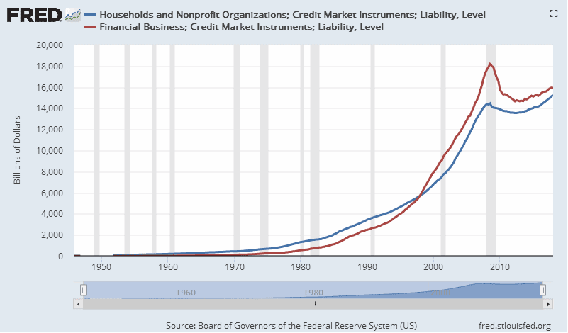
Graph #2: Household Debt (blue) and Financial Debt (red). Data for the US only.
Close. They're close. Who knew?

And how do they compare for size?

Graph #3: Financial Debt as a Percent of Household Debt
Financial debt grew from 20% of Household debt, to 120%, and then started tapering off.

Household debt is the fastest growing component of non-financial debt. But Financial debt grew faster, from the 1950s to 2001. For half a century, financial debt grew faster than household debt.


Hey Cecchetti.

What?

Financial debt, it was growing even faster than household debt.

Yeah, so?

You wanna show it on our graph?

Nah.

Sunday, August 12, 2018

A follow-up note on the growth of debt

Before the silence resumes, an afterthought.

I'm looking at non-financial debt: Domestic Nonfinancial Sectors; Credit Market Instruments; Liability, Level at FRED. Annual data, downloaded to Excel. Looking for something I can compare to what I'm reading about the growth of non-financial debt in CM&Z's The real effects of debt.

They look at debt (first, debt relative to GDP, then the growth of inflation-adjusted debt) and they observe
... the surge in non-financial debt preceding the recent crisis is not a new phenomenon. It is merely the continuation of a trend that was ongoing over the entire period for which we have been able to assemble comprehensive data...
One clear limitation of our dataset is that it starts in 1980. It is sufficient, however, to look back at the history of the United States (for which long back data are easily available) to understand how extraordinary the developments over the last 30 years have been. As Graph 2 shows, the US non-financial debt-to-GDP ratio was steady at around 150% from the early 1950s until the mid-1980s.
They say that non-financial debt has been growing rapidly since the 1980s, but not before the 1980s. They are careless, though, offering no more than a "sufficient" argument. They evaluate the growth of inflation-adjusted debt for the post-1980 but not the pre-1980 years. Without looking at it, they say debt growth was relatively slow before 1980 -- specifically in the US -- and they want me to take their word for it. This I cannot do.

I'm looking at compound annual growth rates for ten-year periods. Looks like CM&Z have it wrong way round. Debt growth shows increase since the 1950s. It was fast since the 1970s, faster than it's been since the mid-1990s! But since 1986, debt growth has been slowing:

Graph #1
Slowing since 1986. That's why GDP growth sucks.

However, because of the growth of debt since the beginning, the level of debt is now very high. This is the reason that the relatively small growth increase of 2001-2008, on my graph, appears as a massive increase in debt in billions and in the debt-to-GDP ratio on everybody else's graphs.

Nonetheless, the trend of debt growth is downward since 1986, and this explains the slowing of economic growth.


Each dot on the graph represents the compound annual growth rate for the 10-year period ending at the date of the dot. The first dot, for example, shows the growth rate for the 1947-1957 period.

The plot peaks at over 12% in 1986 (that is, the 1976-1986 period). It falls to a low of about 5.5% in 2001. It peaks in 2008 at about 7.5%. The graph ends in 2017 with debt growth at about 4% for the last ten years.

The 2008 peak value was exceeded back in 1973.

//

Check/duplicate my work:
The value for 1947 is in cell C12, with the following years' data on the rows below. In Column D on row 22 (the row for 1957) is this formula:
=RATE(COUNT(C12:C22)-1,,-C12,C22)
with that formula copied to the rows below. Values from Column D are displayed on the graph.

Saturday, August 11, 2018

An outright contradiction

As I tell the circling buzzards while I'm mowing the lawn, I'm not dead yet. I'm working on something that's taking forever. So I interrupt my silence to present some related material.


In an upcoming post I quote Stephen G Cecchetti, Madhusudan Mohanty and Fabrizio Zampolli (CM&Z) from BIS Working Paper No 352: The real effects of debt:
Overall, real debt of the non-financial sector in advanced economies has been growing steadily at a rate of slightly less than 4½% for the past 30 years.
That's not for the US. Their growth number is an average for 16 advanced economies.

I have easy access to US data, at FRED, and I'm comfortable working with US data -- call me a patriot! -- so I want to compare CM&Z's growth number to US data. I'll be using "Domestic Nonfinancial Sectors; Credit Market Instruments; Liability, Level", which is similar to CM&Z's debt measure except mine includes the debt of nonfinancial noncorporate business. Should be good enough. I just want to get a rough idea.

//

Following CM&Z, for real debt I'm dividing by the Consumer Price Index. (They describe their first graph as showing debt "deflated by consumer prices". Seems odd to me, but okay.)

Here's the graph for US data:

Graph #1: Real US Non-Financial Debt (see text)
I get a growth rate of 3.79% 4.05% (see The big picture is wrong). A little less than their number.

It looks like real debt goes up a lot faster after 1980 than before. This agrees with CM&Z, whose "past 30 years" is the 1980-2010 period. (Their paper is from 2011.) Still...

Exponential growth is growth that doubles at a constant rate.  I wonder how long it takes for this debt to double. Here is the same graph again, with some numbers on it:

Graph #2: Doublings
Starting in 1950 at 1709.6, the debt reaches twice that level in 1967, 17 years later.
Starting in 1967 at 3431.2, the debt reaches twice that level in 1986, 19 years later.
Starting in 1986 at 7136.4, the debt reaches twice that level in 2006, 20 years later.

The debt growth looks roughly exponential to me. If anything, debt growth was faster early and slower late.

Here's the same data again, this time showing logged values:

Graph #3: Logged
Definitely slower late. This is an outright contradiction of what CM&Z said.

//

Let me review what CM&Z said, exactly. They said:
The past three decades have witnessed a remarkable rise in advanced country indebtedness.
...
Graph 1 shows the aggregate non-financial sector debt of advanced economies and its composition since 1980.
...
What these panels show is that the surge in non-financial debt preceding the recent crisis is not a new phenomenon. It is merely the continuation of a trend that was ongoing over the entire period for which we have been able to assemble comprehensive data...

One clear limitation of our dataset is that it starts in 1980. It is sufficient, however, to look back at the history of the United States (for which long back data are easily available) to understand how extraordinary the developments over the last 30 years have been. As Graph 2 shows, the US non-financial debt-to-GDP ratio was steady at around 150% from the early 1950s until the mid-1980s.
I'm not showing their graph. As I read it, they are saying:
Debt has been growing rapidly since around 1980: since long before the housing bubble. This rapid growth since 1980 is extraordinary: much different than what came before. For evidence that debt growth was slow before 1980, look at the US data.
I don't see slow debt growth before 1980 in the US.

I don't see an extraordinary change around 1980.

I see rapid debt growth from the start.

Sunday, August 5, 2018

With one eye closed

I've been looking at an old PDF lately: The real effects of debt, the 2011 paper by Cecchetti, Mohanty and Zampolli (CMZ). They show this graph:


They write:
As Graph 2 shows, the US non-financial debt-to-GDP ratio was steady at around 150% from the early 1950s until the mid-1980s. In some periods, public debt was high, but then private debt was low; while in others it was the reverse.
Their remarks are footnoted:
See Friedman (1981 and 1986) for a discussion.
I wondered if they meant Milton Friedman because, far as I know, debt wasn't really his thing. So I checked their list of references, and found this item:
Friedman, M (1981): “Debt and economic activity in the United States”, in M Friedman (ed), The changing roles of debt and equity in financing US capital formation, University of Chicago Press.
Friedman, M, they say. But I think they mean Benjamin M. Friedman, whose 1981 paper Debt and Economic Activity in the United States is available from NBER. The paper "documents a long-standing stability in the relationship between outstanding debt and economic activity in the United States". Must be it.

So now I'm looking at an even older PDF.

From a page dated March, 1981, here are the opening sentences of Friedman's paper:
Businesses and individuals, in an economy like that of the United States, can finance their activities in a rich variety of ways. Businesses investing in new plant and equipment can rely on internally generated funds, or they can raise external funds from the financial markets. When they do turn to external sources of funds, they can issue either debt obligations or new equity shares in the enterprise. Individuals can likewise use their own or borrowed funds to make major purchases like automobiles, and many individuals can also borrow to finance ordinary consumer spending apart from major hardgoods. Even in arranging home purchases, transactions that are almost always partly debt financed, individuals usually can choose what fraction of the purchase price initially represents their own equity. In principle, businesses and individuals are continually making these and other financing choices on the basis of yield comparisons, credit availability, and other considerations, so that the total amount of debt financing does not necessarily have to bear any close relationship to the underlying economic activity.

In fact, however, the relationship between outstanding debt and economic activity in the United States is remarkably steady — indeed, just as steady as the more widely recognized and better understood relationship between economic activity and money. The aggregate outstanding indebtedness of all nonfinancial borrowers in the United States has been approximately $1.40 for each $1.00 of the economy's gross national product, ever since World War II. Throughout the postwar period the overall debt—to—income ratio has displayed neither trend nor cyclical variation.

And again, the sentence on which I focus:
The aggregate outstanding indebtedness of all nonfinancial borrowers in the United States has been approximately $1.40 for each $1.00 of the economy's gross national product
Friedman in 1981 considers nonfinancial debt only. His paragraphs are engorged with detail, but he offers no justification for the exclusion of financial debt.

Cecchetti, Mohanty and Zampolli, like Benjamin Friedman, consider only non-financial debt. The funding of borrowers is the focus. The funding of lenders merits no consideration.

As if our problems with debt can be reduced by failing to count the half of it.

Friday, August 3, 2018

A look at the growth of debt using "Kruger Industrial" smoothing

Household debt, for starters. Quarterly data. Change in billions, relative to Disposable Personal Income in billions. Flow relative to flow.

The numbers are small: 1%, 2%, 3%. That's because it's quarterly data. Multiply by 4 to approximate annual values, and we're talking 8-to-12% annual increase here.

That ain't nothin.

Graph #1
The blue is the FRED data. The red is the super-smooth trend, the Hodrick-Prescott with a smoothing factor of 400,000.

The trend line shows household credit use rising already in the 1960s and, if you look, already even in the 1950s.

Inflation may have caused an increase in borrowing in the 1960s and '70s, as prices went up on things purchased on credit. But prices went up also on things purchased not on credit; and inflation caused an increase in incomes, in the "nominal" numbers. So inflation cancels itself out of the "change in debt relative to income" calculation.

The same is not true for "accumulated debt relative to income" of course. Because last year's debt is increased by the addition of this year's credit use, but last year's debt is not increased by this year's inflation. That's why inflation is said to be good for borrowers and bad for lenders, at least as long as wages are going up along with prices.

Come to think of it, the "bad for lenders" thing could be the main reason wages no longer go up along with prices. That would be just one more piece of evidence saying there's too much finance in our economy these days, and that we go out of our way too much for finance, and that this creates problems for people, and it changes the economy.

Well this post sure didn't end up where I thought it might.

Wednesday, August 1, 2018

Yeah, Bill, but

Bill Mitchell writes:
Unsustainable growth processes are those that rely on households accumulating ever increasing debt levels.
That's true. But don't get your undies in a bunch. The last time we relied on households accumulating ever-increasing debt levels it worked for 60 years, from 1947 to 2007.

After 2007 the US economy went into ever-decreasing debt levels mode, which lasted about four years. Then it took another four years or so with household debt on the increase, before it finally went above the pre-crisis peak. Then we started to hear the knee-jerk warnings about debt causing another crisis.

I'm empathetic. I agree that debt is the problem. But it is not necessarily a problem if debt today is more than it was yesterday. That happens all the time. There is too much baseless fear in our gut these days, left over from the problems of 2007-2009.

It is true that household debt is now (and has been since 2016) higher than it was at the previous peak:

Graph #1

But that is not true for debt relative to income:

Graph #2
Not even close. Actually it looks like it's still going down. (When it starts going up, that's when we get the vigor I've been predicting since 2016.)

Likewise, debt service costs remain low:

Graph #3
It's too soon to panic over debt. First comes the vigor.

Stop and smell the roses.