Friday, December 22, 2023

Step One

Let reducing government debt be third on our to-do list, not first on that list. After excessive private-sector debt comes down some -- after business and household debt come down --it will be easier to reduce government debt. Oh, and notice the word help in the graph title there.

Happy Holidays. Merry Christmas. 

Peace.

Wednesday, December 13, 2023

(13 Dec 2023)

I want to look at household debt, the slowing growth of household debt.

Going with debt relative to income, I'll compare household debt to "disposable" personal income (DPI), the measure of "after tax" income.

In FRED's Table 2.1. Personal Income and Its Disposition: Annual they subtract "personal current taxes" from "personal income" to get "disposable personal income". Then, from disposable personal income they subtract three categories of cost

  • personal consumption expenditures,
  • personal interest payments, and
  • personal current transfer payments

and what's left is called "personal saving".

Hey, I'm just making sure it makes sense to subtract household interest cost from DPI. Where else?

Funny you should ask. Because "Personal interest payments" is half or less than half the interest that is paid by households:

Graph #1: "Personal Interest Payments" as a Percent of the Monetary Interest Paid by Households

Why? They have their reasons. Apparently the rest of the interest is counted as business expense. According to the CHAPTER 12: RENTAL INCOME OF PERSONS PDF,

The housing stock provides a flow of housing services that are consumed by persons who rent their housing and by persons who own the housing they occupy (referred to as “owner-occupiers”). In the NIPAs, owner-occupiers are treated as owning unincorporated enterprises that provide housing services to themselves in the form of the rental value of their dwellings.

Chapter 12 continues:

Thus, personal consumption expenditures (PCE) for housing services includes both the monetary rents paid by tenants and an imputed rental value for owner-occupied dwellings (measured as the income the homeowner could have received if the house had been rented to a tenant)...

So the "Personal consumption expenditures", which is counted in GDP, includes the cost of an imaginary monetary rent that homeowners (called "owner-occupiers") pay to live in their own homes. Conveniently, this cost is offset by imaginary income:

... and rental income of persons includes the monetary income earned by landlords and an imputed rental income earned by owner-occupiers.

Apparently, this imaginary rental income is counted as an addition to homeowners' income, offsetting the imaginary cost of paying the rent. This imagining allows "owner-occupied" houses to be "treated as fixed assets" for accounting purposes, just as "tenant-occupied" houses are.

In a paper on modeling imputed rent, Arnold J. Katz points out that "The rental value of owner‐occupied housing ... accounts for about 8 percent of GDP". Katz is right. Unbelievably, in 2022, imputed rent added two trillion dollars to GDP.

Oh, they have their reasons.

Monday, December 11, 2023

Things I want to remember about my dog Mish


5:31 AM Fri, 10/15/2021

She's getting old, and she knows it. Me too, I'm getting old and I know it, so I have sympathy for her.

Perhaps I should say, I'm retired a few years now. Retiring simplified my life and made the dogs a bigger part of it. They get a lot of my time.

When I bring her a treat her eyes are on me, not the treat. Until I'm arms-length away from her, her eyes are on my eyes. (Our other dogs look only at the treat.)

For the past couple months, her back leg troubles her. She has a bit of a limp. It varies, some days worse than others. Finally it occurred to me to stop the roughhousing. I keep an eye on our (hundred-pound) puppy so he doesn't jump on her. Actually, he caught on quickly. He knows, too, that she is getting old.

Yesterday I noticed some blood by her butt. Oh, that can't be good.


6:36 AM Fri, 10/15/2021

Sometimes, she wants something. "What do you want?" I ask.  She licks her lips: A treat, Daddy. I want a treat.

I love it that she talks to me like that.


1:37 AM Sat, 10/16/2021

All the dogs I ever had, had dark brown eyes. Except Mish. Hers are very light brown, almost golden.


28 Oct

She loves to "hold hands" -- to wrap her front leg around my forearm while I'm petting her with the other hand.

And I've been watching her eyes: She definitely watches my eyes when I bring her a treat, till I'm within arm's length of her.


3 Nov 2021

When I take her paw in my hand, it's a handful. But she does prefer wrapping forearms.


4 Nov 2021

Yesterday I let our three dogs out and (later) in again, around lunchtime. I was in a good mood and gave them each a "chicken stick" treat.

Today, just now, just before noon, I let them in. They all looked at me expectantly. Mish looked at me and licked her lips: A treat, Daddy. I want a treat.

What a personality that dog has!


10 Nov 2021

I was sitting on the couch. Mish was on the couch, lying down, her front paws out in front of her. I put my hand gently on her paws. She pulled one paw out and put it on top of my hand.

Her butt is improved, by the way. No more blood.

She has a lot of good days, too, with that achy hind leg. The MSM helps, and the Dasuquin. And for a while we stopped the roughhousing that (I think) was the original source of the ache. Gave her time to heal up. I still interrupt them when they roughhouse, but not immediately.


3:23 PM  1 Dec 2021 // Dad's birthday. Happy Birthday, Dad!

Garbage day. Time for my weekly-if-I-remember start-the-garden-tractor-and-let-it-run. Took the dogs out with me, two birds one stone.

After about 15 minutes Mish came to get me -- came up within 5ft of the noisy tractor to get my attention. I could see the other two by the house. Probably want to go in, I figured. Hopped off the tractor & walked toward the house. Mish stayed right with me.

As I got close to the house, Max and Lexi walked up to the door, definitely ready to go in. I opened the door and as they went in, I turned to look at Mish. She looked at me as if to say "No, I'm not ready yet" and walked away.

That's my Mish.


5:14 AM 15 Jan 2022

I love it when she looks me in the eye as I bring her a treat. She loves me more than she loves the treat!

Lately, I have Mish on a leash every time she goes out. To prevent the running and roughhousing. We seem to have it down to a schedule. Every two hours Max (the puppy) is ready to go out again. So the four of us go out, Max and Lexi and Mish and me, with Mish and me leashed together. 20 minutes, give or take. Retirement creates time for such things.

Every two hours, 6 AM to 6 PM, but perhaps we can skip one around noon.


//

7:52 PM  Fri Aug 12 2022

Around 3:30 this afternoon, I figured it was time to watch a little TV. Found season one of Brokenwood, set the volume right, and settled down into the sofa.

Mish barked, that urgent bark that means I-need-your-attention-pronto. I mumbled to myself and settled deeper into the sofa. A minute later, the urgent bark came a second time.

I got up. When I got close enough to see her, she looked me right in the eye and licked her lips three times: "I'M GETTING PRETTY HUNGRY NOW"

The nerve of that dog! I laughed and went back to the couch. Not five minutes later, the third urgent bark. I shut off the TV and made their dinner.

//

Later, about 20 minutes ago, 7:30 PM, the dogs are quiet, settled-in for the night.  I decide to have a glass of wine.

I grab the glass, grab the bottle, pour the wine, you know the steps.

Before I get to step four (put the wine away) Mish hobbles into the kitchen as if to say "I'm ready for wine-on-the-porch". I couldn't feign misunderstanding. We had to go out.

She does love her time outside.

/////

11 December 2023

Today, my girl Mish died, a victim of the cancer. We found out seven months ago. The vet gave her three months. She lasted seven.

She was fine on Saturday. Sunday she woke up in pain so bad she could hardly move. Monday, today, we took her to the vet and had her put to sleep.

You spend your whole life developing a trust relationship with your dog. And the last thing you do for her is lie and say the vet is going to help you sleep better now. It was as close as I could come to not lying. But not close enough.

She was the prettiest, smartest, most human dog I ever knew.

Mish


Saturday, December 9, 2023

When did things go bad?

The blue line on the graph shows household debt service since 1980. The red line is my estimate of household debt service going back to 1946:

Graph #1: Household Debt Service since 1980 (blue)
and my estimate back to 1946 (red)

My estimate is based on 4.6% of outstanding household debt being repaid each year. Less than 5%. Evidently the actual (blue) percentage varies some from year to year: When the blue line is higher than the red, we are repaying more than 4.6% of our outstanding debt; when the blue line is lower than the red, we are repaying less than 4.6%.

The red line starts in 1946 at almost exactly two percent. So, in 1946, my parents probably used about 2% of their disposable (after-tax) income to pay down their outstanding debt. The red line shows that by 1956 they were probably using more than 5% of their income each year to pay down less than 5% of their debt. And by 1965, when I turned 16, my folks may have been using almost 7.5% of their income for the debt service payment -- while still repaying less than 5% of their debt.

On average, by my estimate, each year people were paying down less than 5% of their existing debt. But by 1956, on average, people were using more than 5% of their disposable income to make the payment. Perhaps we should say that by 1956 people were already "under water" on their financial obligations. By 1956.

Wednesday, December 6, 2023

"CHAPTER 12: RENTAL INCOME OF PERSONS"

CHAPTER 12: RENTAL INCOME OF PERSONS
(Updated: November 2019)
https://www.bea.gov/system/files/2019-12/Chapter-12.pdf


The Bureau of Economic Analysis (BEA) makes the official estimates of the National Income and Product Accounts (NIPAs). Two key aggregates in these accounts are the nation’s gross domestic product (GDP) and the personal income of households. The rental value of owner‐occupied housing is an important component of both. It accounts for about 8 percent of GDP and largely determines the rental income of persons.


I had been looking at the relation between what we spend ("Personal Consumption Expenditures") and our after-tax income ("Disposable Personal Income") and I got some particularly interesting results because of a mistake in my calculation. So then I was being extra-careful, going over details...

The FRED graph page listed some tables for the data I was looking at. I've been discovering recently how useful such tables are: They show components that are added together (or subtracted out) to come up with the data; they identify all the datasets involved; and the tables even provide links to the data.

Turns out, it's not Disposable Personal Income minus Personal Consumption Expenditures that leaves us with Personal Saving. Nope. It's Disposable Personal Income, minus Personal Consumption Expenditures, minus Personal Interest Payments, minus Personal Current Transfer Payments -- and after that, what's left over is our Personal Saving.

So I checked the tables and gathered the data I should have been using. Then I had to go back and make sure that when they use a data series in more than one table, it is always the same dataset, not just the same description. Yup. I guess it has to be, or the tables would be more trouble than they are worth.

One of the things they subtract to get from DPI to personal saving is "Personal Interest Payments". I looked at the data: Personal interest payments are always less than 3% of Disposable Personal Income. I wish! If our interest costs were really that low, our economy would be healthy and vigorous. "Monetary Interest Paid: Households" hasn't been that low since the 1950s!

The interest cost measures I usually use are all subsets of "Monetary Interest Paid". The "Household" subset has two parts: the mortgage interest part, and the non-mortgage part. The non-mortgage part runs close to the the "personal interest payments" number, for some reason averaging roughly a quarter-point higher. But the two series follow the same path. I figure those two are the same.

That leaves the mortgage interest. Who pays that? We do -- but it's not counted as part of Personal Consumption Expenditures or Personal Outlays. Where is is counted? And why is it not counted as part of personal spending?

Well, I rummaged around the internet for half an hour before I found anything worth noting. In the glossary at BEA, "Personal interest payments" is defined as "Non-mortgage interest paid by persons." So I got that right. 

But to answer the question where is my mortgage interest counted? took another hour or more of rummaging.

I searched BEA for mortgage interest. There seemed to be a lot on "rental income of owner-occupied property" in the search results. That stood out when I saw it, because I remember Oilfield Trash telling me about it a while back. Finally, somewhere in the search results I found this:

"Note that mortgage interest paid by households is an expense item in the calculation of rental income of persons."

So, my mortgage payment comes out of the money I pay myself for renting my house to me.

After that, I searched BEA for rental income of persons, and then I started making progress.

From page 5 in CHAPTER 12: RENTAL INCOME OF PERSONS:

As noted in “Chapter 2: Fundamental Concepts,” purchases of newly constructed housing are treated as private fixed investment rather than as consumption expenditures in the NIPAs, and the stock of housing is treated as fixed assets. The housing stock provides a flow of housing services that are consumed by persons who rent their housing and by persons who own the housing they occupy (referred to as “owner-occupiers”). In the NIPAs, owner-occupiers are treated as owning unincorporated enterprises that provide housing services to themselves in the form of the rental value of their dwellings.8 Thus, personal consumption expenditures (PCE) for housing services includes both the monetary rents paid by tenants and an imputed rental value for owner-occupied dwellings (measured as the income the homeowner could have received if the house had been rented to a tenant), and rental income of persons includes the monetary income earned by landlords and an imputed rental income earned by owner-occupiers.

Emphasis added. Their thought continues:

This treatment is designed to make PCE, GDP, and the incomes associated with them invariant to whether the house is rented by a landlord to a tenant or is lived in by the homeowner.

What, they do all this imputed-rent stuff to make life easier for the stats guys? Really? Or maybe, as footnote 8 says, they do it to be "consistent"  with the SNA. Footnote 8:

This treatment is consistent with that of the international System of International Accounts (SNA): “Households that own the dwellings they occupy are formally treated as owners of unincorporated enterprises that produce housing services consumed by those same households” (SNA 2008: 6.117).

Yup: My mortgage payment comes out of the money I pay myself for renting my house to me. It's like something out of Alice in Wonderland.

And what was it Arnold Katz said? "The rental value of owner‐occupied housing ... accounts for about 8 percent of GDP".

Sunday, December 3, 2023

"The Classical Dichotomy"

From LibreTexts -- Section 26.2: The Quantity Theory of Money

Prior to the Great Depression, the dominant view in economics was an economic theory called the classical dichotomy. Although this term sounds imposing, the idea is not. According to the classical dichotomy, real variables are determined independently of nominal variables. In other words, if you take the long list of variables used by macroeconomists and write them in two columns—real variables on the left and nominal variables on the right—then you can figure out all the real variables without needing to know any of the nominal variables.

Following the Great Depression, economists turned instead to the aggregate expenditure model to better understand the fluctuations of the aggregate economy. In that framework, the classical dichotomy does not hold. Economists still believe the classical dichotomy is important, but today economists think that the classical dichotomy only applies in the long run.

The classical dichotomy can be seen from the following thought experiment. Start with a situation in which the economy is in equilibrium, meaning that supply and demand are in balance in all the different markets in the economy. The classical dichotomy tells us that this equilibrium determines relative prices (the price of one good in terms of another), not absolute prices.

"If among a nation of hunters," Adam Smith wrote, "it usually costs twice the labour to kill a beaver which it does to kill a deer, one beaver should naturally exchange for or be worth two deer."

Okay, that's relative prices.

Thursday, November 30, 2023

Balance of Trade

Three graphs today.

Balance of trade seems a simple concept. If we buy more than we sell in international markets, we have a trade deficit. If we sell more than we buy we have a surplus. But maybe I have that all wrong, because I can never find useful graphs on the balance of trade. I'm going with what I found yesterday.

I found these three one after the other, just as I am showing them here. First, for the years 1866 to 1969, the excess of total exports over general imports during that century:

Graph #1

Here, the US shows a surplus of exports over imports. I see the growth of trade, as tiny jiggies get bigger in the 1870s and bigger yet in the 1890s. There is a significant increase during World War One, then a return to trend growth in the 1920s. The Depression and Smoot-Hawley stand out as a low spot in the 1930s. Then there is a massive increase during the Second World War. After that war, the massiveness continues (in hundreds of millions of dollars), with perhaps a hint of decline making an appearance during the 1960s.

The second graph shows total trade of goods for the United States, for 1960 to 2013. This dataset was "discontinued" in 2013:

Graph #2

This second graph appears to start out near zero, like the first one. Not so. Hovering the mouse over the graph at FRED shows the trade surplus in the early years runs in the neighborhood of a billion or two -- until 1967:

  • 1967 Q1: 1.024 billion
  • 1967 Q2: 1.380 billion
  • 1967 Q3: 0.774 billion
  • 1967 Q4: 0.622 billion
  • 1968 Q1: 0.256 billion

And it is all downhill from there -- with jiggies, of course (1968 Q2 = 0.442 billion; 1968 Q3 = negative 0.161 billion, a deficit). Unfortunately, this shift from surplus to deficit occurred only a few years before 1971, when Nixon "closed the gold window". People today all too often say that closing the gold window caused our trade deficits. No. The "gold window" thing was a canary in the coal mine. It was a warning of trouble to come.


The third graph shows the trade balance for goods and services, from 1992 to the latest data (September 2023):

Graph #3

This graph also appears to start near zero, but the first value shown is a two billion dollar trade deficit.


The data on the first graph is mostly above zero; on the second graph, mostly below; on the third graph, everything is below zero. So it goes.

The vertical scale of the first graph shows millions of dollars; the other two show billions. But the steps in vertical scale #2 are 40-billion-dollar steps; in #3 they are half as big. So I guess it's not time to "discontinue" the Graph #3 dataset. Not yet.

Friday, November 24, 2023

Household Debt since 1980

If we take Household Debt Service Payments as a Percent of Disposable Personal Income, multiply by Disposable Personal Income, and divide by 100 we get Household Debt Service Payments in billions.

By the way, I'm working in annual data, here. Default units, unless noted. And billions, unless noted.

If we take Household Debt Service Payments (in billions) and subtract Monetary interest paid: Households, we get Principle Repaid on Household Debt.

If we take Principle Repaid on Household Debt, divide by Households and Nonprofit Organizations; Debt Securities and Loans; Liability, Level, multiply by 100, and ignore Nonprofit Organizations, we get Principle Repaid on Household Debt as a Percent of Household Debt Outstanding.

Make that

divide by (Households and Nonprofit Organizations; Debt Securities and Loans; Liability, Level (in billions) less Households and Nonprofit Organizations; Debt Securities and Loans; Liability, Level (in "Change, Billions"), multiply by 100, and ignore Nonprofit Organizations

By this adjustment the calculation shows the interest paid each year as a percent of the outstanding debt at the start of the year for household debt.

That leaves us (as of 2021-22) with principle repaid on household debt around 6% of household debt outstanding. That's near the high end of the range of values since 1980.

The average for the 1980-2022 period is 5.123%, say five percent. Principle repayment on average runs about 5% of outstanding household debt.

For comparison, monetary interest paid on household debt works out to 7.71% for the 1980-2022 period. It reached a bottom in 2021 at 4.40%, and rose in 2022 to 4.49%

For the last couple of years, with principle repayment around 6% of outstanding debt and interest cost near 4.5%, the debt service total is running about 10.5% of debt owed.

This graph shows household debt service as a percent of DPI (blue) and as a percent of household debt outstanding at the start of each year.

Tuesday, November 21, 2023

FYI: Population

FYI: Writing about this stuff helps me remember it -- and helps me find it again later, when I can't remember!

 
They have their reasons, no doubt, but economists use a couple different measures of population.

At FRED, this Real gross domestic product per capita page links to Table 7.1, which identifies FRED series B230RC0Q173SBEA as the relevant population measure for the per capita calculation. FRED calls that measure "Population". But when I search FRED for population, I get 107,803 results. So I call it "B23". I checked the arithmetic. Yes, that's the right population data for per capita GDP.

So we know the population measure for per capita output. But economists use a different population measure to figure labor force size. When they figure the Labor Force Participation Rate, they divide the Civilian Labor Force Level by a measure called Population Level. I checked the arithmetic here, too. The numbers work out.

So using two different measures of population is standard practice. The "B23" measure, FRED's "Population", is now approaching 340 million people. I did a quick check; these three other population measures offer numbers in the same neighborhood as the B23, but vary in details like data frequency and the start- and end-dates of the data:

FRED's "Population Level" dataset is approaching 270 million people, far short of 340 million. According to ALFRED, until 2019 this Population Level dataset was called the "Civilian Noninstitutional Population". And according to FRED's notes on the series,

Civilian noninstitutional population is defined as persons 16 years of age and older residing in the 50 states and the District of Columbia, who are not inmates of institutions (e.g., penal and mental facilities, homes for the aged), and who are not on active duty in the Armed Forces.

The "Population Level" dataset leaves out a lot of people that the "B23" dataset includes.


By the way: To figure the unemployment rate, they count up the number of people unemployed, and divide this by a third population measure: the Civilian Labor Force Level. I think of that measure as a subset of the population, and it is. But it is also a useful measure of population. This measure is presently approaching a count of 170 million -- half the level of the B23 series, at 340.

Again, I checked the arithmetic.


This I find interesting: Economists talk about the Labor Force Participation Rate quite often. The participation rate is the number of people who have a job or want one, as a percent of the "Population Level", the small population measure, people who could have a job or want one.

The story is that the participation rate increased all through the 1960s and '70s and '80s because of the baby boom after World War Two, and because of the increasing entry of women into the workforce.

That story continues: The participation rate continued to increase in the 1990s, but more slowly. Then after 2000, the participation rate started to come down: People who started working in the 1960s were starting to retire in the 2000s. Then, after the financial disruption of 2008, participation started coming down even faster. This graph shows that history:

Graph #1: The Labor Force Participation Rate

Graph #1 is based on population after excluding people under 16, and people who are not US residents, and people who are inmates of institutions, and people on active duty in the armed forces. If instead we use a more inclusive measure of population, the graph will look different. For the next graph I use the bigger measure, my B23, the one FRED calls "Population". Now the "participation rate" looks like this:

Graph #2: The Keep-This-In-Mind Participation Rate

By this measure, the participation rate is well below 40% in 1962. It rises rapidly from the early 1960s to 1990, just as the official measure does. But that's it. It reaches 50% and stays there. It doesn't fall after 2000, as the official measure does.

The Graph #2 picture of the participation rate looks like it has reached an upper limit, a ceiling of some kind. Oh, yes, it came down two percentage points after the financial disruption of 2008. But it leveled off in 2014 and started rising the following year. By the end of 2019 it was almost back to 50%. And yes, with covid in 2020 the participation rate came down a couple points once again. But after the Covid Shutdown Recession, the rate went up again, and rapidly this time. By the third quarter of 2023 it had reached 49.96%. It will almost certainly be back to 50% by the time the end-of-year data is in.

Is there an upper limit to labor force participation? If we get a couple of years without a pandemic and without a financial crisis, this non-standard measure of the participation rate might go above 50% and keep on going up. Or maybe it will sit at the 50% level until the economy improves or, god help us, until it gets worse again. If we can go two years without some kind of global emergency, we will see if the participation rate can go over 50%. 

Here's a thought: Maybe the Labor Force Participation Rate increases as the economy goes bad, because more people have more need for money at such times. If that is true, then both graphs above would indicate that the economy was going bad from the 1960s to 1990. I dunno if that's true -- and the two graphs disagree after 1990, so maybe not -- but going bad since the 1960s is a bedrock principle of my thoughts on our long-term economic decline.


PS: I'm not saying there is anything wrong with the official measure of the labor force participation rate. I just wanted to see how it would look if we used a measure of population that matches how I think of the US population: all of us.

Thursday, November 16, 2023

Still saying the same (after almost 14 years)

I re-post below mine of 20 February 2010, from my old blog, revised only slightly.

I should say that when I use the word "credit" you should understand me to mean "borrowed money". I use the word "credit" to distinguish borrowed money from earned money, because borrowed money comes with debt and the cost of interest. Earned money does not.


We use credit for money

I say debt is caused not by excessive spending, but by the use of credit. You think that's just silly. You think excessive spending causes the use of credit.

I agree: That can happen sometimes.

You: It happens all the time. It is why the federal debt is so big.

(I do not point out that if the Prodigal Son wastes his whole inheritance but not a penny more, he has spent excessively without using credit. Nor do I point out that the non-federal debt is bigger than the federal.)

Me: No. Excessive spending is just one cause of credit-use. There are other causes.

You: That cannot be. Excessive spending -- spending in excess of income -- always results in the use of credit. There is no other cause.

(I do not point out that if one saves 75% of one's income, and spends a frugal 30% of income by borrowing 5%, this also results in the use of credit.)

Me: Okay. But what you are telling me is: IF A > B THEN (B-A) < 0. That is a mathematical definition, and it is certainly true. But it is not a cause. The mathematical definition is true always -- even when we do not have a deficit. Why do we have deficits?

You: Well, the reason is corruption... the special interests... greed... liberal thinking... forgetting conservative principles. The reason is whatever causes spending to be more than government brings in.

Me: Oh, you are right about that: The reason is whatever causes spending to be more than government brings in. Yes, indeed. It may be that spending is excessive. Or it may be that spending is not excessive but is "greater than B" for other reasons. We will never solve these budget imbalances until we discover the real cause of excessive credit use, and fix that specific problem.

And what is the real cause of excessive credit use? The cause is economic policy:

  •  It is policy to minimize spending-money in the economy (to fight inflation).

  •  It is policy to encourage spending (to promote economic growth).

  •  It is policy to encourage the use of credit (as a source of spendable funds).

  •  It is policy to encourage accumulation of debt (by unintended consequence).


Why do we have all this debt? Because we use all that credit. It's policy.

Monday, November 13, 2023

Oatmilk Tea

Edit 17 Nov 2023 (Renamed); old name: "Not Economics".  

No econ today -- but what would we talk about anyway? Government shutdown, again?


When I was 15 or so, some 60 years back, I spent the summer on my uncle's farm. He had a horse -- Sally, her name was. He had a wooden bin in the barn where he kept oats for the horse. First time I had to feed Sally I lifted the lid of the bin and -- WOW! It smelled so good!

So that was my first impression of oats. It's still with me today.


I was a coffee drinker my whole life, until recently coffee started messing up my stomach. Looked for an alternative but kept going back to coffee because nothing else tasted right. But finally, my stomach made me quit.

Went with tea for a while, switching, peppermint tea and green tea and Celestial Seasonings Cinnamon Apple Spice and back. Eventually I stopped longing for the taste of coffee, and settled on green tea. It felt like I was home again then, for a while. But I must have been making it too strong, and my stomach started acting up again. So I stopped cold turkey.

I wanted to drink milk. But milk is cold, and I don't especially like the taste. And then we got oat milk. Planet Oat Oatmilk, the "extra creamy original". This stuff tastes good. I never thought I would say such a thing. Before long I was making oatmilk tea, hot water with a little oatmilk. So now I think about Sally and Uncle Cecil and his oats bin almost every day. And my stomach, so far, is okay.

Time for another cup.

Sunday, November 12, 2023

Intrinsic value


"But what was always true in the past, and will remain so in the future, is that the output of a free market economy and the notion of wealth creation will reflect the value preferences of people. Indeed, the very concept of wealth has no meaning other than as a reflection of human value preferences. There is no intrinsic value in wheat, a machine, or a software program. It is only as these products satisfy human needs currently, or are perceived to be able do so in the future, that they are valued."


Again, Greenspan says:

"There is no intrinsic value in wheat, a machine, or a software program. It is only as these products satisfy human needs ... that they are valued."


Wheat, machinery, software, gold, and irredeemable paper money. No intrinsic value. Value is in the eye of the beholder.

Saturday, November 11, 2023

Federal spending that counts in GDP

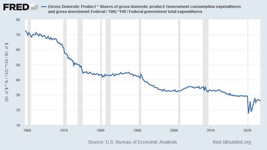
Federal spending that counts in GDP, as a percent of Total federal spending:

Graph #1: Federal Spending that Counts in GDP, as a Percent of Total Federal Spending

70% in 1960, 26% now. Check my work. First time I looked at this.


Table 1.1.10 shows "Percentage Shares of Gross Domestic Product".

Thursday, November 9, 2023

Shares in cost since 1987

Labor's share:

At FRED: https://fred.stlouisfed.org/series/MPU4910141

Capital's share:

At FRED: https://fred.stlouisfed.org/series/MPU4910131

"Share in cost" is at least approximately equal to Share of income:

At FRED: https://fred.stlouisfed.org/graph/?g=1b9SO

Tuesday, November 7, 2023

A difference often overlooked


"It is useful to distinguish between supply and demand causes of rising inflation, because supply-driven (or cost-push) inflation is associated with a decline in output, while demand-driven (or demand-pull) inflation is associated with a rise in output."
from "Inflation in the U.S. Economy: Causes and Policy Options", Congressional Research Service

Wikipedia: "The Congressional Research Service (CRS) is a public policy research institute of the United States Congress. Operating within the Library of Congress, it works primarily and directly for members of Congress and their committees and staff on a confidential, nonpartisan basis. CRS is sometimes known as Congress' think tank due to its broad mandate of providing research and analysis on all matters relevant to national policymaking."


See also:
"The most important difference between cost-push and demand-pull inflation"

Monday, November 6, 2023

The wages of finance

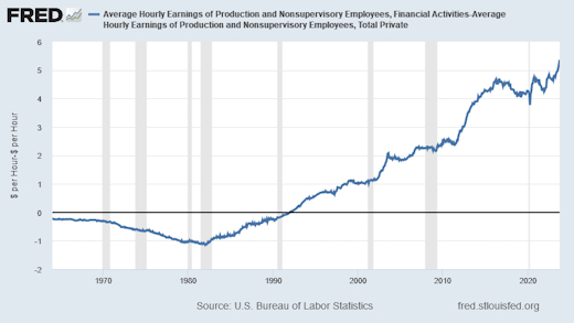
Average Hourly Earnings of Production and Nonsupervisory Employees,
Financial Activities versus the whole Private Sector

The Difference in Average Hourly Earnings:

Graph #1: Difference between average wages in finance and the private sector overall
at the grunt level

I subtracted the "Total Private" average wage from the "Financial Activities" average wage to see the difference. The Financial Activities wage was less than the Total Private wage until 1992. Since 1992, the Financial Activities wage has been the bigger number.

In the 1960s the average hourly wage in finance was 25 to 30 cents less than the private sector average.

In 1979, finance was a dollar less.

In January 1982, finance was $1.15 less. That was the low point for finance.

In December 1991, the financial wage was two cents less than the overall average.

In February 1992 the financial wage was two cents more than the private sector number.

In July 1998 finance was a dollar more than the private sector average.

In August 2003 finance was $2.08 more.

In May 2012, $3.01 more.

In May 2014, $4.06 more.

And in August 2023, the average grunt-level financial wage was $5.07 more than the average for all the grunts in the private sector.


But if you ask me, none of these numbers matter. What matters is the unrelenting uptrend visible in every aspect of finance.

Sunday, November 5, 2023

Three from Paul Samuelson

"... there is only one valid reality in a given economic situation, however hard it may be to recognize and isolate it. There is not one theory of economics for Republicans and one for Democrats, not one for workers and one for employers." 


"Individual virtues can be restored to being social virtues, provided we are able to restore a healthy environment of adequate aggregate demand for the product of business."


"... the political health of a democracy is tied up in a crucial way with the successful maintenance of stable high employment and living opportunities." 


From Chapter 1 of Samuelson's Economics, fourth edition (1958).

Saturday, November 4, 2023

Thursday, November 2, 2023

This morning the Democrats have lost the November 2024 election

The news this morning tells of big-city mayors getting together to beg the federal government for money, because of costs related to the immigrants bussed out of Texas.

Government spending is NOT the cause of our continuing economic troubles, but PEOPLE THINK IT IS THE CAUSE OF THOSE TROUBLES. And the Democrats' questionable immigration policies now come down to a matter of government spending.

The only thing the Republicans need to say now is "I told you so" and the 2024 presidential election is theirs.

Tuesday, October 31, 2023

Sent

I found a site called USAFACTS. Lots of data & graphs. They say they are nonpartisan, and to me this looks pretty close to the truth. They say USAFACTS was founded by Steve Ballmer, former CEO of Microsoft.

They say "We exclusively use publicly available government data" and they mention their trust in that data. This is somewhat unusual by today's standards but I see it as a plus.

They say "We don’t make judgments or prescribe policies." This leaves me a little uneasy, because some combinations of the facts are more meaningful than others, and some combinations of the facts only convey false impressions. But what can you do?

They say: "Whether government money is spent wisely or not, whether the quality of life is improving or getting worse — that’s for you to decide." That leaves me nervous, given the way things are going.

They say: "Americans deserve unbiased facts straight from the government to have serious, reasoned, and informed debate." But of course they don't say it is almost impossible to make a dent in the massive machinery of that "informed debate" by adding even one more piece of information to it.

I sent em an email anyway.


Saturday, October 28, 2023

Dear Mr. Speaker:


Graph #1: US Federal Budget, 1901-1935

Economists say monetary and fiscal policy sometimes cooperate, and sometimes work against each other.

Milton Friedman said bad monetary policy caused the Great Depression.

But as the graph shows, fiscal policy cooperated, magnifying the effects of Federal Reserve policy.

Congress wants to cut spending, but they need to be careful. The fundamentals are not sound.

Friday, October 27, 2023

So the House has a new speaker...

In a speech given more than three years before the Great Depression, Keynes said:

As things are now, we have nothing to look forward to except a continuance of Conservative Governments, not merely until they have made mistakes in the tolerable degree which would have caused a swing of the pendulum in former days, but until their mistakes have mounted up to the height of a disaster.

Three years before the Great Depression, he knew. 

Sunday, October 22, 2023

Nothing could be finer than to be in your economic equilibrium

At JSTOR ...

From a review of Milton Friedman's "A Program for Monetary Stability" by Lawrence Ritter, from 1960:

Friedman argues that the economy has been and is now inherently stable, and that it would automatically tend to maintain high employment with a stable price level if only it were not being almost continuously thrown off the track by erratic and unwise monetary policies.

If economic equilibrium is as ridiculous as it seems to me, and if Lawrence Ritter's summary is correct, then Milton Friedman's argument is embarrassingly stupid.

I have never seen an argument depend so completely on the fantasy called equilibrium.

Thursday, October 19, 2023

Wrong-headed thinking


Wrong-headed thinking arises as the economy decays, as things more and more turn out worse than expected. The bad economy changes our approach to problem-solving. We come to position ourselves for the greatest advantage out of economic necessity, even if other people are hurt by it. More and more we think micro ("what's best for me") instead of macro ("what's best for us"). It puts neighbors at odds. And it is a source of polarization.
From mine of 7 Feb 2022 (revised)

Please note that by a "bad economy" I don't mean just a recession. Recessions only last a year or so. That isn't long enough to change our personalities and remodel our brains. However, when I google long-term economic decline, most of the results focus on recession, and only a few on depression. Finally, after three sittings, I found one search result that actually considers the long-term decline of growth.

That one hit is "Recessions are difficult, but stagnant growth could prove more challenging, Stanford economist warns", by Melissa De Witte in the Stanford News, dated 7 December 2022. The article is an interview with John Cochrane. You may know Cochrane from The Grumpy Economist blog.

From De Witte's article:

While recessions are difficult, they are temporary, says Stanford economist John Cochrane. What is more painful is long-term economic slowdown and stagnation.

My respect for Cochrane grew three sizes that day. I went back and read "Just how bad is the economy?", an old blog post of his from 2012. Cochrane says "long-run growth matters more than anything else." But, based on estimates of Potential GDP, he added: "All we can hope for is a modest recovery, and then anemic, sclerotic growth forever after that... We seem stuck at 2.4% growth forever."

Cochrane has a solution in mind. He does some simple growth accounting:

GDP = Productivity x workers

And he says "Rising productivity is the core of a 'growth' agenda as economists understand the word."

Concluding the post, Cochrane writes:

What to do? If only it were so simple as to have the Fed print up another two trillion dollars, or have the Treasury borrow another $5 trillion and blow it on stimulus boondoggles. We're stuck in sclerotic growth, and to everyone but a few die-hard extremists, that means growth-oriented policies are the only way out.

He doesn't believe printing money will do the trick. He wants more pro-growth policy.

Funny thing, though. The same sort of slowdown happened in the 1970s: a slowdown of growth along with a decline in productivity. The economist Scott Sumner wrote about it. Sumner said:

The neoliberal revolution occurred precisely because growth was slowing almost everywhere in the 1970s and 1980s, and after 1980 growth slowed the most in those countries that reformed the least.

To boost economic growth, John Cochrane wants another neoliberal revolution. I have a problem with Cochrane's solution: It didn't work the last time we tried it. Scott Sumner explains:

I am not denying that growth in US living standards slowed after 1973, rather I am arguing that it would have slowed more had we not reformed our economy.

Sumner is saying that economic growth remained slow despite the neoliberal reforms. They only helped a little, he says. I would say it this way: Those reforms did not solve the problem. But Cochrane, who says long-run growth matters more than anything else, only wants more neoliberal reform. Cochrane wants pro-growth policy from the start. He doesn't want to think any more about it.

The problem I have with Cochrane is that his thinking is exactly the opposite of the thinking that is needed.  

Cochrane's plan is based on pre-existing knowledge. How did he put it? "Rising productivity is the core of a 'growth' agenda as economists understand the word." But that plan didn't work back in the 1980s, so we should not expect it to work now. What we must do is re-think the problem: Why is growth slow? If we don't ask the question and come up with a better answer, then we are only fighting the last war -- and we didn't win that time, either: "I am not denying that growth in US living standards slowed after 1973".

And so I say again:

There is a lot of that these days, a lot of evaluating the expected result and basing one's view on the expected outcome. This is exactly the opposite of the thinking we need. We need first to understand problems in terms of their causes, not in terms of the imagined result of some potential solution. The time for thinking about solutions is only after we grasp the causes.

Monday, October 16, 2023

Loria

Sidney Ball, reviewing Franklin Giddings's 1896 book The Principles of Sociology, offers some entertaining criticism:

The book is simply strewn with generalizations,  many of which are more than doubtful, or, if true, carry us a wonderfully little way.

Ball makes his praise for the book as empty as the book itself: "On the other hand ... the author's references to theoretic economics are generally happy and pertinent."

Even more striking, Ball uses the review as an opportunity to praise a different writer's work:

But it is surprising that an author who seems so thoroughly conversant with the literature of the subject should not have recognized -- even to the extent of discussing its "errors" in a footnote -- what we may call the school of Economic Sociology, of which Professor Achille Loria is the most distinguished representative. Some account should be taken, at least, of the view that all social causation is ultimately economic, and that all social institutions -- moral, legal, and political -- have their origin in the economic relations of the different social classes. This view may be a great abstraction, but it is at any rate a more positive working conception than any we can find in the kind of vague and abstract sociology of which Professor Giddings is a representative.

This was my introduction to Achille Loria, for whom all social causation is ultimately economic.

All social causation is ultimately economic. That's how I see things too, you know. So I sort of dropped everything and went looking for Achille Loria.

Wikipedia says Loria (1857 – 1943) was an Italian political economist who

developed an original deterministic theory of economic development. It is based on the premise that the relative scarcity of land leads to the subjugation of some members of society by others, a mechanism that works differently in different stages of development.

The scarcity of land leads to subjugation? That escapes me. But change "the relative scarcity of land" to "the relative scarcity of wealth" and I see it clearly. Loria's theory

  • describes "a mechanism that works differently in different stages of development." I see that. Arnold Toynbee identifies the stages of civilization as genesis, growth, breakdown, disintegration, and the universal state. Carroll Quigley identifies them as mixture, gestation, expansion, conflict, the universal empire, decay, and invasion. Werner Sombart and Ernest Mandel studied the stages of capitalism; Sombart's study goes back to the proto-capitalism of the Early Middle Ages -- the Dark Age, where civilization begins. And Keynes himself identified the high point of civilization (and capitalism), writing of "a period of almost one hundred and fifty years" which he described as "the greatest age of the inducement to investment", a time when employment was "reasonably satisfactory" and  "not intolerably low".

  • The theory ties the various stages together by identifying a mechanism that drives the process of change. For Loria, that mechanism is the scarcity of land. (For me, the mechanism is the concentration of wealth.)

  • Loria's theory is "deterministic" one, meaning things could not happen any other way -- but, as I believe, if we know and understand the problem we can change the outcome. We can pause the "mechanism" at an opportune moment, before the fall-of-Rome stage. Maybe we can even turn downtrend into uptrend, which is really what needs to be done. "Challenge and response," Toynbee said: If our response is successful, our civilization survives. If not, then not.

And yes, Loria's theory may be "a great abstraction", as Sidney Ball said. But we are certainly capable of ignoring, denying, and not seeing half a century or more of dramatic decline in our own economy

Are we not capable of recognizing it when we finally do see it? Are we not capable of turning the trend around? We do not have to go the way of Rome and the other ancient civilizations. But we have to know about the problem, and we have to understand the problem. The difficulty is not in solving the problem. The difficulty is in understanding it. Once the problem is correctly understood, solving it is the easy thing.

Just to be clear on this, neither the Democrats nor the Republicans understand the problem. The hard work is yet to be done.


In the October 1950 edition of the journal *Agricultural History*, one finds Lee Benson's article "Achille Loria's Influence on American Economic Thought". JSTOR provides access to the article at no cost. Below is Benson's opening paragraph:

In recent years a mantle of obscurity has fallen over the name and reputation of the Italian economist, Achille Loria. Yet, in the last two decades of the nineteenth century, his system of "economic sociology" was of primary importance, and contemporary observers placed him among the foremost academicians of the time. His contributions to the economic interpretation of history and his theories concerning the role of land in the social process profoundly influenced both European and American thought. Thus there is a warrant for attempting to rescue him from an undeserved obscurity.

That's great, and maybe I can help rescue Loria from that obscurity. But my purpose here is to repeat Sidney Ball's description of Loria's view

that all social causation is ultimately economic, and that all social institutions -- moral, legal, and political -- have their origin in the economic relations of the different social classes.

When you turn the news on and it is all politics, try to remember: the underlying cause of it all is that our economy is in decline. When you turn the news on and it is war over Gaza and war over Crimea -- war over land, Loria would point out -- remember what people say: "War is politics by other means." Politics by worse means. Things get worse. And the root of it all is economic decline.

Long-term economic decline is indistinguishable from the decline of civilization. If it continues, long-term economic decline creates the decline of civilization. If we solve the economic problem, it doesn't.

Saturday, October 14, 2023

Parallel argument

When I was little I was talking too much and my mommy said there are only so many words in your voice box and if you use them all up you can't talk any more.

Congress seems to be thinking that there is only so much spending in the economy and if government does it, then business cannot.

Sunday, October 1, 2023

"The Economic Roots of the Rise of Trumpism"

"The Economic Roots of the Rise of Trumpism" (23-page PDF) by John Komlos

Here's the Abstract:

Donald Trump won the election in 2016 largely because enough voters in three states, all in the Rustbelt, who had voted for Barack Obama in both 2008 and 2012, switched their vote from Democratic to Republican. Economic dislocations played a crucial role in these swing states or democratic strongholds to persuade many voters to take the dramatic step to vote for an anti-establishment candidate even if that meant a leap of faith into the unknown. The sources of the dislocation were the development of a dual economy characterized at one end by low and stagnating wages, increasing debt, downward social mobility, declining relative incomes, and the hopelessness accompanying them while at the other end of the income distribution the economy was simply booming. This was longer than a three-decade process that started with Reaganomics and its tax cuts that privileged the rich and conferred immense wealth, and its concomitant, political power, on them. Reaganomics also accelerated the decline in the power of unions which had supported the middle class. The process continued under Bill Clinton’s administration and its continuing both financial deregulation and of hyper-globalization. George Bush continued to pamper the superrich with his tax policies. The process culminated with Barack Obama’s bailing out the superrich and his benign neglect of Mainstreet. Five administration’s disinterest in the social group Hillary Clinton referred to flippantly as “the deplorables” culminated in the revolt of the masses in favor of an incompetent strongman by overthrowing the establishment captured by such chants at Trump rallies as “Lock her up!”, “USA!”, “Build the wall”, or “Drain the swamp” (i.e., in Washington D.C.)

CESifo Working Paper No. 6868.

Saturday, September 30, 2023

Motor Vehicle Manufacturing in Michigan: Employment

Graph #1


Dunno how much of US auto manufacturing is done in Michigan, nor the reason for the 2000-2010 decline, but I think the graph shows an interesting picture. Employment shown on the graph fell from 90,000 to 30,000 in ten years.

Wednesday, September 27, 2023

Seven good years...

Note the sequence: First the low spot, then the good years of the latter 1990s. Then too much of a good thing, followed by hard times:

Graph #1: Ratio of Credit to Money

Saturday, September 23, 2023

Same graph as yesterday, but showing natural log of the values

Natural Log of the federal spending data shown yesterday:

Graph #1: Natural Log of federal current spending

The slope of the line indicates the rate of growth.

From say 1952 to 1965 the line goes up.

From 1965 to around 1983 it goes up a lot faster: this was during the "Great Inflation".

After 1983 it goes up about as fast as it did from 1952 to 1965. In other words, since the 1980s federal spending has been increasing about as fast as it did during the "golden age" that followed World War Two.

Friday, September 22, 2023

Federal Government: Current Expenditures 1947-2023

See those sharp points there on the right?

Graph #1: Current expenditures of the federal government

Republicans don't like sitting on them.

But even those of us on the left should be able to sympathize.

Sunday, September 17, 2023

Labor Cost and Profit since 2018

Comparing the labor cost of Nonfinancial Corporate Business (NCB) to NCB profits since 2018. The vertical gray bar during 2020 shows the recession we had during the covid-19 shutdown:

Graph #1xxx

The values are "indexed" so that labor costs and profits both start at the 100 level in 2018. When they start out the same, it is easy to see how they vary as time goes by.

Before the covid recession, profit (red) varies more than labor cost (blue), but they do run more or less together. After the covid recession profit goes high, and since that time profit has been running about 25% higher than before.

Tuesday, September 12, 2023

Political irony on a massive scale

I don't know, but Milton Friedman did speak of "long and variable" lags in the effects of policy on inflation. Specifically, he observed lags as long as two years and more.

It would be political irony on a massive scale if the covid shutdown of 2020 caused the inflation of 2021-2023, and Biden took the hit for it in 2024.


From the CDC's Covid Timeline:

  • December 12, 2019: A cluster of patients in China’s Hubei Province, in the city of Wuhan, begin to experience the symptoms of an atypical pneumonia-like illness that does not respond well to standard treatments.
  • March 13, 2020: The Trump Administration declares a nationwide emergency...
  • March 15, 2020: States begin to implement shutdowns in order to prevent the spread of COVID-19.


Links:

Milton Friedman (1961):

The central empirical finding in dispute is my conclusion that monetary actions affect economic conditions only after a lag that is both long and variable.

Axios (July 2023): 

In Central Banking 101, there is frequent talk of "long and variable lags" — the idea that after making an interest rate move, there is a delay of uncertain length before it really affects the economy.

Investing.com (Jan 2023):

Raphael Bostic, President and Chief Executive Officer Federal Reserve Bank of Atlanta said,

A large body of research tells us it can take 18 months to two years or more for tighter monetary policy to materially affect inflation.

The Hill (March 2023):

Citing the findings from his joint work with Anna Schwartz, Friedman goes on to state: “For individual cycles, the recorded lead has varied between 6 and 29 months at peaks and between 4 and 22 months at troughs.”

Sunday, September 3, 2023

It depends what you mean by "influenced by"

I came upon this just now in Google Search:


They are right, of course. The one they call "Real GDP" changes because of changes in the output we produce, but not because of changes in prices. The one they call "Nominal GDP" changes because of changes in output and because of changes in prices. 

If we say Nominal GDP is all of the output purchased in a year, measured at that year's prices, then Nominal GDP is a measure of actual spending. If we say Real GDP is all of the output purchased in a year, measured at 2012 prices, then Real GDP is a measure of what that spending would have been if prices never went up. Actual things are called "nominal", and fantasies are called "real". This, it seems, is the way economists think. That being the case, it must be easy for them to say Real GDP is "not influenced by changes in prices."

As for myself, I understand that raising interest rates slows the economy and reduces inflation. I understand this is the preferred economic policy of many nations. I do not think it is the best way to reduce inflation, nor even a very good way, but that is not my topic here. So I say, without complaining, that raising interest rates slows the economy and reduces inflation.

Now, Nominal GDP measures changing output at changing prices. And Real GDP measures changing output at unchanging prices. But to get prices to be really "unchanging" we would have to reduce inflation. 

And reducing inflation slows the economy.

And "slowing the economy" means reducing the amount of output we produce. So, if the question is Do changing prices influence Real GDP? then the answer is Yes, absolutely, they do.

To expand on that thought: If by "price changes" we mean either "prices going up because of inflation" or "policies that reduce inflation", again I have to say yes, such changes in the price level do influence Real GDP growth. Yes, absolutely.

That's my short answer.